WPF自定义控件与样式(2)-自定义按钮FButton
一.前言.效果图
还是先看看效果图吧:

定义Button按钮名称叫FButton,主要是集成了字体图标(参考上一篇: WPF自定义控件与样式1-矢量字体图标(iconfont) )。其实在WPF里,要实现本文FButton的需求,完全可以不用自定义控件,使用样式、模板就可以搞定了的。
二.按钮FButton控件定义
2.1 FButton继承自微软基础控件Button (C#代码)
FButton继承自微软基础控件Button,没有什么逻辑代码,主要扩展了几个属性:
- 控件外观控制的属性,如圆角、鼠标悬浮前景色背景色、是否开启动画(鼠标悬停时小图标转一圈,移开又转回去)、鼠标按下颜色等;
- 字体图标相关属性,如字符值、字体图标大小、字体图标间距等。
详见代码:
/// <summary> /// FButton.xaml 的交互逻辑 /// </summary> public partial class FButton : Button { public static readonly DependencyProperty PressedBackgroundProperty = DependencyProperty.Register("PressedBackground", typeof(Brush), typeof(FButton), new PropertyMetadata(Brushes.DarkBlue)); /// <summary> /// 鼠标按下背景样式 /// </summary> public Brush PressedBackground { get { return (Brush)GetValue(PressedBackgroundProperty); } set { SetValue(PressedBackgroundProperty, value); } } public static readonly DependencyProperty PressedForegroundProperty = DependencyProperty.Register("PressedForeground", typeof(Brush), typeof(FButton), new PropertyMetadata(Brushes.White)); /// <summary> /// 鼠标按下前景样式(图标、文字) /// </summary> public Brush PressedForeground { get { return (Brush)GetValue(PressedForegroundProperty); } set { SetValue(PressedForegroundProperty, value); } } public static readonly DependencyProperty MouseOverBackgroundProperty = DependencyProperty.Register("MouseOverBackground", typeof(Brush), typeof(FButton), new PropertyMetadata(Brushes.RoyalBlue)); /// <summary> /// 鼠标进入背景样式 /// </summary> public Brush MouseOverBackground { get { return (Brush)GetValue(MouseOverBackgroundProperty); } set { SetValue(MouseOverBackgroundProperty, value); } } public static readonly DependencyProperty MouseOverForegroundProperty = DependencyProperty.Register("MouseOverForeground", typeof(Brush), typeof(FButton), new PropertyMetadata(Brushes.White)); /// <summary> /// 鼠标进入前景样式 /// </summary> public Brush MouseOverForeground { get { return (Brush)GetValue(MouseOverForegroundProperty); } set { SetValue(MouseOverForegroundProperty, value); } } public static readonly DependencyProperty FIconProperty = DependencyProperty.Register("FIcon", typeof(string), typeof(FButton), new PropertyMetadata("/ue604")); /// <summary> /// 按钮字体图标编码 /// </summary> public string FIcon { get { return (string)GetValue(FIconProperty); } set { SetValue(FIconProperty, value); } } public static readonly DependencyProperty FIconSizeProperty = DependencyProperty.Register("FIconSize", typeof(int), typeof(FButton), new PropertyMetadata(20)); /// <summary> /// 按钮字体图标大小 /// </summary> public int FIconSize { get { return (int)GetValue(FIconSizeProperty); } set { SetValue(FIconSizeProperty, value); } } public static readonly DependencyProperty FIconMarginProperty = DependencyProperty.Register( "FIconMargin", typeof(Thickness), typeof(FButton), new PropertyMetadata(new Thickness(0, 1, 3, 1))); /// <summary> /// 字体图标间距 /// </summary> public Thickness FIconMargin { get { return (Thickness)GetValue(FIconMarginProperty); } set { SetValue(FIconMarginProperty, value); } } public static readonly DependencyProperty AllowsAnimationProperty = DependencyProperty.Register( "AllowsAnimation", typeof(bool), typeof(FButton), new PropertyMetadata(true)); /// <summary> /// 是否启用Ficon动画 /// </summary> public bool AllowsAnimation { get { return (bool)GetValue(AllowsAnimationProperty); } set { SetValue(AllowsAnimationProperty, value); } } public static readonly DependencyProperty CornerRadiusProperty = DependencyProperty.Register("CornerRadius", typeof(CornerRadius), typeof(FButton), new PropertyMetadata(new CornerRadius(2))); /// <summary> /// 按钮圆角大小,左上,右上,右下,左下 /// </summary> public CornerRadius CornerRadius { get { return (CornerRadius)GetValue(CornerRadiusProperty); } set { SetValue(CornerRadiusProperty, value); } } public static readonly DependencyProperty ContentDecorationsProperty = DependencyProperty.Register( "ContentDecorations", typeof(TextDecorationCollection), typeof(FButton), new PropertyMetadata(null)); public TextDecorationCollection ContentDecorations { get { return (TextDecorationCollection)GetValue(ContentDecorationsProperty); } set { SetValue(ContentDecorationsProperty, value); } } static FButton() { DefaultStyleKeyProperty.OverrideMetadata(typeof(FButton), new FrameworkPropertyMetadata(typeof(FButton))); } } View Code 2.2 FButton控件模板定义
模板内容分为两部分,第一部分为为基本结构,第二部分就是触发器,用触发器实现按钮不同状态的样式控制,详见代码:
<!--FButton模板--> <ControlTemplate x:Key="FButton_Template" TargetType="{x:Type local:FButton}"> <Border x:Name="border" Background="{Binding RelativeSource={RelativeSource Mode=TemplatedParent}, Path= Background}" Height="{Binding RelativeSource={RelativeSource Mode=TemplatedParent}, Path=Height}" CornerRadius="{Binding RelativeSource={RelativeSource Mode=TemplatedParent}, Path=CornerRadius}" Width="{Binding RelativeSource={RelativeSource Mode=TemplatedParent}, Path=Width}"> <!--Icon/Text--> <StackPanel Orientation="Horizontal" VerticalAlignment="Center" Margin="{TemplateBinding Padding}" HorizontalAlignment="{TemplateBinding HorizontalContentAlignment}"> <TextBlock x:Name="icon" Margin="{Binding RelativeSource={RelativeSource Mode=TemplatedParent}, Path=FIconMargin}" RenderTransformOrigin="0.5,0.5" Style="{StaticResource FIcon}" Text="{Binding RelativeSource={RelativeSource Mode=TemplatedParent}, Path= FIcon}" FontSize="{Binding RelativeSource={RelativeSource Mode=TemplatedParent}, Path= FIconSize}" Foreground="{Binding RelativeSource={RelativeSource Mode=TemplatedParent}, Path= Foreground}"> <TextBlock.RenderTransform> <RotateTransform x:Name="transIcon" Angle="0"/> </TextBlock.RenderTransform> </TextBlock> <TextBlock VerticalAlignment="Center" x:Name="txt" TextDecorations="{Binding RelativeSource={RelativeSource Mode=TemplatedParent}, Path=ContentDecorations}" Text="{Binding RelativeSource={RelativeSource Mode=TemplatedParent}, Path=Content}" FontSize="{Binding RelativeSource={RelativeSource Mode=TemplatedParent}, Path=FontSize}" Foreground="{Binding RelativeSource={RelativeSource Mode=TemplatedParent}, Path=Foreground}"></TextBlock> </StackPanel> </Border> <!--触发器--> <ControlTemplate.Triggers> <!--设置鼠标进入时的背景、前景样式--> <Trigger Property="IsMouseOver" Value="True"> <Setter Property="Background" Value="{Binding RelativeSource={RelativeSource Mode=TemplatedParent}, Path=MouseOverBackground}" TargetName="border" /> <Setter Property="Foreground" Value="{Binding RelativeSource={RelativeSource Mode=TemplatedParent}, Path=MouseOverForeground}" TargetName="icon"/> <Setter Property="Foreground" Value="{Binding RelativeSource={RelativeSource Mode=TemplatedParent}, Path=MouseOverForeground}" TargetName="txt"/> </Trigger> <!--Ficon的动画触发器--> <MultiTrigger> <MultiTrigger.Conditions> <Condition Property="IsMouseOver" Value="true"></Condition> <Condition Property="AllowsAnimation" Value="true"></Condition> </MultiTrigger.Conditions> <MultiTrigger.EnterActions> <BeginStoryboard> <Storyboard> <DoubleAnimation Storyboard.TargetName="transIcon" Storyboard.TargetProperty="Angle" To="180" Duration="0:0:0.2" /> </Storyboard> </BeginStoryboard> </MultiTrigger.EnterActions> <MultiTrigger.ExitActions> <BeginStoryboard> <Storyboard> <DoubleAnimation Storyboard.TargetName="transIcon" Storyboard.TargetProperty="Angle" To="0" Duration="0:0:0.2" /> </Storyboard> </BeginStoryboard> </MultiTrigger.ExitActions> </MultiTrigger> <!--鼠标按下时的前景、背景样式--> <Trigger Property="IsPressed" Value="True"> <Setter Property="Background" Value="{Binding RelativeSource={RelativeSource Mode=TemplatedParent}, Path=PressedBackground}" TargetName="border" /> <Setter Property="Foreground" Value="{Binding RelativeSource={RelativeSource Mode=TemplatedParent}, Path=PressedForeground}" TargetName="icon"/> <Setter Property="Foreground" Value="{Binding RelativeSource={RelativeSource Mode=TemplatedParent}, Path=PressedForeground}" TargetName="txt"/> </Trigger> <Trigger Property="IsEnabled" Value="false"> <Setter Property="Opacity" Value="0.5" TargetName="border"/> </Trigger> </ControlTemplate.Triggers> </ControlTemplate> View Code 2.3 FButton基本样式
样式定义代码:
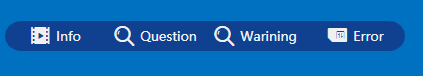
<!--默认样式--> <Style TargetType="{x:Type local:FButton}"> <Setter Property="Background" Value="{StaticResource ButtonBackground}" /> <Setter Property="Foreground" Value="{StaticResource ButtonForeground}" /> <Setter Property="MouseOverBackground" Value="{StaticResource ButtonMouseOverBackground}" /> <Setter Property="MouseOverForeground" Value="{StaticResource ButtonMouseOverForeground}" /> <Setter Property="PressedBackground" Value="{StaticResource ButtonPressedBackground}" /> <Setter Property="PressedForeground" Value="{StaticResource ButtonPressedForeground}" /> <Setter Property="HorizontalContentAlignment" Value="Center" /> <Setter Property="Width" Value="100" /> <Setter Property="Height" Value="30" /> <Setter Property="FontSize" Value="13" /> <Setter Property="CornerRadius" Value="0" /> <Setter Property="FIconSize" Value="22" /> <Setter Property="Template" Value="{StaticResource FButton_Template}"/> <Setter Property="Padding" Value="3,1,3,1" /> <Setter Property="Content" Value="{x:Null}" /> <Setter Property="FIconMargin" Value="0,0,5,0" /> <Setter Property="AllowsAnimation" Value="False" /> </Style> 基本按钮的效果,参考( 一.前言 - 效果图 ),示例代码:
<StackPanel > <xly:FButton FIcon="" Margin="3">系统换转</xly:FButton> <xly:FButton FIcon="" Margin="3" Width="140" Height="40" Background="#771C79" MouseOverBackground="#F20BA0" Click="FButton_Click" >WaitingBox</xly:FButton> <xly:FButton FIcon="" Margin="3" Width="140" Height="40" Background="#12B512" IsDefault="True" MouseOverBackground="#08EE08" Click="FButton_Click_WindowBase">WindowBase</xly:FButton> <xly:FButton FIcon="" Margin="5,0,0,0" CornerRadius="16,0,0,16" AllowsAnimation="True" Click="FButton_Click_Info">Info</xly:FButton> <xly:FButton FIcon="" CornerRadius="0" Click="FButton_Click_Question">Question</xly:FButton> <xly:FButton FIcon="" CornerRadius="0" Click="FButton_Click_Warning">Warining</xly:FButton> <xly:FButton FIcon="" CornerRadius="0,16,16,0" AllowsAnimation="True" Click="FButton_Click_Error">Error</xly:FButton> </StackPanel>
2.4 FButton透明背景样式
背景透明效果的按钮样式
<!--背景透明的FButton样式--> <Style x:Key="FButton_Transparency" TargetType="{x:Type local:FButton}"> <Setter Property="Background" Value="Transparent" /> <Setter Property="MouseOverBackground" Value="Transparent" /> <Setter Property="PressedBackground" Value="Transparent" /> <Setter Property="Foreground" Value="{StaticResource TextForeground}" /> <Setter Property="MouseOverForeground" Value="{StaticResource MouseOverForeground}" /> <Setter Property="PressedForeground" Value="{StaticResource PressedForeground}" /> <Setter Property="HorizontalContentAlignment" Value="Center" /> <Setter Property="Height" Value="Auto" /> <Setter Property="Width" Value="Auto" /> <Setter Property="CornerRadius" Value="0" /> <Setter Property="FontSize" Value="13" /> <Setter Property="FIconSize" Value="20" /> <Setter Property="Template" Value="{StaticResource FButton_Template}"/> <Setter Property="Padding" Value="3,1,3,1" /> <Setter Property="Content" Value="{x:Null}" /> <Setter Property="FIconMargin" Value="0,0,2,0" /> <Setter Property="AllowsAnimation" Value="False" /> <Setter Property="Cursor" Value="Hand" /> </Style> 示例及效果:
<xly:FButton FIcon="" Margin="5" FIconMargin="0" FIconSize="30" Style="{StaticResource FButton_Transparency}" ></xly:FButton> <xly:FButton FIcon="" Margin="5" Style="{StaticResource FButton_Transparency}"></xly:FButton> <xly:FButton FIcon="" Margin="5" Style="{StaticResource FButton_Transparency}" IsEnabled="False"></xly:FButton> <xly:FButton FIcon="" Margin="3" Style="{StaticResource FButton_Transparency}">如何开启调试模式?</xly:FButton> <xly:FButton FIcon="" Margin="3" Style="{StaticResource FButton_Transparency}" IsEnabled="False">设备检测</xly:FButton> <xly:FButton FIcon="" Margin="3" Style="{StaticResource FButton_Transparency}">爸爸回来了</xly:FButton> 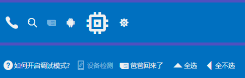
2.3 类似LinkButton(超链接)样式
样式定义:
<!--LinkButton的FButton样式,默认无FIcon--> <Style x:Key="FButton_LinkButton" TargetType="{x:Type local:FButton}"> <Setter Property="Background" Value="Transparent" /> <Setter Property="MouseOverBackground" Value="Transparent" /> <Setter Property="PressedBackground" Value="Transparent" /> <Setter Property="Foreground" Value="{StaticResource LinkForeground}" /> <Setter Property="MouseOverForeground" Value="{StaticResource MouseOverForeground}" /> <Setter Property="PressedForeground" Value="{StaticResource PressedForeground}" /> <Setter Property="HorizontalContentAlignment" Value="Center" /> <Setter Property="Height" Value="Auto" /> <Setter Property="Width" Value="Auto" /> <Setter Property="CornerRadius" Value="0" /> <Setter Property="FontSize" Value="13" /> <Setter Property="FIconSize" Value="20" /> <Setter Property="Template" Value="{StaticResource FButton_Template}"/> <Setter Property="Padding" Value="3,1,3,1" /> <Setter Property="Content" Value="{x:Null}" /> <Setter Property="FIconMargin" Value="0" /> <Setter Property="FIcon" Value="" /> <Setter Property="AllowsAnimation" Value="False" /> <Setter Property="ContentDecorations" Value="Underline" /> <Setter Property="Cursor" Value="Hand" /> </Style> 示例及效果:
<xly:FButton Margin="3,15" Style="{StaticResource FButton_LinkButton}" >如何开启调试模式?</xly:FButton> <xly:FButton FIcon="" Margin="3" Style="{StaticResource FButton_LinkButton}">设备检测</xly:FButton> <xly:FButton Margin="3" Style="{StaticResource FButton_LinkButton}">爸爸回来了</xly:FButton> 
附录:参考引用
WPF自定义控件与样式(1)-矢量字体图标(iconfont)
版权所有,文章来源: http://www.cnblogs.com/anding
个人能力有限,本文内容仅供学习、探讨,欢迎指正、交流。
正文到此结束
热门推荐


相关文章

近期评论
-
你这基本没有更新呀,最近文章显示还是2019年的文章。不符合要求哈
-
关键词:慕云博客 链接:https://www.lilun.me 描述:分享原创文字的个人博客
-
-
-
可以提供一下源码吗
-
不是商业站,鸡娃学习笔记
-
-
-
-
听他们说很厉害的样子
Loading...
![[HBLOG]公众号](http://www.liuhaihua.cn/img/qrcode_gzh.jpg)

