WPF自定义控件与样式(4)-CheckBox/RadioButton自定义样式
一.前言
申明:WPF自定义控件与样式是一个系列文章,前后是有些关联的,但大多是按照由简到繁的顺序逐步发布的等,若有不明白的地方可以参考本系列前面的文章,文末附有部分文章链接。
本文主要内容:
- CheckBox复选框的自定义样式,有两种不同的风格实现;
- RadioButton单选框自定义样式,有两种不同的风格实现;
二. CheckBox自定义样式
2.1 CheckBox基本样式
标准CheckBox样式代码如下,实现了三态的显示,其中不同状态的图标用了字体图标(关于字体图标,可以参考 本文末尾附录链接)
<Style x:Key="DefaultCheckBox" TargetType="{x:Type CheckBox}"> <Setter Property="Background" Value="Transparent"></Setter> <Setter Property="Foreground" Value="{StaticResource TextForeground}"></Setter> <Setter Property="Padding" Value="0"></Setter> <Setter Property="local:ControlAttachProperty.FIconMargin" Value="1, 1, 3, 1"></Setter> <Setter Property="local:ControlAttachProperty.FIconSize" Value="22"></Setter> <Setter Property="FontSize" Value="{StaticResource FontSize}"></Setter> <Setter Property="Template"> <Setter.Value> <ControlTemplate TargetType="{x:Type CheckBox}"> <Grid x:Name="grid" Margin="{TemplateBinding Padding}" VerticalAlignment="Center"> <StackPanel Orientation="Horizontal" VerticalAlignment="Center"> <TextBlock x:Name="icon" Style="{StaticResource FIcon}" Text="" FontSize="{TemplateBinding local:ControlAttachProperty.FIconSize}" Margin="{TemplateBinding local:ControlAttachProperty.FIconMargin}" Foreground="{TemplateBinding Foreground}"/> <ContentPresenter VerticalAlignment="Center"/> </StackPanel> </Grid> <!--触发器:设置选中状态符号--> <ControlTemplate.Triggers> <Trigger Property="IsChecked" Value="true"> <Setter Property="Text" Value="" TargetName="icon" ></Setter> <Setter Property="Foreground" Value="{StaticResource CheckedForeground}"></Setter> </Trigger> <Trigger Property="IsChecked" Value="{x:Null}"> <Setter Property="Text" Value="" TargetName="icon" ></Setter> </Trigger> <Trigger Property="IsMouseOver" Value="true"> <Setter Property="Foreground" Value="{StaticResource MouseOverForeground}"></Setter> </Trigger> <Trigger Property="IsEnabled" Value="False"> <Setter Property="Opacity" Value="{StaticResource DisableOpacity}" TargetName="grid" ></Setter> </Trigger> </ControlTemplate.Triggers> </ControlTemplate> </Setter.Value> </Setter> </Style> 使用示例及效果:
<CheckBox Margin="3">男</CheckBox> <CheckBox Margin="3">女</CheckBox> <CheckBox Margin="3" IsChecked="{x:Null}">其他</CheckBox> <CheckBox Margin="3" IsChecked="{x:Null}">女</CheckBox> <CheckBox Margin="3" IsEnabled="False">我被禁用了</CheckBox> <CheckBox Margin="3" IsEnabled="False" IsChecked="{x:Null}">我被禁用了</CheckBox> <CheckBox Margin="3" IsEnabled="False" IsChecked="True">我被禁用了</CheckBox> 
2.2 CheckBox另一种样式
在移动端比较常见的一种复选效果,先看看效果
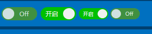
这个代码是很久以前写的,用的控件的形式实现的,可以纯样式实现,更简洁,懒得改了。C#代码:
/// <summary> /// BulletCheckBox.xaml 的交互逻辑 /// </summary> public class BulletCheckBox : CheckBox { public static readonly DependencyProperty TextProperty = DependencyProperty.Register( "Text", typeof(string), typeof(BulletCheckBox), new PropertyMetadata("Off")); /// <summary> /// 默认文本(未选中) /// </summary> public string Text { get { return (string)GetValue(TextProperty); } set { SetValue(TextProperty, value); } } public static readonly DependencyProperty CheckedTextProperty = DependencyProperty.Register( "CheckedText", typeof(string), typeof(BulletCheckBox), new PropertyMetadata("On")); /// <summary> /// 选中状态文本 /// </summary> public string CheckedText { get { return (string)GetValue(CheckedTextProperty); } set { SetValue(CheckedTextProperty, value); } } public static readonly DependencyProperty CheckedForegroundProperty = DependencyProperty.Register("CheckedForeground", typeof(Brush), typeof(BulletCheckBox), new PropertyMetadata(Brushes.WhiteSmoke)); /// <summary> /// 选中状态前景样式 /// </summary> public Brush CheckedForeground { get { return (Brush)GetValue(CheckedForegroundProperty); } set { SetValue(CheckedForegroundProperty, value); } } public static readonly DependencyProperty CheckedBackgroundProperty = DependencyProperty.Register("CheckedBackground", typeof(Brush), typeof(BulletCheckBox), new PropertyMetadata(Brushes.LimeGreen)); /// <summary> /// 选中状态背景色 /// </summary> public Brush CheckedBackground { get { return (Brush)GetValue(CheckedBackgroundProperty); } set { SetValue(CheckedBackgroundProperty, value); } } static BulletCheckBox() { DefaultStyleKeyProperty.OverrideMetadata(typeof(BulletCheckBox), new FrameworkPropertyMetadata(typeof(BulletCheckBox))); } } View Code 样式代码,状态变换用了点小动画,为了支持缩放,用了一个Viewbox来包装内容:
<Style TargetType="{x:Type local:BulletCheckBox}"> <Setter Property="Background" Value="#FF4A9E4A"></Setter> <Setter Property="Foreground" Value="#DDE8E1"></Setter> <Setter Property="CheckedForeground" Value="White"></Setter> <Setter Property="CheckedBackground" Value="#FF0CC50C"></Setter> <Setter Property="FontSize" Value="13"></Setter> <Setter Property="Cursor" Value="Hand"></Setter> <Setter Property="Width" Value="75"></Setter> <Setter Property="Height" Value="28"></Setter> <Setter Property="Margin" Value="1"></Setter> <Setter Property="Template"> <Setter.Value> <!--控件模板--> <ControlTemplate TargetType="{x:Type local:BulletCheckBox}"> <Viewbox Stretch="Uniform" VerticalAlignment="Center" HorizontalAlignment="Center"> <Border x:Name="border" Width="75" Height="28" Background="{TemplateBinding Background}" SnapsToDevicePixels="True" Margin="{TemplateBinding Margin}" CornerRadius="14"> <StackPanel Orientation="Horizontal"> <!--状态球--> <Border x:Name="state" Width="24" Height="24" Margin="3,2,1,2" CornerRadius="12" SnapsToDevicePixels="True" Background="{TemplateBinding Foreground}"> <Border.RenderTransform> <TranslateTransform x:Name="transState" X="0"></TranslateTransform> </Border.RenderTransform> </Border> <!--文本框--> <TextBlock Width="40" Foreground="{TemplateBinding Foreground}" x:Name="txt" Text="{TemplateBinding Text}" VerticalAlignment="Center" TextAlignment="Center"> <TextBlock.RenderTransform> <TranslateTransform x:Name="transTxt" X="0"></TranslateTransform> </TextBlock.RenderTransform> </TextBlock> </StackPanel> </Border> </Viewbox> <!--触发器:设置选中状态符号--> <ControlTemplate.Triggers> <Trigger Property="IsChecked" Value="True"> <Setter Property="Text" Value="{Binding RelativeSource={RelativeSource Mode=TemplatedParent}, Path=CheckedText}" TargetName="txt"/> <Setter Property="Background" Value="{Binding RelativeSource={RelativeSource Mode=TemplatedParent}, Path=CheckedForeground}" TargetName="state"/> <Setter Property="Foreground" Value="{Binding RelativeSource={RelativeSource Mode=TemplatedParent}, Path=CheckedForeground}" TargetName="txt"/> <Setter Property="Background" Value="{Binding RelativeSource={RelativeSource Mode=TemplatedParent}, Path=CheckedBackground}" TargetName="border"/> <Trigger.EnterActions> <BeginStoryboard> <Storyboard> <DoubleAnimation Storyboard.TargetName="transState" Storyboard.TargetProperty="X" To="45" Duration="0:0:0.2" /> <DoubleAnimation Storyboard.TargetName="transTxt" Storyboard.TargetProperty="X" To="-24" Duration="0:0:0.2" /> </Storyboard> </BeginStoryboard> </Trigger.EnterActions> <Trigger.ExitActions> <BeginStoryboard> <Storyboard> <DoubleAnimation Storyboard.TargetName="transState" Storyboard.TargetProperty="X" To="0" Duration="0:0:0.2" /> <DoubleAnimation Storyboard.TargetName="transTxt" Storyboard.TargetProperty="X" To="0" Duration="0:0:0.2" /> </Storyboard> </BeginStoryboard> </Trigger.ExitActions> </Trigger> <Trigger Property="IsEnabled" Value="false"> <Setter Property="Opacity" Value="{StaticResource DisableOpacity}" TargetName="border"/> </Trigger> </ControlTemplate.Triggers> </ControlTemplate> </Setter.Value> </Setter> </Style> View Code 使用示例:
<kc:BulletCheckBox /> <kc:BulletCheckBox Text="不开窍" CheckedText="开启" IsChecked="True" /> <kc:BulletCheckBox Text="不开窍" CheckedText="开启" IsChecked="True" Height="24" Width="60" /> <kc:BulletCheckBox Height="24" Width="60"/>
三.RadioButton自定义样式
3.1 RadioButon基本样式
标准单选控件的样式很简单,用不同图标标识不同状态,然后触发器控制不同状态的显示效果。
<!--默认样式--> <Style x:Key="DefaultRadioButton" TargetType="{x:Type RadioButton}"> <Setter Property="Background" Value="Transparent"></Setter> <Setter Property="Foreground" Value="{StaticResource TextForeground}"></Setter> <Setter Property="Padding" Value="0"></Setter> <Setter Property="local:ControlAttachProperty.FIconMargin" Value="1, 1, 3, 1"></Setter> <Setter Property="local:ControlAttachProperty.FIconSize" Value="25"></Setter> <Setter Property="FontSize" Value="{StaticResource FontSize}"></Setter> <Setter Property="Template"> <Setter.Value> <ControlTemplate TargetType="{x:Type RadioButton}"> <Grid x:Name="grid" Margin="{TemplateBinding Padding}" VerticalAlignment="Center"> <StackPanel Orientation="Horizontal" VerticalAlignment="Center"> <TextBlock x:Name="icon" Text="" Style="{StaticResource FIcon}" SnapsToDevicePixels="True" FontSize="{TemplateBinding local:ControlAttachProperty.FIconSize}" Margin="{TemplateBinding local:ControlAttachProperty.FIconMargin}" Foreground="{TemplateBinding Foreground}"/> <ContentPresenter VerticalAlignment="Center"/> </StackPanel> </Grid> <!--触发器:设置选中状态符号--> <ControlTemplate.Triggers> <Trigger Property="IsChecked" Value="true"> <Setter Property="Text" Value="" TargetName="icon" ></Setter> <Setter Property="Foreground" Value="{StaticResource CheckedForeground}"></Setter> </Trigger> <Trigger Property="IsMouseOver" Value="true"> <Setter Property="Foreground" Value="{StaticResource MouseOverForeground}"></Setter> </Trigger> <Trigger Property="IsEnabled" Value="False"> <Setter Property="Opacity" Value="{StaticResource DisableOpacity}" TargetName="grid" ></Setter> </Trigger> </ControlTemplate.Triggers> </ControlTemplate> </Setter.Value> </Setter> </Style> 使用示例:
<RadioButton Margin="3" core:ControlAttachProperty.FIconSize="18">男</RadioButton> <RadioButton Margin="3" core:ControlAttachProperty.FIconSize="20">女</RadioButton> <RadioButton Margin="3" IsChecked="{x:Null}" core:ControlAttachProperty.FIconSize="22">其他</RadioButton> <RadioButton Margin="3" IsChecked="{x:Null}" core:ControlAttachProperty.FIconSize="24">女</RadioButton> <RadioButton Margin="3" IsChecked="{x:Null}" core:ControlAttachProperty.FIconSize="26">女</RadioButton> <RadioButton Margin="3" IsEnabled="False">我被禁用了</RadioButton> <RadioButton Margin="3" IsEnabled="False" IsChecked="{x:Null}">我被禁用了</RadioButton> 效果图:

3.2 RadioButton淘宝、京东物品尺码单项样式
先看看效果:
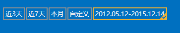
样式定义也很简单,右下角那个小勾勾用的是一个字体图标,可以根据需要调整大小。
<Style x:Key="BoxRadioButton" TargetType="{x:Type RadioButton}"> <Setter Property="Background" Value="Transparent"></Setter> <Setter Property="Foreground" Value="{StaticResource TextForeground}"></Setter> <Setter Property="Padding" Value="3 2 3 2"></Setter> <Setter Property="FontSize" Value="{StaticResource FontSize}"></Setter> <Setter Property="BorderThickness" Value="2"></Setter> <Setter Property="Height" Value="auto"></Setter> <Setter Property="SnapsToDevicePixels" Value="true"></Setter> <Setter Property="BorderBrush" Value="{StaticResource ControlBorderBrush}" /> <Setter Property="Template"> <Setter.Value> <ControlTemplate TargetType="{x:Type RadioButton}"> <Grid x:Name="grid" VerticalAlignment="Center"> <Border BorderThickness="{TemplateBinding BorderThickness}" BorderBrush="{TemplateBinding BorderBrush}" Height="{TemplateBinding Height}" HorizontalAlignment="Center" Background="{TemplateBinding Background}" Width="{TemplateBinding Width}"> <ContentPresenter VerticalAlignment="Center" HorizontalAlignment="Center" Margin="{TemplateBinding Padding}" SnapsToDevicePixels="{TemplateBinding SnapsToDevicePixels}"/> </Border> <!--选中的状态标识--> <TextBlock Text="" x:Name="checkState" Style="{StaticResource FIcon}" VerticalAlignment="Bottom" Visibility="Collapsed" FontSize="14" Margin="1" HorizontalAlignment="Right" Foreground="{StaticResource CheckedForeground}"/> </Grid> <!--触发器:设置选中状态符号--> <ControlTemplate.Triggers> <Trigger Property="IsChecked" Value="true"> <Setter Property="Visibility" Value="Visible" TargetName="checkState" ></Setter> <Setter Property="BorderBrush" Value="{StaticResource CheckedForeground}"></Setter> </Trigger> <Trigger Property="IsMouseOver" Value="true"> <Setter Property="BorderBrush" Value="{StaticResource MouseOverForeground}"></Setter> </Trigger> <Trigger Property="IsEnabled" Value="False"> <Setter Property="Opacity" Value="{StaticResource DisableOpacity}" TargetName="grid" ></Setter> </Trigger> </ControlTemplate.Triggers> </ControlTemplate> </Setter.Value> </Setter> </Style> 示例代码:
<RadioButton Style="{StaticResource BoxRadioButton}" Margin="1">近3天</RadioButton> <RadioButton Style="{StaticResource BoxRadioButton}" Margin="1">近7天</RadioButton> <RadioButton Style="{StaticResource BoxRadioButton}" Margin="1">本月</RadioButton> <RadioButton Style="{StaticResource BoxRadioButton}" Margin="1">自定义</RadioButton> <RadioButton Style="{StaticResource BoxRadioButton}" Margin="1">2012.05.12-2015.12.14</RadioButton> 补充说明,上面样式中有用到附加属性,如
ControlAttachProperty.FIconMargin" Value ="1, 1, 3, 1":复选框或单选框字体图标的边距
ControlAttachProperty.FIconSize" Value ="25" :复选框或单选框字体图标的大小
关于附加属性可以参考上一篇(本文末尾链接),C#定义代码:
#region FIconProperty 字体图标 /// <summary> /// 字体图标 /// </summary> public static readonly DependencyProperty FIconProperty = DependencyProperty.RegisterAttached( "FIcon", typeof(string), typeof(ControlAttachProperty), new FrameworkPropertyMetadata("")); public static string GetFIcon(DependencyObject d) { return (string)d.GetValue(FIconProperty); } public static void SetFIcon(DependencyObject obj, string value) { obj.SetValue(FIconProperty, value); } #endregion #region FIconSizeProperty 字体图标大小 /// <summary> /// 字体图标 /// </summary> public static readonly DependencyProperty FIconSizeProperty = DependencyProperty.RegisterAttached( "FIconSize", typeof(double), typeof(ControlAttachProperty), new FrameworkPropertyMetadata(12D)); public static double GetFIconSize(DependencyObject d) { return (double)d.GetValue(FIconSizeProperty); } public static void SetFIconSize(DependencyObject obj, double value) { obj.SetValue(FIconSizeProperty, value); } #endregion #region FIconMarginProperty 字体图标边距 /// <summary> /// 字体图标 /// </summary> public static readonly DependencyProperty FIconMarginProperty = DependencyProperty.RegisterAttached( "FIconMargin", typeof(Thickness), typeof(ControlAttachProperty), new FrameworkPropertyMetadata(null)); public static Thickness GetFIconMargin(DependencyObject d) { return (Thickness)d.GetValue(FIconMarginProperty); } public static void SetFIconMargin(DependencyObject obj, Thickness value) { obj.SetValue(FIconMarginProperty, value); } #endregion 附录:参考引用
WPF自定义控件与样式(1)-矢量字体图标(iconfont)
WPF 自定义控件与样式 (2)- 自定义按钮 FButton
WPF自定义控件与样式(3)-TextBox & RichTextBox & PasswordBox样式、水印、Label标签、功能扩展
版权所有,文章来源: http://www.cnblogs.com/anding
个人能力有限,本文内容仅供学习、探讨,欢迎指正、交流。
正文到此结束
热门推荐


相关文章


Loading...
![[HBLOG]公众号](http://www.liuhaihua.cn/img/qrcode_gzh.jpg)

