WPF自定义控件与样式(9)-树控件TreeView与菜单Menu-ContextMenu
一.前言
申明 :WPF自定义控件与样式是一个系列文章,前后是有些关联的,但大多是按照由简到繁的顺序逐步发布的等,若有不明白的地方可以参考本系列前面的文章,文末附有部分文章链接。
本文主要内容:
- 菜单Menu的自定义样式;
- 右键菜单ContextMenu的自定义样式;
- 树控件TreeView的自定义样式,及右键菜单实现。
二.菜单Menu的自定义样式
自定义菜单样式的效果图:

Menu和ContextMenu样式本身很简单,他们最主要的部分就是MenuItem,MenuItem中包含的内容比较多,如图标、选中状态、二级菜单、二级菜单的指针、快捷键等。 使用了字体图标定义菜单项MenuItem样式代码:
<!--菜单项MenuItem样式FIconMenuItem--> <Style x:Key="FIconMenuItem" TargetType="{x:Type MenuItem}"> <Setter Property="BorderBrush" Value="{StaticResource MenuBorderBrush}"/> <Setter Property="BorderThickness" Value="1"/> <Setter Property="Background" Value="{StaticResource MenuBackground}"/> <Setter Property="Foreground" Value="{StaticResource MenuForeground}"/> <Setter Property="FontSize" Value="{StaticResource FontSize}"/> <Setter Property="Height" Value="28"/> <Setter Property="Width" Value="Auto"/> <Setter Property="Margin" Value="1"/> <Setter Property="local:ControlAttachProperty.FIconSize" Value="22"/> <Setter Property="Template"> <Setter.Value> <ControlTemplate TargetType="{x:Type MenuItem}"> <!--Item--> <Border x:Name="border" Background="Transparent" Height="{TemplateBinding Height}" Opacity="1"> <Grid VerticalAlignment="Center" Margin="{TemplateBinding Margin}"> <Grid.ColumnDefinitions> <ColumnDefinition x:Name="icon_col" MaxWidth="35" SharedSizeGroup="MenuItemIconColumnGroup"/> <ColumnDefinition Width="Auto" SharedSizeGroup="MenuTextColumnGroup"/> <ColumnDefinition Width="Auto" SharedSizeGroup="MenuItemIGTColumnGroup"/> <ColumnDefinition Width="16" x:Name="arrow_col" SharedSizeGroup="MenumItemArrow"/> </Grid.ColumnDefinitions> <!--icon--> <TextBlock x:Name="PART_Icon" Text="{TemplateBinding Icon}" Foreground="{TemplateBinding Foreground}" Margin="5,1,1,1" FontSize="{TemplateBinding local:ControlAttachProperty.FIconSize}" Style="{StaticResource FIcon}"/> <!--Header--> <ContentPresenter Grid.Column="1" x:Name="txtHeader" Margin="3,1,5,1" MinWidth="90" RecognizesAccessKey="True" VerticalAlignment="Center" ContentSource="Header"/> <!--快捷键 InputGestureText 暂不支持你了 --> <TextBlock Grid.Column="2" Margin="3,1,3,1" x:Name="IGTHost" Text="{TemplateBinding InputGestureText}" FontSize="{TemplateBinding FontSize}" VerticalAlignment="Center" Visibility="Visible" Foreground="{TemplateBinding Foreground}" /> <!--右指针--> <TextBlock x:Name="PART_Arrow" Grid.Column="3" Text="" Foreground="{TemplateBinding Foreground}" FontSize="14" Style="{StaticResource FIcon}"/> <!--淡出子集菜单容器--> <Popup x:Name="SubMenuPopup" AllowsTransparency="true" IsOpen="{Binding IsSubmenuOpen, RelativeSource={RelativeSource TemplatedParent}}" Placement="Bottom" Focusable="false" VerticalOffset="0" PopupAnimation="{DynamicResource {x:Static SystemParameters.MenuPopupAnimationKey}}"> <Border Background="{TemplateBinding Background}" CornerRadius="0" Margin="5" Effect="{StaticResource DefaultDropShadow}" BorderBrush="{TemplateBinding BorderBrush}" BorderThickness="{TemplateBinding BorderThickness}"> <Grid x:Name="SubMenu" Grid.IsSharedSizeScope="True"> <StackPanel Margin="0" IsItemsHost="True" KeyboardNavigation.DirectionalNavigation="Cycle"/> </Grid> </Border> </Popup> </Grid> </Border> <!--触发器--> <ControlTemplate.Triggers> <!--TopLevelHeader:第一级菜单(有子菜单)--> <Trigger Property="Role" Value="TopLevelHeader"> <Setter Property="Visibility" Value="Collapsed" TargetName="PART_Arrow"/> <Setter Property="Visibility" Value="Collapsed" TargetName="IGTHost"/> <Setter Property="Margin" Value="5,1,1,1" TargetName="PART_Icon"/> <Setter Property="Margin" Value="1,1,6,1" TargetName="txtHeader"/> <Setter Property="MinWidth" Value="10" TargetName="txtHeader"/> <Setter Property="Width" Value="0" TargetName="arrow_col"/> </Trigger> <!--TopLevelItem 第一级菜单(无子级)--> <Trigger Property="Role" Value="TopLevelItem"> <Setter Property="Visibility" Value="Collapsed" TargetName="PART_Arrow"/> <Setter Property="Visibility" Value="Collapsed" TargetName="IGTHost"/> <Setter Property="Margin" Value="5,1,1,1" TargetName="PART_Icon"/> <Setter Property="Margin" Value="1,1,6,1" TargetName="txtHeader"/> <Setter Property="MinWidth" Value="10" TargetName="txtHeader"/> <Setter Property="Width" Value="0" TargetName="arrow_col"/> </Trigger> <!--SubmenuHeader:子菜单,有子菜单--> <Trigger Property="Role" Value="SubmenuHeader"> <Setter Property="Visibility" Value="Visible" TargetName="PART_Arrow"/> <Setter Property="Placement" Value="Right" TargetName="SubMenuPopup"/> </Trigger> <!--SubMenuItem:子菜单,无子级--> <Trigger Property="Role" Value="SubMenuItem"> <Setter Property="Visibility" Value="Collapsed" TargetName="PART_Arrow"/> </Trigger> <!--选中状态,优先级将高于Icon--> <Trigger Property="IsChecked" Value="True"> <Setter TargetName="PART_Icon" Value="" Property="Text"></Setter> <Setter TargetName="PART_Icon" Value="18" Property="FontSize"></Setter> <Setter TargetName="PART_Icon" Value="{StaticResource CheckedForeground}" Property="Foreground"></Setter> </Trigger> <Trigger Property="IsEnabled" Value="False"> <Setter TargetName="border" Value="{StaticResource DisableOpacity}" Property="Opacity"></Setter> </Trigger> <!--高亮状态--> <Trigger Property="IsHighlighted" Value="true"> <Setter Property="Background" TargetName="border" Value="{StaticResource MenuMouseOverBackground}"></Setter> <Setter Property="Foreground" Value="{StaticResource MenuMouseOverForeground}"></Setter> </Trigger> <Trigger Property="IsPressed" Value="true"> <Setter Property="Background" TargetName="border" Value="{StaticResource MenuPressedBackground}"></Setter> <Setter Property="Foreground" Value="{StaticResource MenuPressedForeground}"></Setter> </Trigger> <!--子菜单打开状态--> <Trigger Property="IsSubmenuOpen" Value="true" > <Setter TargetName="PART_Arrow" Value="{StaticResource CheckedForeground}" Property="Foreground"></Setter> </Trigger> </ControlTemplate.Triggers> </ControlTemplate> </Setter.Value> </Setter> </Style> <!--基于FIconMenuItem的默认样式,提供Header模板--> <Style x:Key="DefaultMenuItem" TargetType="{x:Type MenuItem}" BasedOn="{StaticResource FIconMenuItem}"> <Setter Property="HeaderTemplate"> <Setter.Value> <DataTemplate> <TextBlock x:Name="txtHeader" FontSize="{Binding FontSize,RelativeSource={RelativeSource AncestorType={x:Type MenuItem},Mode=FindAncestor}}" HorizontalAlignment="Stretch" Margin="3,1,5,1" Text="{Binding Header,RelativeSource={RelativeSource AncestorType={x:Type MenuItem},Mode=FindAncestor}}" VerticalAlignment="Center" Foreground="{Binding Foreground,RelativeSource={RelativeSource AncestorType={x:Type MenuItem},Mode=FindAncestor}}"/> </DataTemplate> </Setter.Value> </Setter> </Style> View Code Menu样式:
<!--默认Menu样式--> <Style x:Key="DefaultMenu" TargetType="{x:Type Menu}"> <Setter Property="SnapsToDevicePixels" Value="True" /> <Setter Property="RenderOptions.ClearTypeHint" Value="Enabled" /> <Setter Property="TextOptions.TextFormattingMode" Value="Ideal" /> <Setter Property="Background" Value="Transparent" /> <Setter Property="ItemContainerStyle" Value="{StaticResource DefaultMenuItem}"/> <Setter Property="Template"> <Setter.Value> <ControlTemplate TargetType="{x:Type Menu}"> <Border BorderBrush="{TemplateBinding BorderBrush}" BorderThickness="{TemplateBinding BorderThickness}" Background="{TemplateBinding Background}" Padding="{TemplateBinding Padding}" SnapsToDevicePixels="{TemplateBinding SnapsToDevicePixels}"> <ItemsPresenter Margin="0" SnapsToDevicePixels="{TemplateBinding SnapsToDevicePixels}" /> </Border> </ControlTemplate> </Setter.Value> </Setter> </Style> 示例代码:
<MenuItem Header="帮助(H)" InputGestureText="Ctrl+H" Icon="" > <MenuItem Header="设置" Icon=""/> <MenuItem Icon="" Header="插件管理" /> <MenuItem Icon="" Header="用户管理" /> <MenuItem Icon="" Header="修改密码" /> <MenuItem Icon="" Header="在线更新" /> <Separator Style="{StaticResource HorizontalSeparatorStyle}"/> <MenuItem Icon="" Header="问题反馈" /> <MenuItem Icon="" Header="技术支持" /> <MenuItem Icon="" Header="帮助" /> <MenuItem Icon="" Header="关于" /> </MenuItem> 三.右键菜单ContextMenu的自定义样式
有了第二节的MenuItem样式,ContextMenu的样式很简单:
<!--默认右键菜单ContextMenu样式--> <Style x:Key="DefaultContextMenu" TargetType="{x:Type ContextMenu}"> <Setter Property="SnapsToDevicePixels" Value="True" /> <Setter Property="RenderOptions.ClearTypeHint" Value="Enabled" /> <Setter Property="TextOptions.TextFormattingMode" Value="Ideal" /> <Setter Property="BorderBrush" Value="{StaticResource MenuBorderBrush}"/> <Setter Property="Background" Value="{StaticResource MenuBackground}"/> <Setter Property="BorderThickness" Value="1" /> <Setter Property="Foreground" Value="{StaticResource MenuForeground}"/> <Setter Property="OverridesDefaultStyle" Value="True" /> <Setter Property="Grid.IsSharedSizeScope" Value="True" /> <Setter Property="HasDropShadow" Value="True" /> <Setter Property="ItemContainerStyle" Value="{StaticResource DefaultMenuItem}"/> <Setter Property="Template"> <Setter.Value> <ControlTemplate TargetType="{x:Type ContextMenu}"> <Grid> <Border x:Name="Border" BorderBrush="{TemplateBinding BorderBrush}" Margin="5" BorderThickness="{TemplateBinding BorderThickness}" Background="{TemplateBinding Background}" Padding="{TemplateBinding Padding}" SnapsToDevicePixels="{TemplateBinding SnapsToDevicePixels}"> <ItemsPresenter x:Name="ItemsPresenter" KeyboardNavigation.DirectionalNavigation="Cycle" Grid.IsSharedSizeScope="True" Margin="0" SnapsToDevicePixels="{TemplateBinding SnapsToDevicePixels}" KeyboardNavigation.TabNavigation="Cycle" /> </Border> </Grid> <ControlTemplate.Triggers> <Trigger Property="HasDropShadow" Value="True"> <Setter TargetName="Border" Property="Effect" Value="{StaticResource DefaultDropShadow}"> </Setter> </Trigger> </ControlTemplate.Triggers> </ControlTemplate> </Setter.Value> </Setter> </Style> 实现一个文本操作(剪切、复制、粘贴)的样式:
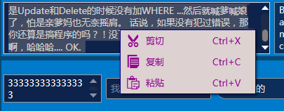
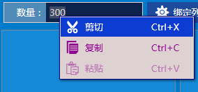
<!--文本操作右键菜单--> <ContextMenu x:Key="TextBoxContextMenu" Style="{StaticResource DefaultContextMenu}"> <MenuItem Command="ApplicationCommands.Cut" Icon="" Style="{DynamicResource DefaultMenuItem}" /> <MenuItem Command="ApplicationCommands.Copy" Icon="" Style="{DynamicResource DefaultMenuItem}" /> <MenuItem Command="ApplicationCommands.Paste" Icon="" Style="{DynamicResource DefaultMenuItem}" /> </ContextMenu> 效果图:
四.树控件TreeView的自定义样式
4.1TreeView基本样式
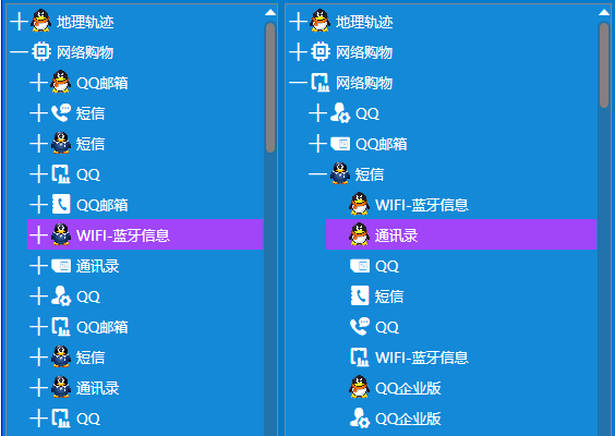
TreeView的样式比较简单,相比ListBox,主要多了层级关系,节点的展开、收缩。效果图:
样式定义中默认是开启虚拟化,以支持大数据,数据不多时最好关闭。样式代码:
<!--TreeViewItem默认样式--> <Style x:Key="DefaultTreeViewItem" TargetType="{x:Type TreeViewItem}"> <Setter Property="MinHeight" Value="25" /> <Setter Property="Foreground" Value="{StaticResource TextForeground}" /> <Setter Property="Background" Value="Transparent" /> <Setter Property="SnapsToDevicePixels" Value="True" /> <Setter Property="Margin" Value="0" /> <Setter Property="local:ControlAttachProperty.FIconSize" Value="19"/> <Setter Property="Template"> <Setter.Value> <ControlTemplate TargetType="{x:Type TreeViewItem}"> <StackPanel> <Border x:Name="Bd" Background="{TemplateBinding Background}" BorderBrush="{TemplateBinding BorderBrush}" BorderThickness="{TemplateBinding BorderThickness}" Padding="{TemplateBinding Padding}" MinHeight="{TemplateBinding MinHeight}" UseLayoutRounding="True" SnapsToDevicePixels="{TemplateBinding SnapsToDevicePixels}"> <!--多层级间隔,暂缓--> <!--<Grid Margin="{Binding Converter={StaticResource LengthConverter}, RelativeSource={x:Static RelativeSource.TemplatedParent}}"--> <Grid Margin="{TemplateBinding Margin}" VerticalAlignment="Stretch"> <Grid.ColumnDefinitions> <ColumnDefinition MinWidth="18" Width="Auto" /> <ColumnDefinition Width="*" /> </Grid.ColumnDefinitions> <!--展开收缩按钮--> <ToggleButton x:Name="ExpanderBtn" IsChecked="{Binding Path=IsExpanded, RelativeSource={x:Static RelativeSource.TemplatedParent}, Mode=TwoWay}" ClickMode="Press" > <ToggleButton.Template> <ControlTemplate TargetType="ToggleButton"> <Border> <ContentPresenter VerticalAlignment="Center" HorizontalAlignment="Center" SnapsToDevicePixels="{TemplateBinding SnapsToDevicePixels}" /> </Border> </ControlTemplate> </ToggleButton.Template> <ToggleButton.Content> <TextBlock x:Name="ExpanderIcon" Foreground="{TemplateBinding Foreground}" Text="" Style="{StaticResource FIcon}" FontSize="{TemplateBinding local:ControlAttachProperty.FIconSize}" /> </ToggleButton.Content> </ToggleButton> <!--内容--> <ContentPresenter x:Name="PART_Header" Grid.Column="1" ContentSource="Header" SnapsToDevicePixels="{TemplateBinding SnapsToDevicePixels}" HorizontalAlignment="{TemplateBinding HorizontalContentAlignment}" VerticalAlignment="{TemplateBinding VerticalContentAlignment}" /> </Grid> </Border> <ItemsPresenter Margin="18,0,0,0" x:Name="ItemsHost" SnapsToDevicePixels="{TemplateBinding SnapsToDevicePixels}" /> </StackPanel> <ControlTemplate.Triggers> <Trigger Property="IsExpanded" Value="False"> <Setter TargetName="ItemsHost" Property="Visibility" Value="Collapsed" /> </Trigger> <Trigger Property="IsExpanded" Value="True"> <Setter TargetName="ExpanderIcon" Property="Text" Value="" /> </Trigger> <Trigger Property="HasItems" Value="False"> <Setter TargetName="ExpanderIcon" Property="Visibility" Value="Hidden" /> </Trigger> <Trigger Property="IsMouseOver" Value="True"> <Setter Property="Background" Value="{StaticResource ItemMouseOverBackground}" /> <Setter Property="Foreground" Value="{StaticResource ItemMouseOverForeground}" /> </Trigger> <Trigger Property="IsSelected" Value="True"> <Setter Property="Background" Value="{StaticResource ItemSelectedBackground}" /> <Setter Property="Foreground" Value="{StaticResource ItemSelectedForeground}" /> </Trigger> <MultiTrigger> <MultiTrigger.Conditions> <Condition Property="IsSelected" Value="True" /> <Condition Property="Selector.IsSelectionActive" Value="True" /> </MultiTrigger.Conditions> <Setter Property="Background" Value="{StaticResource ItemSelectedBackground}" /> <Setter Property="Foreground" Value="{StaticResource ItemSelectedForeground}" /> </MultiTrigger> </ControlTemplate.Triggers> </ControlTemplate> </Setter.Value> </Setter> </Style> <!--TreeView样式--> <Style x:Key="DefaultTreeView" TargetType="{x:Type TreeView}"> <Setter Property="ScrollViewer.CanContentScroll" Value="True" /> <Setter Property="VirtualizingStackPanel.IsVirtualizing" Value="True"></Setter> <Setter Property="VirtualizingStackPanel.VirtualizationMode" Value="Recycling" /> <Setter Property="ScrollViewer.IsDeferredScrollingEnabled" Value="False" /> <Setter Property="Background" Value="{StaticResource ItemsContentBackground}"/> <Setter Property="ItemContainerStyle" Value="{StaticResource DefaultTreeViewItem}"></Setter> <Setter Property="ItemsPanel"> <Setter.Value> <ItemsPanelTemplate> <VirtualizingStackPanel IsItemsHost="True" IsVirtualizing="True" VirtualizationMode="Recycling" Margin="0"/> </ItemsPanelTemplate> </Setter.Value> </Setter> </Style> View Code 4.2 TreeView的右键菜单实现
TreeView支持右键操作应该是比较常见的需求,实现很简单,效果演示:

示例代码:
<HierarchicalDataTemplate x:Key="ItemNode" DataType="{x:Type local:NodeX}" ItemsSource="{Binding Nodes}"> <StackPanel Orientation="Horizontal" Height="28"> <core:FImage Source="{Binding Icon}" Width="22" Height="22"></core:FImage> <TextBlock Text="{Binding Name}" FontSize="13" VerticalAlignment="Center" Margin="3,0,0,0"></TextBlock> </StackPanel> </HierarchicalDataTemplate> <TreeView Width="250" Margin="3" x:Name="tree1" ItemTemplate="{StaticResource ItemNode}"> <TreeView.ItemContainerStyle> <Style BasedOn="{StaticResource DefaultTreeViewItem}" TargetType="{x:Type TreeViewItem}"> <EventSetter Event="TreeViewItem.PreviewMouseRightButtonDown" Handler="TreeViewItem_PreviewMouseRightButtonDown"/> </Style> </TreeView.ItemContainerStyle> <TreeView.ContextMenu> <ContextMenu> <MenuItem Icon="" Header="展开" Click="MenuItem_OnClick" Style="{DynamicResource DefaultMenuItem}" /> <MenuItem Icon="" Header="剪切" Style="{DynamicResource DefaultMenuItem}" /> <MenuItem Icon="" Header="赋值" Style="{DynamicResource DefaultMenuItem}" /> </ContextMenu> </TreeView.ContextMenu> </TreeView> 后台C#代码:
private void TreeViewItem_PreviewMouseRightButtonDown(object sender, MouseButtonEventArgs e) { var treeViewItem = VisualUpwardSearch<TreeViewItem>(e.OriginalSource as DependencyObject) as TreeViewItem; if (treeViewItem != null) { treeViewItem.Focus(); e.Handled = true; } } static DependencyObject VisualUpwardSearch<T>(DependencyObject source) { while (source != null && source.GetType() != typeof(T)) source = VisualTreeHelper.GetParent(source); return source; } private void MenuItem_OnClick(object sender, RoutedEventArgs e) { var item = this.tree1.SelectedItem as NodeX; if (item != null) { MessageBoxX.Info(item.Name.ToString()); } } 附录:参考引用
WPF自定义控件与样式(1)-矢量字体图标(iconfont)
WPF自定义控件与样式(2)-自定义按钮FButton
WPF自定义控件与样式(3)-TextBox & RichTextBox & PasswordBox样式、水印、Label标签、功能扩展
WPF自定义控件与样式(4)-CheckBox/RadioButton自定义样式
WPF自定义控件与样式(5)-Calendar/DatePicker日期控件自定义样式及扩展
WPF自定义控件与样式(6)-ScrollViewer与ListBox自定义样式
WPF自定义控件与样式(7)-列表控件DataGrid与ListView自定义样式
WPF自定义控件与样式(8)-ComboBox与自定义多选控件MultComboBox
版权所有,文章来源: http://www.cnblogs.com/anding
个人能力有限,本文内容仅供学习、探讨,欢迎指正、交流。
正文到此结束
热门推荐


相关文章

近期评论
-
你这基本没有更新呀,最近文章显示还是2019年的文章。不符合要求哈
-
关键词:慕云博客 链接:https://www.lilun.me 描述:分享原创文字的个人博客
-
-
-
可以提供一下源码吗
-
不是商业站,鸡娃学习笔记
-
-
-
-
听他们说很厉害的样子
Loading...
![[HBLOG]公众号](http://www.liuhaihua.cn/img/qrcode_gzh.jpg)

