【R】异常值检测
引言
受Netfix 帖子 的启发,我决定写一篇如何利用R语言实现该异常值检验的博文。
有好几个非常棒的软件包可以实现这个功能,本文所采用的是 AnomalyDetection包 。
你可以从 这里 下载完整的R语言代码。
正常值 vs.异常值
异常值的定义是:和大多数样本表现不一致的个体。
数据噪声:就好比当你收听一个信号不好的无线广播时,你会听到许多背景噪声。

图中橙色区域的数据围绕某个值上下波动并且没有表现出确定的趋势,我们称之为白噪声数据。
图中红圈中的数据是噪声数据吗?抑或是某种未发现趋势的峰值呢?
一个好的算法可以检测出异常值并将其剔除掉,AnomalyDetection包种的AnomalyDetectionTs函数可以很好地实现这个功能。
异常值检测实例
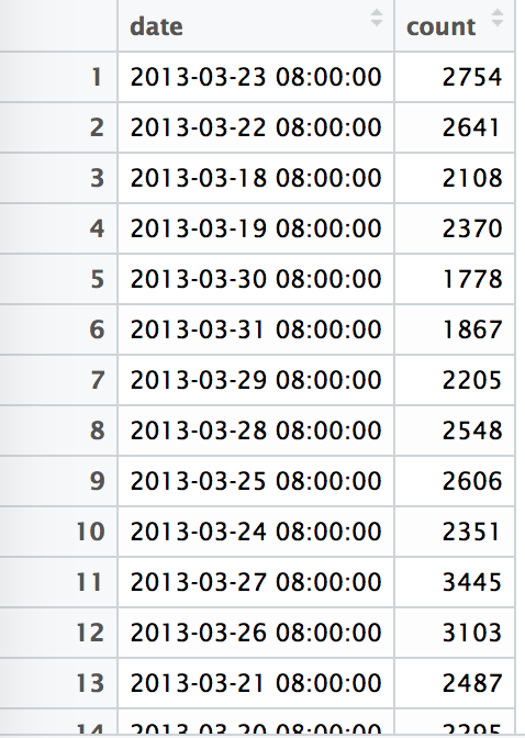
本文案例采用的是维基百科的数据,我们可以利用R通过API接口下载某个特定词项每日浏览量的数据。
本文的研究数据是:英文词语fifa从2013-02-22至今每日浏览量的数据。
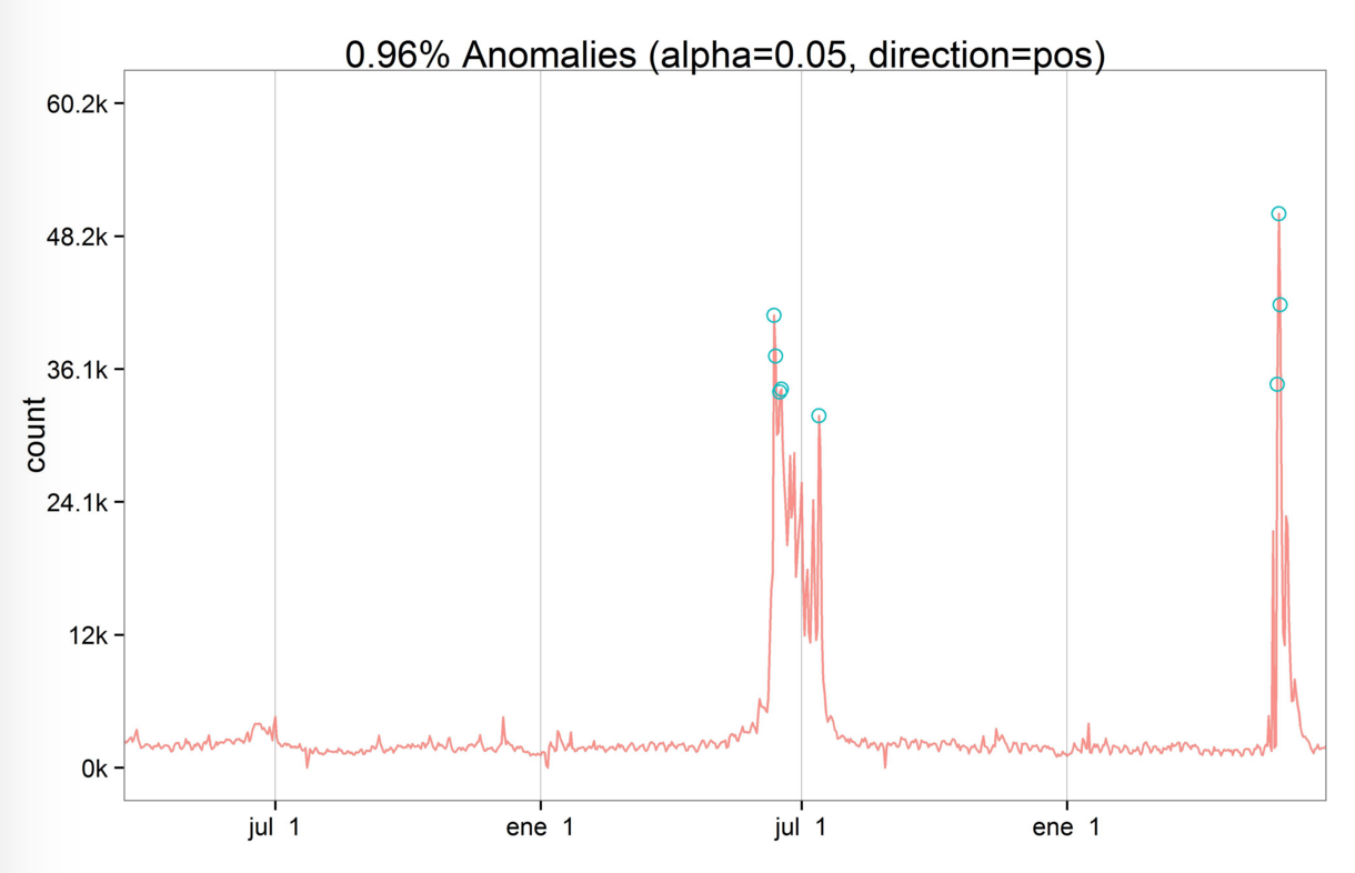
应用上文提到的算法,我们可以绘制出原始的时间序列图并标注出异常值的位置。
算法解析
算法中的参数max_anoms=0.01表示在最终结果中标注出0.01%的异常值;而参数direction=”pos”则表示检测高于平均水平的异常值。
如下表所示,该算法不仅可以检测出异常值,还会返回对应的平均水平值。

如果你想了解更多的关于该算法的数学原理,你可以搜索Generalized ESD和时间序列分解。
发现异常情况
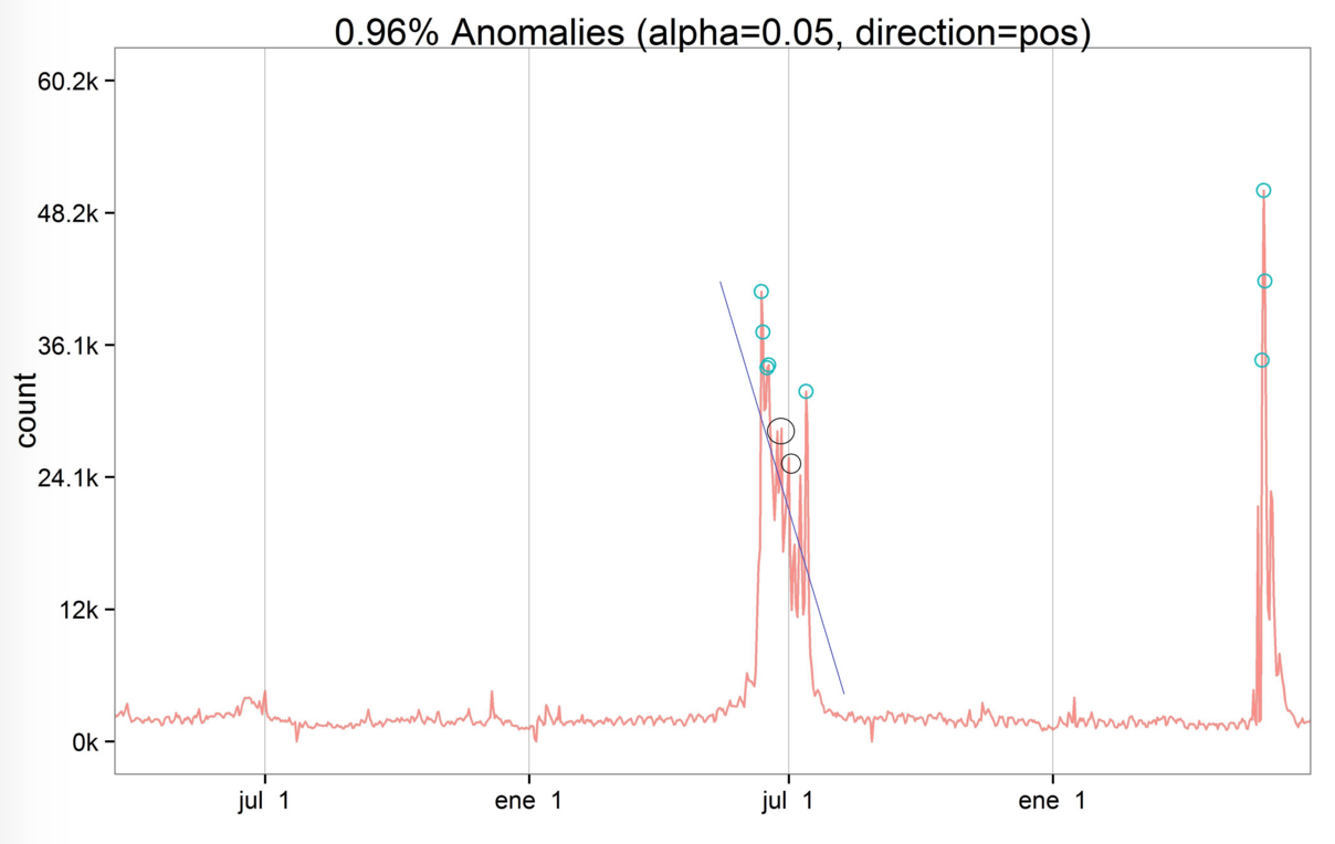 上图中黑色直线表示该时期内的浏览量呈递减趋势。有趣的是,位于直线上方用黑圈标注出来的两个点并没有被判定为异常值,这是因为该异常值检测算法主要关注的是趋势变化时的情况。黑圈中的点还是处于下降趋势中,所以没有被判定为异常值。相反地,2014-07-12的浏览量突然上升,突破前期的下降趋势,因此该点被判定为异常值。
新闻核实
词语fifa浏览量的异常值与国际足联的新闻消息息息相关,第一组异常值出现在2014年世界杯期间(2014年6 - 7月),而第二组异常值出现在国际足联丑闻事件期间(2015年5月)。
洛杉矶时报 中展示了国际足联丑闻事件进展的时间表,正如我们算法所检测出的异常值,该丑闻事件有两个重要的时间点:5月27日和28日。
附录(R Code)
install.packages(“devtools”) devtools::install_github(“petermeissner/wikipediatrend”) devtools::install_github(“twitter/AnomalyDetection”) install.packages(“Rcpp”) library(wikipediatrend) ## Library containing API wikipedia access library(AnomalyDetection) library(ggplot2) Download wiki webpage “fifa” fifa_data = wp_trend(“fifa”, from=”2013-03-18”, lang = “en”) Plotting data ggplot(fifa_data, aes(x=date, y=count, color=count)) + geom_line() Convert date variable fifa_data<img alt="date = as.POSIXct(fifa_data" data-cke-saved-src="https://chart.googleapis.com/chart?cht=tx&chl=date%20%3D%20as.POSIXct(fifa_data" src="https://chart.googleapis.com/chart?cht=tx&chl=date%20%3D%20as.POSIXct(fifa_data">date) Keep only desiered variables (date & page views) fifa_data=fifa_data[,c(1,2)] Apply anomaly detection data_anomaly = AnomalyDetectionTs(fifa_data, max_anoms=0.01, direction=”pos”, plot=TRUE, e_value = T) jpeg(“03_fifa_wikipedia_term_page_views_anomaly_detection.jpg”, width= 8.25, height= 5.25, units=”in”, res=500, pointsize = 4) Plot original data + anomalies points data_anomaly$plot dev.off() Calculate deviation percentage from the expected value data_anomaly<img alt="anoms" data-cke-saved-src="https://chart.googleapis.com/chart?cht=tx&chl=anoms" src="https://chart.googleapis.com/chart?cht=tx&chl=anoms">perc_diff=round(100*(data_anomaly<img alt="anoms" data-cke-saved-src="https://chart.googleapis.com/chart?cht=tx&chl=anoms" src="https://chart.googleapis.com/chart?cht=tx&chl=anoms">expected_value-data_anomaly<img alt="anoms" data-cke-saved-src="https://chart.googleapis.com/chart?cht=tx&chl=anoms" src="https://chart.googleapis.com/chart?cht=tx&chl=anoms">anoms)/data_anomaly<img alt="anoms" data-cke-saved-src="https://chart.googleapis.com/chart?cht=tx&chl=anoms" src="https://chart.googleapis.com/chart?cht=tx&chl=anoms">expected_value) Plot anomalies table anomaly_table=data_anomaly$anoms 原文作者:Pablo C.
原文链接:http://blog.datascienceheroes.com/anomaly-detection-in-r/
译者:Fibears
正文到此结束
热门推荐


相关文章

近期评论
-
你这基本没有更新呀,最近文章显示还是2019年的文章。不符合要求哈
-
关键词:慕云博客 链接:https://www.lilun.me 描述:分享原创文字的个人博客
-
-
-
可以提供一下源码吗
-
不是商业站,鸡娃学习笔记
-
-
-
-
听他们说很厉害的样子
Loading...
![[HBLOG]公众号](http://www.liuhaihua.cn/img/qrcode_gzh.jpg)