matlab 画图(五): 垂直柱状图

% Create data for childhood disease cases
measles = [38556 24472 14556 18060 19549 8122 28541 7880 3283 4135 7953 1884]';%列向量
mumps = [20178 23536 34561 37395 36072 32237 18597 9408 6005 6268 8963 13882]';
chickenPox = [37140 32169 37533 39103 33244 23269 16737 5411 3435 6052 12825 23332]';
% Create a vertical bar chart using the bar function
figure
bar(1:12, [measles mumps chickenPox], 1);

% Set the axis limits
axis([0 13 0 40000])
set(gca, 'XTick', 1:12)

% Add title and axis labels
title('Childhood diseases by month')
xlabel('Month')
ylabel('Cases (in thousands)')

% Add a legend
legend('Measles', 'Mumps', 'Chicken pox')
bar 这个函数的调用形式有很多种: bar(Y) , bar(x, Y) , bar(_,width) , bar(_,style) , bar(_,bar_color) , bar(_,name,value) , bar(axes_handle,_) , h=bar(_)
1. bar(Y)
向量 Y 中的数据依次对应一个柱形,每个柱子所在的位置从1依次递增(也就是横坐标依次递增)
2. bar(x,Y)
向量 Y 中的数据依次对应一个柱形,每个柱子在横轴上的位置保存在 x 向量中。
3. bar(_,width)
width 表示的是每个柱子的宽度。
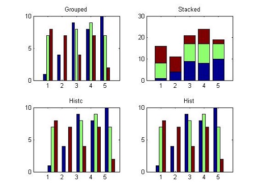
4. bar(_,style)
style 可以设置每个bar的形式。
style 的取值可以为:grouped,stacked,histc,hist 这四种。
Y = round(rand(5,3)*10);
figure;
subplot(2,2,1)
bar(Y,'grouped');
title('Grouped')

subplot(2,2,2)
bar(Y,'stacked');
title('Stacked');

subplot(2,2,3)
bar(Y,'histc');
title('Histc');

subplot(2,2,4)
bar(Y,'hist');
title('Hist');
5. bar(_,bar_color)
设置柱子的颜色。
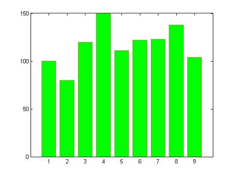
6. bar(_,name,value)
name-value 的取值可以有:
BarLayout: grouped,stacked,histc,hist
BaseValue: base line location
LineStyle: line style of bar edges
LineWidth: width of bar edges
BarWidth
FaceColor
EdgeColor
例如:
y = [100,80,120,150,111,122,123,138,104]

figure;
bar(y,'g','EdgeColor',[1 0.5 0.5])
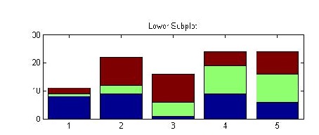
7. bar(axex_handle,_)
rng(0,'twister') %initialize random
Y = round(rand(5,3)*10)
figure;
ax = subplot(2,1,2);
bar(ax,Y,'stacked')
title('Lower Subplot')
8. overlay line
days = 0:5:35;
conc = [515,420,370,250,135,120,60,20]
temp = [29,23,27,25,20,23,23,27]
figure;
[hAxes,hBar,hLine] = plotyy(days,temp,days,conc,'bar','plot')

% 修改属性
set(hLine,'LineWidth',2,'Color',[0,0.7,0.7],'Marker','o')

title('Trend Chart for Concentration')
xlabel('Day')
ylabel(hAxes(1),'Temperature (^{o}C)')
ylabel(hAxes(2),'Concentration')

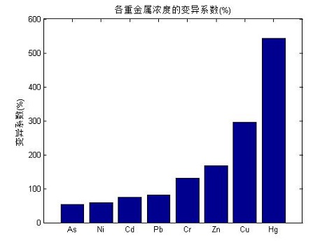
9. 自定义横坐标
clc,clear
x = [53;74;131;296;543;58;81;168];
%    As Cd  Cr  Cu  Hg Ni Pb  Zn
y = sort(x);
bar(y);
title('各重金属浓度的变异系数(%)');
%xlabel('x轴');
ylabel('变异系数(%)');
set(gca,'xticklabel',{'As','Ni','Cd','Pb','Cr','Zn','Cu','Hg'});
正文到此结束
热门推荐


相关文章


Loading...
![[HBLOG]公众号](http://www.liuhaihua.cn/img/qrcode_gzh.jpg)