11款好看的 Checkbox 切换开关样式 – Switcher styles collection
发表于:HTML & CSS . 评论
赞助商链接 
把一个选项属性(Checkbox)设计成切换形关的样式,确实是一个很有创意的想法,视觉体验方面也大大提升。
随着是CSS3 的出现,实现这些切换样式并不困难,今天我们分享来自 Imagine Alex 编写的「Switcher styles collection」,里面有11款目前流行的切换开头样式,并且包住源码,设计师们可以参考或学习这些技术。
作品名称:Switcher styles collection
演示地址: http://codepen.io/ImagineAlex/pen/GZaavy
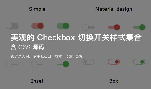
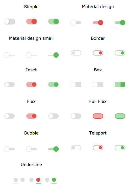
样式截图:
使用教程
演示中,一共有11款开关样式,而且用法相当简单
Step 1: HTML 代码每个开头使用二行代码完成,非常简洁。
<input type="checkbox" id="simple-1"> <label for="simple-1"></label>
Step 2: CSS3样式
input[type="checkbox"]{ display: none; &+label{ display: inline-block; width: 40px; height: 20px; position: relative; transition: 0.3s; margin: 0px 20px; box-sizing: border-box; &:after,&:before{ content: ''; display: block; position: absolute; left: 0px; top: 0px; width: 20px; height: 20px; transition: 0.3s; cursor: pointer; } } } #simple-1,#simple-2,#simple-3{ &:checked+label{ &.red{background: #ECA9A7;&:after{background: #D9534F;}} &.green{background: #AEDCAE;&:after{background: #5CB85C;}} &:after{ left: calc(~'100% - 20px'); } } &+label{ background: #ddd; border-radius: 20px; box-shadow: 1px 1px 3px #aaa; &:after{ background: #fff; border-radius: 50%; box-shadow: 1px 1px 3px #aaa; } } } 建议大家直接看演示链接的效果,里面也有源代码查看和编辑。
交流:想结交更多有才华的设计师?请到(UI设计QQ群)列表,与50000名设计师交流设计。
设计导航:小盆友和大神都值得拥有的设计师网址导航: http://hao.shejidaren.com
正文到此结束
热门推荐


相关文章


Loading...
![[HBLOG]公众号](http://www.liuhaihua.cn/img/qrcode_gzh.jpg)

