【译】22个必备的CSS小技巧
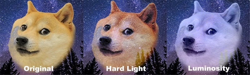 不久之前Firefox和Safari浏览器已经开始支持类似Photoshop的混合模式,但是在Chrome和Opera浏览器中需要添加前缀。举个栗子:
// 你也可以尝试不同的样式

.blend {
    background: #fff;
}
.blend img {
    mix-blend-mode: darken;
}
在线体验地址
渐变边框
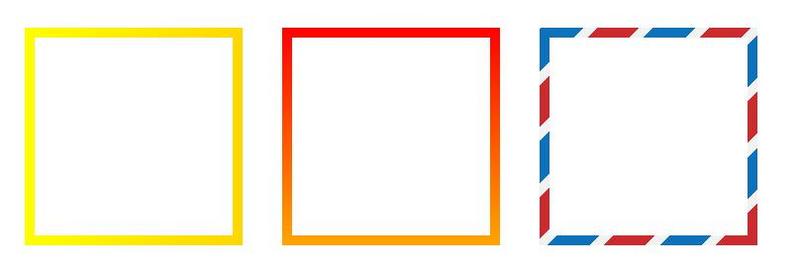
现在,你甚至可以在边框中使用渐变。
要使用渐变边框非常简单,只需要设置一个更低 z-index 的伪元素即可:
.box {
  margin: 80px 30px;
  width: 200px;
  height: 200px;
  position: relative;
  background: #fff;
  float: left;
}
.box:before {
      content: '';
      z-index: -1;
      position: absolute;
      width: 220px;
      height: 220px;
      top: -10px;
      left: -10px;
      background-image: linear-gradient(90deg, yellow, gold);
}
具体的例子可以看 这里 ,或者看 这里 使用的是 background-clip 和 background-origin 属性。在不久的将来,也许所有浏览器都将支持 border-image 属性,最终的代码会和下面一样:
.box {
    border-image: linear-gradient(to bottom, #000000 0%, #FFFFFF 100%);
    border-image-slice: 1; /* set internal offset */
}
z-index的过渡

也许你不知道 z-index 同样支持过渡!在过渡的每一步中,它的值都不发生改变,所以你以为它不支持过渡——但其实它支持。
currentColor
我们可以使用这个方法来侦测当前的颜色,以避免经常地重复定义它。
这个方法在使用SVG图标的时候非常有用,因为它们的颜色由其父元素决定。通常我们是这么做的:
.button {
  color: black;
}
.button:hover {
  color: red;
}
.button:active {
  color: green;
}

.button svg {
  fill: black;
}
.button:hover svg {
  fill: red;
}
.button:active svg {
  fill: green;
}
但我们可以使用 currentColor 这么做:
svg {
  fill: currentColor;
}

.button {
  color: black;
  border: 1px solid currentColor;
}
.button:hover {
  color: red;
}
.button:active {
  color: green;
}
附上其它带有伪元素的例子:
a {
  color: #000;
}
a:hover {
  color: #333;
}
a:active {
  color: #666;
}

a:after,
a:hover:after,
a:active:after {
  background: currentColor;
  ...
}
Object Fit
你是否还记得为了解决一些问题而给一幅背景图设置 background-size 属性的时刻呢?现在你可以使用 object-fit 属性啦,webkit浏览器都支持它,Firefox也将在近期予以支持。
.image__contain {
  object-fit: contain;
}
.image__fill {
  object-fit: fill;
}
.image__cover {
  object-fit: cover;
}
.image__scale-down {
  object-fit: scale-down;
}
 举个栗子
举个栗子
单选框和复选框的样式
让我们一起不使用图片来设置复选框的样式:
<!-- html -->
<input type="checkbox" id="check" name="check" />
<label for="check">Checkbox</label>
<!-- css -->
input[type=checkbox] {display: none;}

input[type=checkbox] + label:before {
    content: "";
    border: 1px solid #000;
    font-size: 11px;
    line-height: 10px;
    margin: 0 5px 0 0;
    height: 10px;
    width: 10px;
    text-align: center;
    vertical-align: middle;
}

input[type=checkbox]:checked + label:before {
    content: "/2713";
}
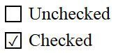 正如你所看见的,我们隐藏了原有的复选框,改为使用伪元素和伪类
 :checked (IE9+)来表现它。当它被选中时,一个设置在 content 里的Unicode编码的字符将会显示出来。
值得注意的是,Unicode编码在CSS和HTML中的写法是不一样的。在CSS中它是一个以反斜杠为开始的十六进制数,而在HTML中它是十进制的,比如 ✓ 。
接着为我们的复选框添加一些动画效果:
<!-- checkbox -->
input[type=checkbox] + label:before {
    content: "/2713";
    color: transparent;
    transition: color ease .3s;
}
input[type=checkbox]:checked + label:before {
    color: #000;
}

<!-- radio -->
input[type=radio] + label:before {
    content: "/26AB";
    border: 1px solid #000;
    border-radius: 50%;
    font-size: 0;
    transition: font-size ease .3s;
}
input[type=radio]:checked + label:before {
    font-size: 10px;
}
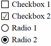 这里 是所有的Unicode编码,以及可以在 这里 进行体验。
CSS中的计数器
总所周知CSS中是可以使用计数器的:
<!-- html -->
<ol class="list">
    <li>a</li>
    <li>b</li>
    <li>c</li>
</ol>
<!-- css -->
.list {
    counter-reset: i; //reset conunter
}
.list > li {
    counter-increment: i; //counter ID
}
.list li:after {
    content: "[" counter(i) "]"; //print the result
}
我们定义了一个ID在 counter-reset 属性中作为初始值(默认为0)。你可以设置另一个值在 counter-increment 属性中作为每一步的递增值。
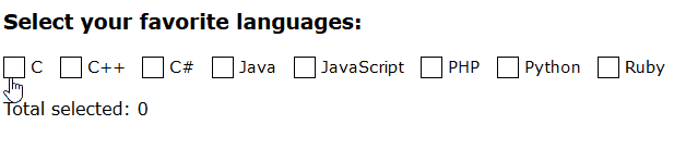
高级CSS计数器
你可以计算出有多少个复选框被用户勾选了:
<!-- html -->
<div class="languages">
  <input id="c" type="checkbox"><label for="c">C</label>
  <input id="C++" type="checkbox"><label for="C++">C++</label>
  <input id="C#" type="checkbox"><label for="C#">C#</label>
  <input id="Java" type="checkbox"><label for="Java">Java</label>
  <input id="JavaScript" type="checkbox"><label for="JavaScript">JavaScript</label>
  <input id="PHP" type="checkbox"><label for="PHP">PHP</label>
  <input id="Python" type="checkbox"><label for="Python">Python</label>
  <input id="Ruby" type="checkbox"><label for="Ruby">Ruby</label>
</div>
<p class="total">
  Total selected:
</p>
<!-- css -->
.languages {
  counter-reset: characters;
}
input:checked {
  counter-increment: characters;
}
.total:after {
  content: counter(characters);
}
你也可以制作一个简单的计算器:
<!-- html -->
<div class="numbers">
  <input id="one" type="checkbox"><label for="one">1</label>
  <input id="two" type="checkbox"><label for="two">2</label>
  <input id="three" type="checkbox"><label for="three">3</label>
  <input id="four" type="checkbox"><label for="four">4</label>
  <input id="five" type="checkbox"><label for="five">5</label>
  <input id="one-hundred" type="checkbox"><label for="one-hundred">100</label>
</div>
<p class="sum">
  Sum
</p>
<!-- css -->
.numbers {
  counter-reset: sum;
}

#one:checked { counter-increment: sum 1; }
#two:checked { counter-increment: sum 2; }
#three:checked { counter-increment: sum 3; }
#four:checked { counter-increment: sum 4; }
#five:checked { counter-increment: sum 5; }
#one-hundred:checked { counter-increment: sum 100; }

.sum::after {
  content: '= ' counter(sum);
}
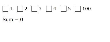 它同样得以运行,请看具体的 DEMO 和 文章 。
不使用图片的菜单图标
你记得你有多么经常被迫需要一个“汉堡”图标吗?
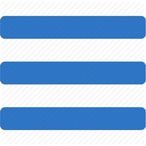
这里有至少3个方式去实现它:
1、 Shadows
.shadow-icon {
  position: relative;
}
.shadow-icon:after {
  content: "";
  position: absolute;
  left: 0;
  top: -50px;
  height: 100%;
  width: 100%;
  box-shadow: 0 5px 0 #000, 0 15px 0 #fff, 0 25px 0 #000, 0 35px 0 #fff, 0 45px 0 #000;
}
2、 Gradient
.gradient-icon {
    background: linear-gradient(to bottom, #000 0%, #000 20%, transparent 20%, transparent 40%, #000 40%, #000 60%, transparent 60%, transparent 80%, #000 80%, #000 100%);
}
3、 UTF-8
你可以直接使用标准符号:☰ (Unicode: U+2630, HTML: ☰)。你也可以像其他元素那样灵活设置它的颜色或大小。看 例子 。
你也可以使用SVG,字体图标,或者通过伪元素设置的 border 边框。
@Supports
这是一个新的叫做 supports 的CSS表达式。顾名思义,它可以检测某些设定是否被浏览器所支持,并非所有的浏览器都支持它,但是你仍然可以使用它作为基本的检测手段:
@supports (display: flex) {
    div { display: flex; }
}

/*You can check prefixes*/
@supports (display: -webkit-flex) or (display: -moz-flex) or (display: flex) {
    section {
        display: -webkit-flex;
        display: -moz-flex;
        display: flex;
        float: none;
    }
}
visibility: visible
依你估计,把一个设置为 visibility: visible 的元素放在一个设置为 visibility: hidden 的元素里面,会发生什么?
.hidden {
  visibility: hidden;
}
.hidden .visible {
  visibility: visible;
}
你可能会认为两个元素都不显示——然而事实上整个父元素都被隐藏了,而子元素不会。请看 DEMO 。
position: sticky
我们发现了一个新的特性,你可以新建一个 sticky 属性的元素。它的运行效果和 fixed 相同,但不会挡住任何元素。你最好看看 例子
只有Mozilla和Safari浏览器支持这一属性,但你也可以像下面那样使用它:
.sticky {
  position: static;
  position: sticky;
  top: 0px;
}
我们将会在支持的浏览器中得到一个 sticky 属性的元素,而在不支持的浏览器中它将会是一个普通的元素。这在你需要建立一个不可替代的,可以移动的元素的移动端页面的时候非常实用。
新的尺寸单位
不久之前,一些新的用以描述不同元素大小的尺寸单位问世了,它们是:
- vw (viewport width) - 浏览器窗口宽度的1%。
- vh (viewport height) - 同上,只不过用来描述高度。
- vmin and vmax 设置介于vh和vw之间的最大最小值。
有趣的是,几乎所有的现代浏览器都能很好地支持它们,所以你可以放心地使用。
为什么我们需要这些新的单位?因为它们可以让不同的尺寸更容易被定义,你不要为父元素指定任何的百分比或者别的什么,请看例子:
.some-text {
    font-size: 100vh;
    line-height: 100vh;
}

或者你可以设置一个漂亮的弹出框在屏幕中间:
.blackSquare {
    background: black;
    position: fixed;
    height: 50vh;
    width: 50vw;
    left: 25vw;
    top: 25vh;
}
这看起来酷毙了,看看在codepen的 例子 吧~
但是目前仍然有一些关于这些新单位的不足之处:
- IE9应该用vm而不是vmin。
- iOS7在使用vh的时候可能会有bug。
- vmax至今并未得到全面的支持。
文字修饰
我们可以通过几行代码修改文字被选中时的效果:
*::selection {
    color: #fff;
    background: #000;
}
*::-moz-selection {
    /*Only Firefox still needs a prefix*/
    color: #fff;
    background: #000;
}
你不仅可以定义文字被选中时的颜色,还能定义阴影或者背景颜色。
触摸屏当中的元素滚动
如果你需要在触摸屏当中为一些元素设置内滚动,那么你不仅需要 overflow: scroll / auto ,还需要 -webkit-overflow-scrolling: touch;
实际上,移动端浏览器在某些时候并不能正确执行 overflow: scroll / auto ,它可能会滚动整个页面而不是你想要的那部分。 -webkit-overflow-scrolling 解决了这个问题,你可以在你的实际项目中体验一下。
使用硬件加速
有时候动画可能会导致用户的电脑卡顿,你可以在特定元素中使用硬件加速来避免这个问题:
.block {
    transform: translateZ(0);
}
你并不会察觉有什么不同,但浏览器会为这个元素进行3D硬件加速,在 will-change 这个特殊属性未被全面支持之前,这个方法还是很有用的。
Unicode Classes
你可以用Unicode符号明名class:
.❤ {
    ...
}
.☢ {
    ...
}
.☭ {
    ...
}
.★ {
    ...
}
.☯ {
    ...
}
但这其实是用来搞笑的,千万不要在大型项目中使用,因为不是所有的电脑都支持Unicode符号。
垂直方向的百分比边距
实际上垂直方向的排列计算是基于父元素的宽度而不是高度。定义两个元素:
<!-- html -->

<div class="parent">
    <div class="child"></div>
</div>
<!-- css -->

.parent {
    height: 400px;
    width: 200px;
}
.child {
    height: 50%;
    padding-top: 25%;
    padding-bottom: 25%;
    width: 100%;
}
理论上,子元素的高会是父元素高的一半,但是看看我们实际得到的情况:
记住,子元素的百分比是相对于父元素的宽度。
火狐浏览器的按钮边距
Firefox用它自己的方式去计算按钮的边距。这听起来有点奇怪,但它会自动地添加一些边距进去:
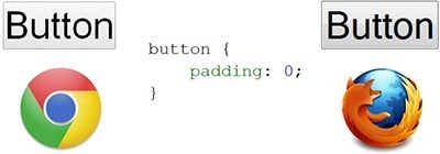
可以用以下方法来修复这个问题:
button::-moz-focus-inner,
input[type="reset"]::-moz-focus-inner,
input[type="button"]::-moz-focus-inner,
input[type="submit"]::-moz-focus-inner {
    border: none;
    padding:0;
}
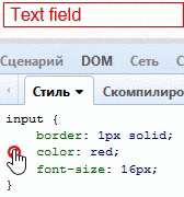
Color + Border = Border-Color
很少人知道,定义了一个元素的文字颜色,意味着这个元素的边框颜色也被定义了:
input[type="text"] {
    color: red;
    border: 1px solid;
}
古老浏览器的彩蛋
如果你仍需要适配IE7或者类似的古老浏览器,你可以在定义hack的时候使用笑脸符号,像这样:
body {
    :) background: pink;
}
是不是很有趣?
如果你觉得我翻译得不错,请点赞收藏并关注 我的专栏 ,我会陆续推出更多精彩的内容。如发现任何的错漏欢迎指正,我们下次见!
正文到此结束
热门推荐


相关文章


Loading...
![[HBLOG]公众号](http://www.liuhaihua.cn/img/qrcode_gzh.jpg)

