React Native 布局浅探
简述
在Web开发中,页面布局基于盒子模型,主要通过定位属性、浮动属性和显示属性实现。而React Native采用的是Flex布局,但也支持盒子模型的margin、padding以及定位属性进行布局。
通过一张图来大致了解flex的布局方式。
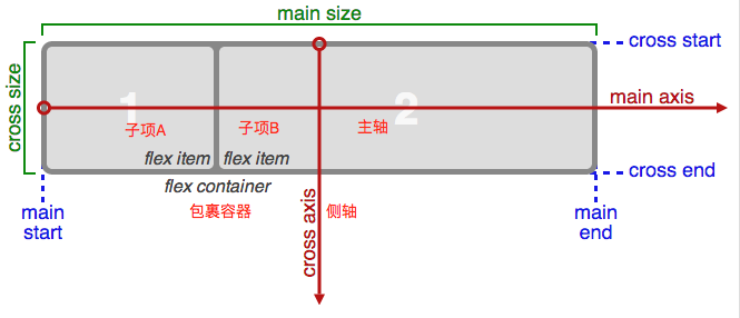
flex布局的基本思想是通过 flex容器 来伸缩控制子项目的宽度和高度。 子项目在主轴上依次排列,在侧轴上填满flex容器的可用空间。
再看看Web flex和RN flex几点区别:
1、因为RN里的所有组件都是以flex作为其显示属性,所以不需要再有 display:flex 的设定
2、主轴默认方向的区别
在Web Flex中,主轴默认方向是水平的,而在RN是垂直的。
3、支持的属性和属性写法的区别
React Native布局中的默认设定
了解RN的一些默认设定对于我们快速实现布局会有很大的帮助。
1、RN flex属性
1)用在flex容器上的属性
① 子项目的排列方向(也就提到很多次的定义主轴):flexDirection: column(default) | row ② 子项目的换行方式(就是超出flex容器跨度时换不换行=。=怎么换):
flexWrap: nowrap(default) | wrap ③ 子项目的对齐方式:
justifyContent: flex-start | flex-end | center | space-between | space-around (主轴)
alignItems: flex-start | flex-end | center | stretch(default) (侧轴)
上面属性的用法和效果都跟Web flex的基本一致,这里不再进行演示。
2)用在flex子项上的属性
单个子项在侧轴上的排列方式: alignItems: auto | flex-start | flex-end | center | stretch
2、RN中的长度单位
在RN中所有的尺寸属性都是不带单位的。官网给出的默认单位是dp。
我们通过 Dimensions 这个Api来获取iphone6模拟器下的设备宽高:
console.log('width:'+Dimensions.get('window').width+',height:'+Dimensions.get('window').height); 得到如下图结果

来看看不同iphone下的一些尺寸数值
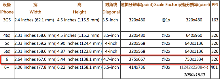
不难发现我们这里获得的宽高正与 逻辑分辨率pt 对应。所以,对于常规的设计图,pt和px的转换规律是 pt=dp=px/2 。
3、取得屏幕大小和设备像素比
1) 屏幕大小
const {devWidth,devHeight} = Dimensions.get('window'); 2) dpr
PixelRatio.get()
4、RN中组件的默认占位大小
在Web布局中,区块以div包裹,文本以span包裹。默认情况下div的宽度为100%屏幕宽度,高为0。span宽高均为0。那么RN中与其用途相似的View和Text组件默认宽高是怎么定义的呢?
做个实验:
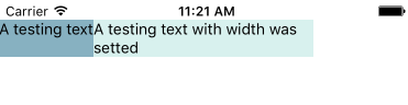
1)主轴方向垂直
① Text不作为包裹容器时
<View style={{paddingTop: 18,}}> <Text style={styles.bgcolor_1}>A testing text</Text> <Text style={[styles.bgcolor_2,{width: 200,}]}>A testing text with width was setted</Text> <View style={styles.bgcolor_3}></View> </View> 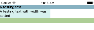
② Text作为包裹容器时
<View style={{paddingTop: 18,}}> <Text> <Text style={styles.bgcolor_1}>A testing text</Text> <Text style={[styles.bgcolor_2,{width: 200,}]}>A testing text with width was setted</Text> </Text> //...代码同上 </View> 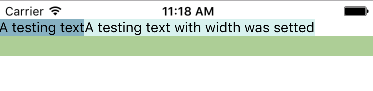
2)主轴方向水平
<View style={{paddingTop: 18,flexDirection: 'row'}}> //...代码同上 </View> ① Text不作为包裹容器时
② Text作为包裹容器时
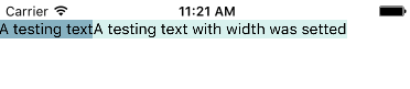
结论:由上实验可得,若Text无嵌套,它的显示方式同View类似。默认情况下,组件是宽度即为屏幕宽度,高度为自身高度(无内容填充则为0)。若Text中嵌套Text,那么子组件Text的显示方式如同Web中的span。
参考官方文档的定义
<Text>元素在布局上不同于其它组件:在Text内部的元素不再使用flexbox布局,而是采用文本布局。这意味着<Text>内部的元素不再是一个个矩形,而可能会在行末进行折叠。
5、其他注意点
1)文本必须写在Text中而非View2)View最好不要嵌套在Text中
React Native布局特殊情况
1、图片布局
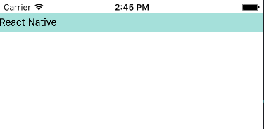
1) 默认尺寸
加载静态资源时,图片的尺寸可以加载时立即得到,并正确渲染到布局中。加载动态资源时,很多要在App中显示的图片并不能在编译的时候获得,这时的图片的默认尺寸为0*0
我们知道Flex布局中,子组件的宽高值受到父组件的约束。而由于在加载静态图时会立即将图片原尺寸赋予Image组件,因此即使不设定宽高,它也不受到父组件尺寸的约束。
<View style={{paddingTop: 18}}> <Text style={{paddingTop: 5,paddingBottom: 5,backgroundColor: '#a5e0da'}}>React Native</Text> <View style={{height: 200}}> <Image source={require('./image/react.png')} /> </View> </View> 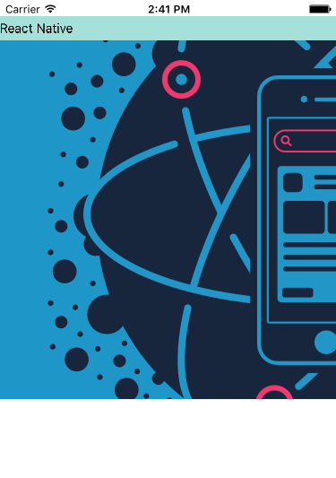
加载动态资源时
因此无论是静态还是动态图,最好都给它设定一个宽高值。对于动态图,若只设定其中一个值,还可以通过 resizeMode 来进行调整。
resizeMode 提供了三个值
看一段代码,分别修改Image的resizeMode属性
<View> <Image style={{height: 100}} resizeMode={'cover'} source={{uri:"http://static.open-open.com/lib/uploadImg/20160412/20160412193341_428.png"}} /> </View> cover: 在保持图片宽高比的前提下缩放图片,直到宽度和高度都大于等于容器视图的尺寸(如果容器有padding内衬的话,则相应减去)。译注:这样图片完全覆盖甚至超出容器,容器中不留任何空白。

contain: 在保持图片宽高比的前提下缩放图片,直到宽度和高度都小于等于容器视图的尺寸(如果容器有padding内衬的话,则相应减去)。译注:这样图片完全被包裹在容器中,容器中可能留有空白

stretch: 拉伸图片且不维持宽高比,直到宽高都刚好填满容器。

3、文本布局
1) numberOfLines占位问题一些博文上提到的就算设置了numberOfLines定义最多显示文本行数,隐藏的文本还是存在占位空间。目前这一问题已经修复,可以放心使用。
<Text numberOfLines={5} style={styles.textWrapper} > <Text style={{fontSize: 20}}>Title</Text>{'/n'} <Text>In this example, the nested title and body text will inherit the fontFamily from styles.baseText, but the title provides its own additional styles. The title and body will stack on top of each other on account of the literal newlines, numberOfLines is Used to truncate the text with an elipsis after computing the text layout, including line wrapping, such that the total number of lines does not exceed this number.</Text> </Text> 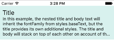
2) lineHeight的使用方式
在web中为实现文本垂直居中效果我们会设定与高度值同样的lineHeight。
但由于在Text嵌套时,Text组件的显示方式与span类似。即不支持宽高定义。并且即使设定了lineHeight也无法改变文本的垂直对齐方式。(verticalAlign)
<Text numberOfLines={5} style={styles.textWrapper} > <Text style={{fontSize: 20,lineHeight: 50,backgroundColor: 'aliceblue'}}>Title</Text>{'/n'} <Text>In this example, the nested title and body text will inherit the fontFamily from styles.baseText, but the title provides its own additional styles. The title and body will stack on top of each other on account of the literal newlines, numberOfLines is Used to truncate the text with an elipsis after computing the text layout, including line wrapping, such that the total number of lines does not exceed this number.</Text> </Text> 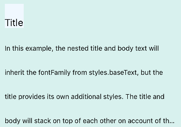
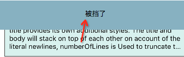
我们看到另一诡异的问题是它的兄弟Text也被设定了同样的lineHeight值。
所以,开发中为了实现这一效果,我们可用View将Text进行包裹,在View中设定其 justifyContent 属性(视实际情况定)
<View style={{height: 50,justifyContent: 'center',backgroundColor: 'aliceblue'}}> <Text style={{fontSize: 20}}>Title</Text> </View> 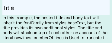
4、对于margin、padding的使用
同Web上的使用方式,但不存在margin塌陷的情况。嵌套的Text不能设置垂直方向上的margin。
5、绝对定位
RN中元素默认的定位方式是 relative ,并且只有「 relative 和 absolute 两种定位方式」。如果为组件加上 position:absolute ,它将会以inline的方式渲染在页面上。并且脱离正常文档流。也就是视觉上会被后面的组件覆盖,但不能通过zIndex方式调整。嵌套的Text不可用。
实例
对于flex各种布局方式的实现可以参见这篇文章 移动端全兼容的flexbox速成班 这是移动端web flex布局,可以套用思路,只需要将属性改成RN的形式就可以了。
终于写完了。。好累_(:з」∠)_
正文到此结束
热门推荐


相关文章

近期评论
-
你这基本没有更新呀,最近文章显示还是2019年的文章。不符合要求哈
-
关键词:慕云博客 链接:https://www.lilun.me 描述:分享原创文字的个人博客
-
-
-
可以提供一下源码吗
-
不是商业站,鸡娃学习笔记
-
-
-
-
听他们说很厉害的样子
Loading...
![[HBLOG]公众号](http://www.liuhaihua.cn/img/qrcode_gzh.jpg)

