species-in-pieces七巧板动画效果的实现
当我第一次看到 species-in-pieces 这个网站的时候,各种动物加特技,duang。很好奇他是怎么做出来的。
裁切和过渡
研究了下他的代码,主要是用clip-path来切割三角形,然后30个三角形拼接起来组成一个动物,代码如下,省略中间相似部分。
.shard-wrap:nth-child(1) .shard { -webkit-clip-path: polygon(11.1% 81.286%,13.9% 80.286%,13.9% 74.429%); background-color: #262327 } ... .shard-wrap:nth-child(30) .shard { -webkit-clip-path: polygon(88.8% 44.643%,87.6% 50.071%,92.7% 47.5%); background-color: #2F2F32 } 变换的时候改变坐标点和颜色, 省略中间代码。
body:hover .shard-wrap:nth-child(1) .shard { -webkit-clip-path: polygon(24.6% 27.143%,32.8% 33.1%,25.8% 38.4%); background-color: #f8f1e8 } ... body:hover .shard-wrap:nth-child(30) .shard { -webkit-clip-path: polygon(69.2% 15.429%,71% 12.714%,73.6% 14.571%); background-color: #d84d50 } 添加过渡效果和延迟
.shard-wrap .shard { position: absolute; width: 100%; height: 100%; transition:all 1s; } @for $i from 1 through 30{ .shard-wrap:nth-child(#{$i}) .shard{ transition-delay:0.02s * $i; } } 这样切换效果就实现了。
See the Pen Byvdqd by zhouwenbin ( @zhouwenbin ) on CodePen .
数据提取
上面的代码有大部分的相似处,只要把数据提取出来,一个循环就能搞定。
$coordinates1 : ( (11.1% 81.286%,13.9% 80.286%,13.9% 74.429%) (9.6% 71.3%,11.2% 81.2%,13.95% 74.571%) ..... (74.4% 57.714%,85.6% 77.857%,83.1% 57%) (64.9% 62.143%,89.3% 43.286%,86.2% 56.286%) (70.7% 60.4%,79.8% 77.8%,79.8% 57.8%) (76.1% 70.6%,73% 86.6%,79.88% 77.6%) (88.8% 44.643%,87.6% 50.071%,92.7% 47.5%) ); $color1 : ( (#262327) (#3C3642) ...... (#1B1B1E) (#29282C) (#19191B) (#2F2F32) );
详细的数据看 这里 ,这里用括号来嵌套,编译的时候不会出错。修改后的代码只剩20行,就实现了这么酷炫的效果。
See the Pen RNEJjj by zhouwenbin ( @zhouwenbin ) on CodePen .
获取坐标点和颜色
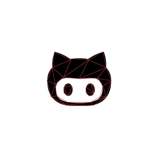
现在的问题就只剩数据了。坐标点如何获取?在网上找了一张github的位图,怎么看起来像头猪。

拖到ai里面,画布1000*1000,方便换算成百分比,然后用直线段工具把轮廓勾勒出来。
然后把导出的图像拖到markman里面,把坐标标注出来。
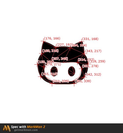
接着就是把坐标,三个一组,替换 之前的数据 为 这个 。验证下效果。
See the Pen RNEBZE by zhouwenbin ( @zhouwenbin ) on CodePen .
正文到此结束
热门推荐


相关文章

近期评论
-
你这基本没有更新呀,最近文章显示还是2019年的文章。不符合要求哈
-
关键词:慕云博客 链接:https://www.lilun.me 描述:分享原创文字的个人博客
-
-
-
可以提供一下源码吗
-
不是商业站,鸡娃学习笔记
-
-
-
-
听他们说很厉害的样子
Loading...
![[HBLOG]公众号](http://www.liuhaihua.cn/img/qrcode_gzh.jpg)

