「小程序JAVA实战」小程序的表单组件(25)
来说下 ,小程序的基础组件。源码:https://github.com/limingios/wxProgram.git 中的No.12
表单组件
- button
- checkbox/label
- form
- input
- picker
- picker-view
- radio
- slider
button的使用
-
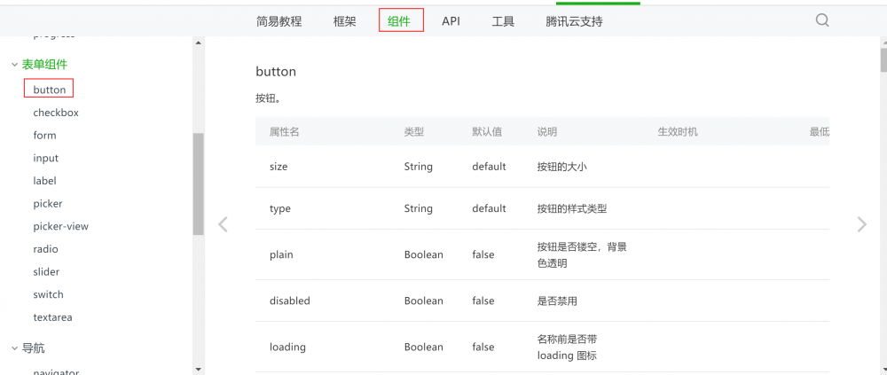
官方介绍
>https://developers.weixin.qq.com/miniprogram/dev/component/button.html
-
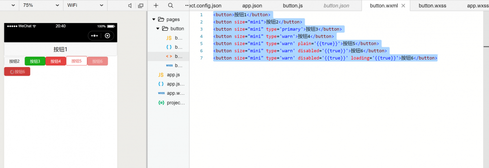
演示用例
>开发能力和api本次不在讲述,等后续跟其他组件结合讲解。
<button>按钮1</button>
<button size="mini">按钮2</button>
<button size="mini" type='primary'>按钮3</button>
<button size="mini" type='warn'>按钮4</button>
<button size="mini" type='warn' plain='{{true}}'>按钮5</button>
<button size="mini" type='warn' disabled='{{true}}'>按钮6</button>
<button size="mini" type='warn' disabled='{{true}}' loading='{{true}}'>按钮6</button>
checkbox/label的使用
-
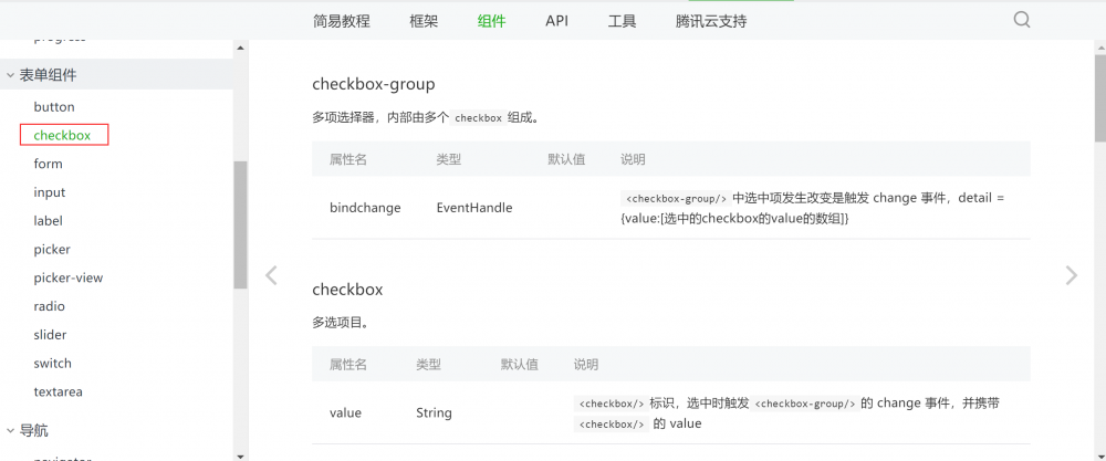
官方介绍
>https://developers.weixin.qq.com/miniprogram/dev/component/checkbox.html
-
演示用例
>开发能力和api本次不在讲述,等后续跟其他组件结合讲解。
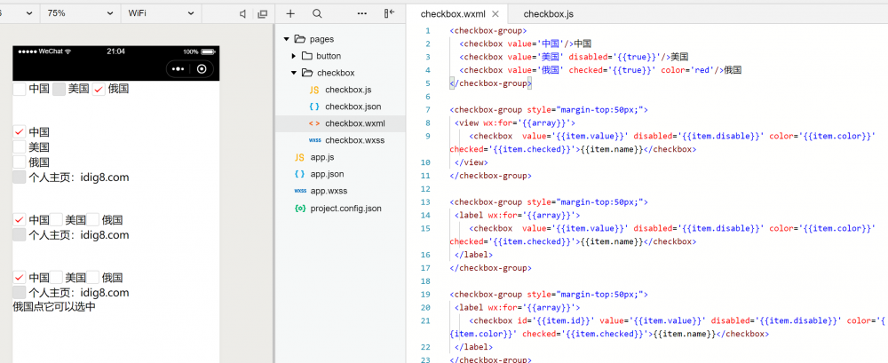
<checkbox-group>
  <checkbox value='中国'/>中国
  <checkbox value='美国' disabled='{{true}}'/>美国
  <checkbox value='俄国' checked='{{true}}' color='red'/>俄国
</checkbox-group>

<checkbox-group style="margin-top:50px;">
 <view wx:for='{{array}}'>
    <checkbox  value='{{item.value}}' disabled='{{item.disable}}' color='{{item.color}}' checked='{{item.checked}}'>{{item.name}}</checkbox>
 </view>
</checkbox-group>

<checkbox-group style="margin-top:50px;">
 <label wx:for='{{array}}'>
    <checkbox  value='{{item.value}}' disabled='{{item.disable}}' color='{{item.color}}' checked='{{item.checked}}'>{{item.name}}</checkbox>
 </label>
</checkbox-group>

<checkbox-group style="margin-top:50px;">
 <label wx:for='{{array}}'>
    <checkbox id='{{item.id}}' value='{{item.value}}' disabled='{{item.disable}}' color='{{item.color}}' checked='{{item.checked}}'>{{item.name}}</checkbox>
 </label>
</checkbox-group>

<label for='1003'>俄国点它可以选中</label>
//button.js

Page({
  data:{
    array:[
      { id: "1001",name: "中国", value: "中国",checked:true,color:'red',disable:false},
      { id: "1002",name: "美国", value: "美国", checked: false, color: 'black', disable: false },
      { id: "1003",name: "俄国", value: "俄国", checked: false, color: 'blue', disable: false },
      { id: "1004",name: "个人主页:idig8.com", value: "idig8.com", checked: false, color: 'yellow', disable: true },
    ]
  }
})
form的使用
-
官方介绍
>https://developers.weixin.qq.com/miniprogram/dev/component/form.html
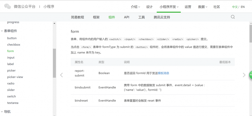
-
演示用例
>在web开发中,表单提交很重要,在小程序里面也有对应的表单提交。
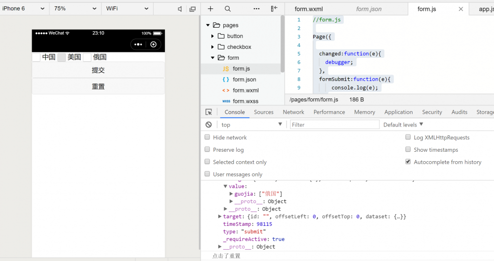
form.wxml
<form bindsubmit='formSubmit' bindreset='formReset'>
  <checkbox-group bindchange="changed" name="guojia">
    <checkbox value='中国'/>中国
    <checkbox value='美国' disabled='{{true}}'/>美国
    <checkbox value='俄国' checked='{{true}}' color='red'/>俄国
  </checkbox-group>
  <button form-type='submit'>提交</button>
  <button form-type='reset'>重置</button>
</form>
form.js
//form.js

Page({

  changed:function(e){
    debugger;
  },
  formSubmit:function(e){
      console.log(e);
  },
  formReset: function (e) {
      console.log("点击了重置")
  }
})
input的输入框
-
官方介绍
>https://developers.weixin.qq.com/miniprogram/dev/component/input.html
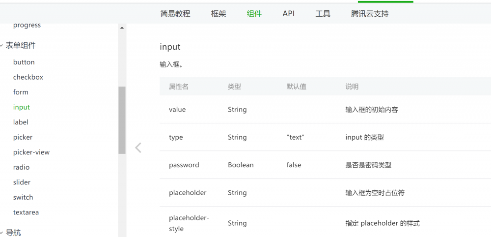
-
演示用例
>插件什么都考虑到了做的真不错。
<input value="个人网页:idig8.com"></input>
<input value="微信公众号:编程坑太多"></input>
<input value="1234567890" type='number'></input>
<input value="410202198511112018" type='idcard'></input>
<input value="5.36" type='digit'></input>
<input value="password" password='{{true}}'></input>
输入账号:<input placeholder='输入框为空时占位符' ></input>
输入账号:<input placeholder='输入框为空时占位符' placeholder-class='placeholderStyle'></input>
输入账号:<input placeholder='输入框为空时占位符' placeholder-style='color:yellow;'></input>
长度限制:<input placeholder='最多5位' maxlength='5'></input>
<!-- 手机端调试-进入获取焦点:<input placeholder='最多5位' focus='{{true}}' cursor='2'></input> -->
手机端调试-点击键盘右下角按钮时是否保持键盘不收起:<input placeholder='点击键盘右下角按钮时是否保持键盘不收起'  confirm-hold='{{true}}'></input>

手机端调试-右下角文字:<input  placeholder='键盘右下角按钮为发送' confirm-type='send'></input>

手机端调试-选中状态:<input  value='123456789' focus='{{true}}' selection-start='1' selection-end='3'></input>
手机端调试-键盘弹起时,是否自动上推页面:<input  placeholder='点击试试键盘弹不弹' adjust-position='{{false}}'></input>
input事件:<input bindinput='inputEvent' bindfocus='focusEvent' bindblur='blurEvent' bindconfirm='confirmEvent'></input>
//form.js

Page({
  inputEvent:function(){
    console.log("inputEvent");
    return "结果很意外吧这个被替换了"
  },
  focusEvent: function () {
    console.log("focusEvent");
  },
  blurEvent: function () {
    console.log("blurEvent");
  },
  confirmEvent: function () {
    console.log("confirmEvent");
  },
})
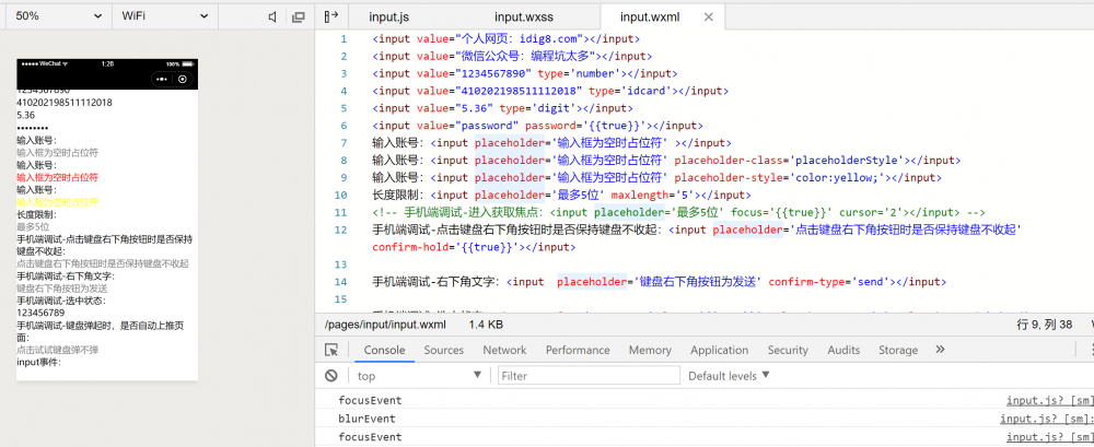
里面很多的效果需要通过在手机端看到,建议远程小程序看看效果很cool!
picker的使用
-
官方介绍
>https://developers.weixin.qq.com/miniprogram/dev/component/picker.html
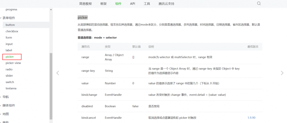
-
演示用例
>选择器——从底部弹起的滚动选择器,现支持五种选择器,通过mode来区分,分别是普通选择器,多列选择器,时间选择器,日期选择器,省市区选择器,默认是普通选择器。
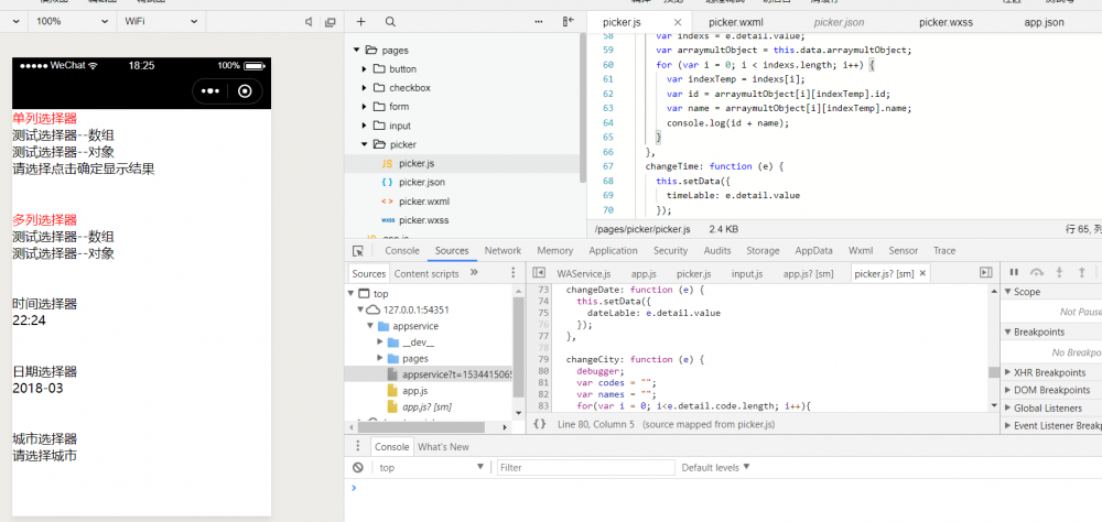
picker.wxml
<view style='color:red'>单列选择器</view>

<picker mode="selector" range="{{array}}">
测试选择器--数组
</picker>
<picker mode="selector" range="{{arrayObject}}" range-key='name' bindchange='mychange' bindcancel='mycancel'>
测试选择器--对象
</picker>


<picker mode="selector" range="{{arrayObject}}" range-key='name' bindchange='mychangeResult'>
{{myTitle}}
</picker>

<view style='color:red;margin-top:100rpx;'>多列选择器</view>

<picker mode="multiSelector" range="{{arraymult}}">
测试选择器--数组
</picker>
<picker mode="multiSelector" range="{{arraymultObject}}" range-key='name' bindcancel='mycancel' bindcolumnchange='mychangemulticolumn' bindchange='mychangemulti'>
测试选择器--对象
</picker>

<view style='margin-top:100rpx;'>时间选择器</view>
<picker mode="time" start="08:08" end="22:30" bindchange="changeTime">
    <view>{{timeLable}}</view>
</picker>

<view style='margin-top:100rpx;'>日期选择器</view>
<picker mode="date" start="2018-03-01" end="2018-06-25" bindchange="changeDate" fields="month">
    <view>{{dateLable}}</view>
</picker>

<view style='margin-top:100rpx;'>城市选择器</view>
<picker mode="region" bindchange="changeCity" custom-item="{{customItem}}" value="{{region}}">
    <view>{{cityLable}}</view>
    <!-- 当前选择:{{region[0]}},{{region[1]}},{{region[2]}} -->
</picker>
picker.js
//picker.js

Page({
 data:{
   array:['一','二','三','四','五','六','七'],
   arrayObject:[
     { id: 1001, name: '个人网址'},
     { id: 1002, name: 'idig8.com' },
     { id: 1003, name: '公众号' },
     { id: 1004, name: '编程坑太多' },
   ],
   myTitle:'请选择点击确定显示结果',
   arraymult:[
     ['一', '二', '三', '四', '五', '六', '七'],
     ['一', '二', '三', '四', '五', '六', '七']
   ],
   arraymultObject: [
     [
       { id: 1001, name: '个人网址' },
       { id: 1002, name: 'idig8.com' },
       { id: 1003, name: '公众号' },
       { id: 1004, name: '编程坑太多' },
     ],
     [
       { id: 1001, name: '个人网址' },
       { id: 1002, name: 'idig8.com' },
       { id: 1003, name: '公众号' },
       { id: 1004, name: '编程坑太多' },
     ]
   ],
   timeLable: "请选择时间",
   dateLable: "请选择日期",
   cityLable: "请选择城市",
   region: ['河南省', '郑州市', '中原区'],
   customItem: "显示全部"
 },
  mychange:function(){
    console.log(' mychange改变了');
  },
  mycancel:function(){
    console.log(' mycancel取消选择了');
  },
  mychangeResult:function(e){
    debugger
    console.log(' mychangeResult 点击确定');
    var index = e.detail.value;
    var id = this.data.arrayObject[index].id;
    var name = this.data.arrayObject[index].name;
    this.setData({
      myTitle:id+name
    })
  },
  mychangemulticolumn:function(e){
    console.log(e.detail);
  },
  mychangemulti: function (e) {

    var indexs = e.detail.value;
    var arraymultObject = this.data.arraymultObject;
    for (var i = 0; i < indexs.length; i++) {
      var indexTemp = indexs[i];
      var id = arraymultObject[i][indexTemp].id;
      var name = arraymultObject[i][indexTemp].name;
      console.log(id + name);
    }
  },
  changeTime: function (e) {
    this.setData({
      timeLable: e.detail.value
    });
  },

  changeDate: function (e) {
    this.setData({
      dateLable: e.detail.value
    });
  },

  changeCity: function (e) {
    debugger;
    var codes = "";
    var names = "";
    for(var i = 0; i<e.detail.code.length; i++){
        var code = e.detail.code[i];
        var name = e.detail.value[i];
        codes += code;
        names +=name;

    }
    this.setData({
      cityLable: codes+names
    });
  }
})
picker的使用
-
官方介绍
>https://developers.weixin.qq.com/miniprogram/dev/component/picker-view.html
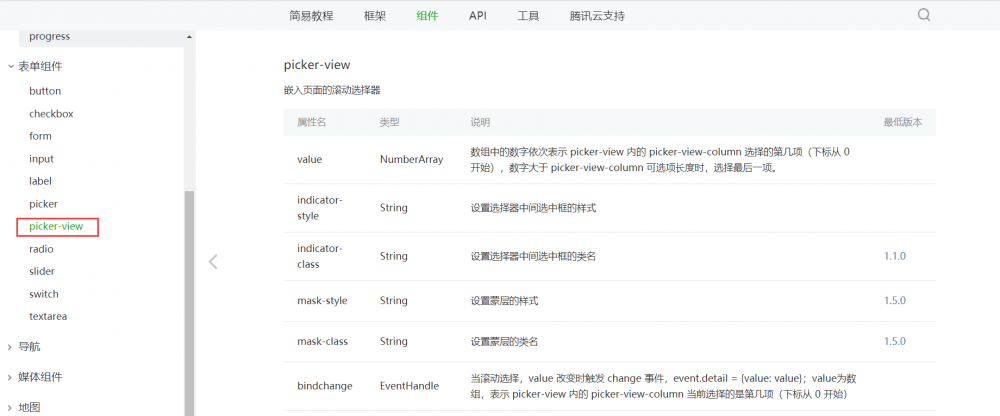
-
演示用例
>嵌入页面的滚动选择器。
picker-view.wxml
<view>
  <view>{{year}}年{{month}}月{{day}}日</view>
  <picker-view indicator-style="height: 50px;" style="width: 100%; height: 300px;" value="{{value}}" bindchange="bindChange">
    <picker-view-column>
      <view wx:for="{{years}}" style="line-height: 50px" wx:key="year">{{item}}年</view>
    </picker-view-column>
    <picker-view-column>
      <view wx:for="{{months}}" style="line-height: 50px"  wx:key="month">{{item}}月</view>
    </picker-view-column>
    <picker-view-column>
      <view wx:for="{{days}}" style="line-height: 50px"  wx:key="days">{{item}}日</view>
    </picker-view-column>
  </picker-view>
</view>
picker-view.js
const date = new Date()
const years = []
const months = []
const days = []

for (let i = 1990; i <= date.getFullYear(); i++) {
  years.push(i)
}

for (let i = 1; i <= 12; i++) {
  months.push(i)
}

for (let i = 1; i <= 31; i++) {
  days.push(i)
}

Page({
  data: {
    years: years,
    year: date.getFullYear(),
    months: months,
    month: 2,
    days: days,
    day: 2,
    value: [9999, 1, 1],
  },
  bindChange: function (e) {
    const val = e.detail.value
    this.setData({
      year: this.data.years[val[0]],
      month: this.data.months[val[1]],
      day: this.data.days[val[2]]
    })
  }
})
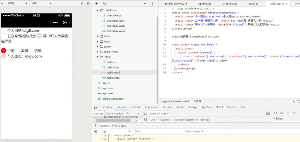
radio
-
官方介绍
>https://developers.weixin.qq.com/miniprogram/dev/component/radio.html
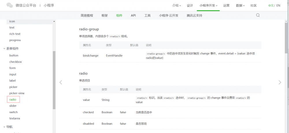
-
演示用例
>单项选择器,内部由多个
组成。其实跟checkbox很类似。
radio.wxml
<!--pages/radio/radio.wxml-->
<radio-group bindchange="bindbindChangeRadio">
  <radio value="个人网站:idig8.com">个人网站:idig8.com</radio>
  <radio value='公众号:编程坑太多' color='red'>公众号:编程坑太多</radio>
  <radio value='简书:IT人故事会' disabled='{{true}}'>简书:IT人故事会</radio>
</radio-group>

<view>选择是{{checkRadio}}</view>

<view style='margin-top:50rpx'>
  <radio-group>
    <block wx:for="{{array}}">
        <radio  value='{{item.value}}' disabled='{{item.disable}}' color='{{item.color}}' checked='{{item.checked}}'>{{item.name}}</radio>
    </block>
  </radio-group>
</view>
radio.js
// pages/radio/radio.js
Page({

  /**
   * 页面的初始数据
   */
  data: {
    array: [
      { id: "1001", name: "中国", value: "中国", checked: true, color: 'red', disable: false },
      { id: "1002", name: "美国", value: "美国", checked: false, color: 'black', disable: false },
      { id: "1003", name: "俄国", value: "俄国", checked: false, color: 'blue', disable: false },
      { id: "1004", name: "个人主页:idig8.com", value: "idig8.com", checked: false, color: 'yellow', disable: true }
    ],
    checkRadio:"",
  },
  bindbindChangeRadio:function(e){
      var value = e.detail.value;
      this.setData({
        checkRadio:value
      })

  },

  /**
   * 生命周期函数--监听页面加载
   */
  onLoad: function (options) {

  },

  /**
   * 生命周期函数--监听页面初次渲染完成
   */
  onReady: function () {

  },

  /**
   * 生命周期函数--监听页面显示
   */
  onShow: function () {

  },

  /**
   * 生命周期函数--监听页面隐藏
   */
  onHide: function () {

  },

  /**
   * 生命周期函数--监听页面卸载
   */
  onUnload: function () {

  },

  /**
   * 页面相关事件处理函数--监听用户下拉动作
   */
  onPullDownRefresh: function () {

  },

  /**
   * 页面上拉触底事件的处理函数
   */
  onReachBottom: function () {

  },

  /**
   * 用户点击右上角分享
   */
  onShareAppMessage: function () {

  }
})
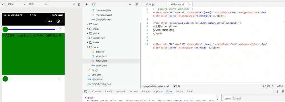
slider
-
官方介绍
>https://developers.weixin.qq.com/miniprogram/dev/component/slider.html
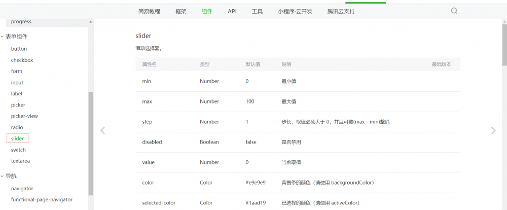
-
演示用例
>滑动选择器。
<!--pages/slider/slider.wxml-->
<slider min="10" max="90" show-value='{{true}}' activeColor='red' backgroundColor='blue' block-color='green' bindchanging='iamchanging'></slider>

<view style='background-color:green;width:100%;height:{{myheight}}'>
个人网站:idig8.com
公众号:编程坑太多
</view>


<slider min="10" max="90" show-value='{{true}}' activeColor='red' backgroundColor='blue' block-color='green' bindchange='iamchange'></slider>
// pages/slider/slider.js
Page({

  /**
   * 页面的初始数据
   */
  data: {
    myheight:"500rpx",
    staticHeight:500

  },

  iamchanging:function(e){
    var value = e.detail.value;
    var newHeight = this.data.staticHeight * (value/100);
    this.setData({
      myheight: newHeight+"rpx"
    })
  },
  iamchange:function(e){
    var value = e.detail.value;
    var newHeight = this.data.staticHeight * (value / 100);
    this.setData({
      myheight: newHeight + "rpx"
    })
  },


  /**
   * 生命周期函数--监听页面加载
   */
  onLoad: function (options) {

  },

  /**
   * 生命周期函数--监听页面初次渲染完成
   */
  onReady: function () {

  },

  /**
   * 生命周期函数--监听页面显示
   */
  onShow: function () {

  },

  /**
   * 生命周期函数--监听页面隐藏
   */
  onHide: function () {

  },

  /**
   * 生命周期函数--监听页面卸载
   */
  onUnload: function () {

  },

  /**
   * 页面相关事件处理函数--监听用户下拉动作
   */
  onPullDownRefresh: function () {

  },

  /**
   * 页面上拉触底事件的处理函数
   */
  onReachBottom: function () {

  },

  /**
   * 用户点击右上角分享
   */
  onShareAppMessage: function () {

  }
})
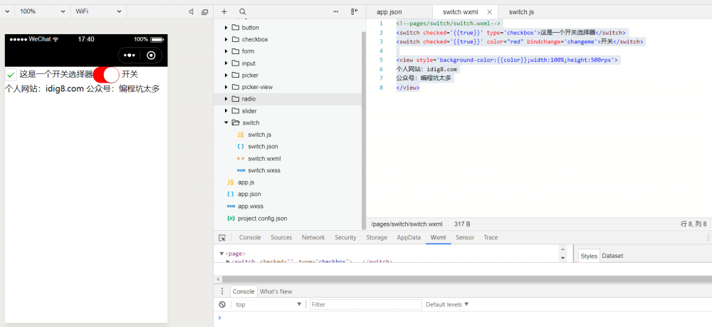
switch
-
官方介绍
>https://developers.weixin.qq.com/miniprogram/dev/component/switch.html
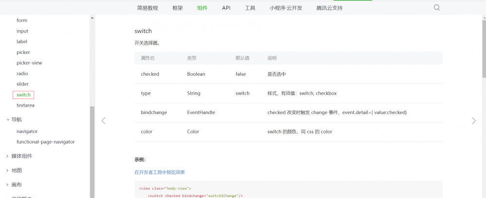
-
演示用例
>开关选择器。
<!--pages/switch/switch.wxml-->
<switch checked='{{true}}' type='checkbox'>这是一个开关选择器</switch>
<switch checked='{{true}}' color="red" bindchange='changeme'>开关</switch>

<view style='background-color:{{color}};width:100%;height:500rpx'>
个人网站:idig8.com
公众号:编程坑太多
</view>
// pages/switch/switch.js
Page({

  /**
   * 页面的初始数据
   */
  data: {
    color:"white"
  },

  changeme:function(e){
    var flag = e.detail.value;
    if (flag){
      this.setData({
        color: "white"
      })
    }else{
      this.setData({
        color: "black"
      })
    }
  },

  /**
   * 生命周期函数--监听页面加载
   */
  onLoad: function (options) {

  },

  /**
   * 生命周期函数--监听页面初次渲染完成
   */
  onReady: function () {

  },

  /**
   * 生命周期函数--监听页面显示
   */
  onShow: function () {

  },

  /**
   * 生命周期函数--监听页面隐藏
   */
  onHide: function () {

  },

  /**
   * 生命周期函数--监听页面卸载
   */
  onUnload: function () {

  },

  /**
   * 页面相关事件处理函数--监听用户下拉动作
   */
  onPullDownRefresh: function () {

  },

  /**
   * 页面上拉触底事件的处理函数
   */
  onReachBottom: function () {

  },

  /**
   * 用户点击右上角分享
   */
  onShareAppMessage: function () {

  }
})
综合例子
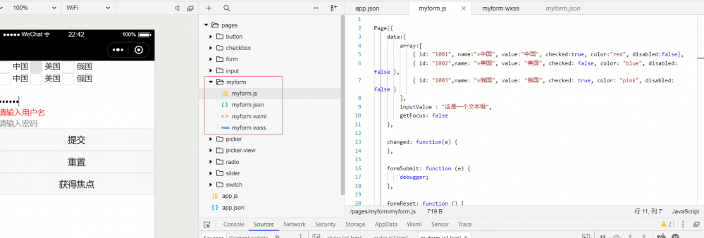
PS:小程序视图基本就是这样,最后我在myform做了个简单的例子。虽然做了几个例子,但是说实话还是没官网详细。大家一定要记住:学习小程序最好的方式就是通过官网,我也是通过这样学习的。
百度未收录
>>原创文章,欢迎转载。转载请注明:转载自IT人故事会,谢谢!
>>原文链接地址:
正文到此结束
热门推荐


相关文章


Loading...
![[HBLOG]公众号](http://www.liuhaihua.cn/img/qrcode_gzh.jpg)

