手把手教你写css3通用动画
之前接了几个微信里的项目,类似电子邀请函,什么分析报告这样的项目, 对css3动画要求十分高,每个页面客户几乎都有天马行空的想法,或者说设计师有这样的想法。
众所周知css3里的keyframe写好了就不能赋值复用的, 所以怎样能把keyframe通用起来就异常关键了。
好,下面先上几个之前写的项目:(今天sae挂了 ,只好用别人的生产地址), 手机打开或者chrome模拟看哦!
http://www.51qianlima.cn/bim/http://wx.mgcc.com.cn/fotile/invite/index.html?leader=2&from=timeline&isappinstalled=0
仔细看你就发现页面的动画有渐显,有飞入,而且可能2者或多者同时存在。
那么问题来了:是不是每个页面的keyframe都得单独写?
在说这个问题之前,你可能得掌握几种常用的水平居中,垂直居中,中心居中;水平偏移,垂直偏移的写法( 以下demo效果请chrome 模拟手机端 打开,-webkit内核哦 )。
demo1:postion结合margin:auto
<!DOCTYPE html> <html> <head lang="en"> <meta charset="UTF-8"> <meta name="viewport" content="width=device-width,initial-scale=1.0, minimum-scale=1.0, maximum-scale=1.0, user-scalable=no,minimal-ui"> <title></title> <style> * { padding:0; margin:0; } html,body { height:100%; } .demo { width:100px; height: 100px; text-align: center; line-height: 100px; background:lightblue; } .demo-1 { position: absolute; margin:0 auto; left:0; right:0; } .demo-2 { position: absolute; margin:auto 0; top:0; bottom:0; } .demo-3 { position: absolute; margin:auto; top:0; bottom:0; left:0; right:0; } </style> </head> <body> <div class="demo demo-1">水平居中</div> <div class="demo demo-2">垂直居中</div> <div class="demo demo-3">中心居中</div> </body> </html>
demo2:postion和translate 一起使用达到水平、垂直居中
<!DOCTYPE html> <html> <head lang="en"> <meta charset="UTF-8"> <meta name="viewport" content="width=device-width,initial-scale=1.0, minimum-scale=1.0, maximum-scale=1.0, user-scalable=no,minimal-ui"> <title></title> <style> * { padding:0; margin:0; } html,body { height:100%; } .demo { width:100px; height: 100px; text-align: center; line-height: 100px; background:peachpuff; } .demo-1 { position: absolute; left:50%; -webkit-transform:translateX(-50%); } .demo-2 { position: absolute; top:50%; -webkit-transform:translateY(-50%); } .demo-3 { position: absolute; top:50%; left:50%; -webkit-transform:translateX(-50%) translateY(-50%); } </style> </head> <body> <div class="demo demo-1">水平居中</div> <div class="demo demo-2">垂直居中</div> <div class="demo demo-3">中心居中</div> </body> </html>
好 掌握了以上2个demo的写法和区别后,正在的项目上 ,往往用到的是根据水平中心点,或者垂直中心点偏移的写法, 因为手机屏幕大小不一,所以这个写法异常常用。
demo3:中心点偏移
<!DOCTYPE html> <html> <head lang="en"> <meta charset="UTF-8"> <meta name="viewport" content="width=device-width,initial-scale=1.0, minimum-scale=1.0, maximum-scale=1.0, user-scalable=no,minimal-ui"> <title></title> <style> * { padding:0; margin:0; } html,body { height:100%; } .demo { width:100px; height: 100px; text-align: center; background:lightblue; } .demo-1 { position: absolute; margin: 0 auto; left: -88px; right: 0; } .demo-2 { position: absolute; margin: auto 0; top: -30px; bottom: 0; } body:before { content: ''; width: 100%; border-bottom: 2px dotted blue; position: absolute; top: 50%; -webkit-transform: translateY(-2px); } body:after { content: ''; height: 100%; border-left: 2px dotted blue; position: absolute; left: 50%; -webkit-transform: translateX(2px); } </style> </head> <body> <div class="demo demo-1">水平 距离偏移</div> <div class="demo demo-2">垂直 距离偏移</div> </body> </html>
行 掌握后接下来可以为写通用动画作铺垫了(主要是飞入效果)如果单纯渐显的话,咱们只需要控制opacity 就可以达到了:
<!DOCTYPE html> <html> <head lang="en"> <meta charset="UTF-8"> <meta name="viewport" content="width=device-width,initial-scale=1.0, minimum-scale=1.0, maximum-scale=1.0, user-scalable=no,minimal-ui"> <title></title> <style> * { padding:0; margin:0; } html,body { height:100%; } .demo { width:100px; height: 100px; text-align: center; line-height: 100px; background:lightblue; opacity: 0; } .demo-1 { position: absolute; margin:0 auto; left:0; right:0; -webkit-animation:.8s ease opacity_kf 0s forwards; } .demo-2 { position: absolute; margin:auto 0; top:0; bottom:0; -webkit-animation:.8s ease opacity_kf .8s forwards; } .demo-3 { position: absolute; margin:auto; top:0; bottom:0; left:0; right:0; -webkit-animation:.8s ease opacity_kf 1.6s forwards; } @-webkit-keyframes opacity_kf { 0% { opacity: 0; } 100% { opacity: 1; } } </style> </head> <body> <div class="demo demo-1">水平居中</div> <div class="demo demo-2">垂直居中</div> <div class="demo demo-3">中心居中</div> </body> </html>
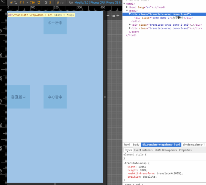
扯了这么多 ,主角来了,就是飞入也分2种写法,一种就是每个飞入效果是一个width:100%;height:100%;的层,然后操作是整个层translate,XY;但是这样写有一个很不方便就是审查元素的时候,放大镜只能定位到一个层上(多个飞入动画,别的层就给盖住了)
demo如下:
<!DOCTYPE html> <html> <head lang="en"> <meta charset="UTF-8"> <meta name="viewport" content="width=device-width,initial-scale=1.0, minimum-scale=1.0, maximum-scale=1.0, user-scalable=no,minimal-ui"> <title></title> <style> * { padding:0; margin:0; } html,body { height:100%; } .demo { width:100px; height: 100px; text-align: center; line-height: 100px; background:lightblue; } .demo-1 { position: absolute; margin:0 auto; left:0; right:0; } .demo-2 { position: absolute; margin:auto 0; top:0; bottom:0; } .demo-3 { position: absolute; margin:auto; top:0; bottom:0; left:0; right:0; } @-webkit-keyframes translate_kf { 0% { -webkit-transform:translateX(100%); } 100% { -webkit-transform:translateX(0); } } .demo-1-ani { -webkit-animation:.8s ease translate_kf 0s forwards; } .demo-2-ani { -webkit-animation:.8s ease translate_kf .8s forwards; } .demo-3-ani { -webkit-animation:.8s ease translate_kf 1.6s forwards; } .translate-wrap { width:100%; height:100%; -webkit-transform:translateX(100%); position:absolute; } </style> </head> <body> <div class="translate-wrap demo-1-ani"> <div class="demo demo-1">水平居中</div> </div> <div class="translate-wrap demo-2-ani"> <div class="demo demo-2">垂直居中</div> </div> <div class="translate-wrap demo-3-ani"> <div class="demo demo-3">中心居中</div> </div> </body> </html>
但是如果换一个写法,就是translate的包裹器里面的节点top和left都写了定值,那么外面动画的包裹器其实是不占文档流的
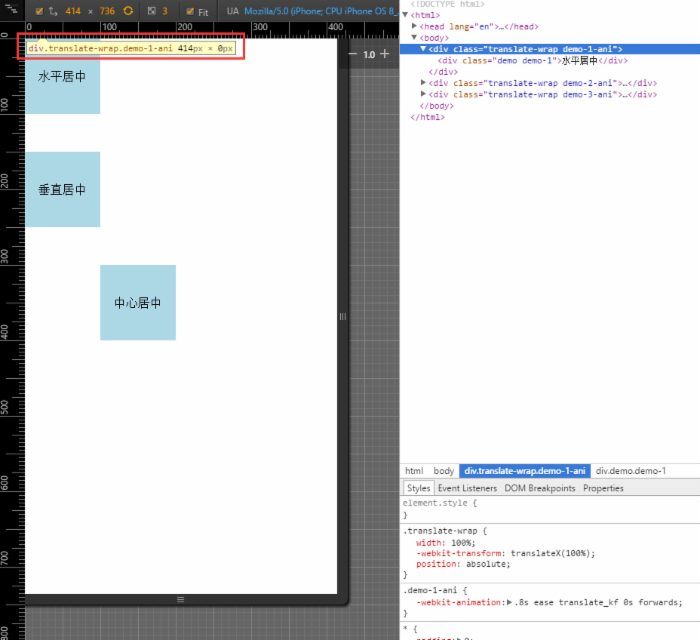
然后我们只需要操作这个不占文档流的容器就可以了
<!DOCTYPE html> <html> <head lang="en"> <meta charset="UTF-8"> <meta name="viewport" content="width=device-width,initial-scale=1.0, minimum-scale=1.0, maximum-scale=1.0, user-scalable=no,minimal-ui"> <title></title> <style> * { padding:0; margin:0; } html,body { height:100%; } .demo { width:100px; height: 100px; text-align: center; line-height: 100px; background:lightblue; } .demo-1 { position: absolute; left:0; right:0; } .demo-2 { position: absolute; top:150px; } .demo-3 { position: absolute; top:300px; left:100px; } @-webkit-keyframes translate_kf { 0% { -webkit-transform:translateX(100%); } 100% { -webkit-transform:translateX(0); } } .demo-1-ani { -webkit-animation:.8s ease translate_kf 0s forwards; } .demo-2-ani { -webkit-animation:.8s ease translate_kf .8s forwards; } .demo-3-ani { -webkit-animation:.8s ease translate_kf 1.6s forwards; } .translate-wrap { width:100%; -webkit-transform:translateX(100%); position:absolute; } </style> </head> <body> <div class="translate-wrap demo-1-ani"> <div class="demo demo-1">水平居中</div> </div> <div class="translate-wrap demo-2-ani"> <div class="demo demo-2">垂直居中</div> </div> <div class="translate-wrap demo-3-ani"> <div class="demo demo-3">中心居中</div> </div> </body> </html>
最后提一点 如果同时用到渐显和飞入,只需要设置好几个间隔一致的class就能很简单的混合使用了,例如有10个控制渐显的动画,和5个控制飞入的动画
.word_1 { opacity: 0; -webkit-animation:.8s ease word_1_kf .5s forwards; } .word_2 { opacity: 0; -webkit-animation:.8s ease word_1_kf 1.3s forwards; } .word_3 { opacity: 0; -webkit-animation:.8s ease word_1_kf 2.1s forwards; } .word_4 { opacity: 0; -webkit-animation:.8s ease word_1_kf 2.9s forwards; } .word_5 { opacity: 0; -webkit-animation:.8s ease word_1_kf 3.7s forwards; } .word_6 { opacity: 0; -webkit-animation:.8s ease word_1_kf 4.5s forwards; } .word_7 { opacity: 0; -webkit-animation:.8s ease word_1_kf 5.3s forwards; } .word_8 { opacity: 0; -webkit-animation:.8s ease word_1_kf 6.1s forwards; } .word_9 { opacity: 0; -webkit-animation:.8s ease word_1_kf 6.9s forwards; } .word_10 { opacity: 0; -webkit-animation:.8s ease word_1_kf 7.7s forwards; } /********************** 左边动画 start ********************************/ .translateX_animation_left_1 { -webkit-transform: translateX(-100%); -webkit-animation: .8s ease translateX_1_left_kf forwards .5s; } .translateX_animation_left_2 { -webkit-transform: translateX(-100%); -webkit-animation: .8s ease translateX_1_left_kf forwards 1.3s; } .translateX_animation_left_3 { -webkit-transform: translateX(-100%); -webkit-animation: .8s ease translateX_1_left_kf forwards 2.1s; } @-webkit-keyframes translateX_1_left_kf { 0% { -webkit-transform: translateX(-100%); } 100% { -webkit-transform: translateX(0); } } /********************** 左边动画 end ********************************/ /********************** 右边动画 start ********************************/ .translateX_animation_right_1 { -webkit-transform: translateX(-100%); -webkit-animation: .8s ease translateX_1_right_kf .5 forwards; } .translateX_animation_right_2 { -webkit-transform: translateX(100%); -webkit-animation: .8s ease translateX_1_right_kf forwards 1.3s; } .translateX_animation_right_3 { -webkit-transform: translateX(100%); -webkit-animation: .8s ease translateX_1_right_kf forwards 2.1s; } .translateX_animation_right_4 { -webkit-transform: translateX(100%); -webkit-animation: .8s ease translateX_1_right_kf forwards 2.9s; } .translateX_animation_right_5 { -webkit-transform: translateX(100%); -webkit-animation: .8s ease translateX_1_right_kf forwards 3.7s; } @-webkit-keyframes translateX_1_right_kf { 0% { -webkit-transform: translateX(100%); } 100% { -webkit-transform: translateX(0); } } /********************** 右边动画 end ********************************/
word_1后可以随意执行 translateX_animation_right_2 或者 translateX_animation_left_2 ,然后word_3神马的。
好,暂时遇到的项目只用到了渐显和飞入,这2个常用的通用动画,小伙伴们有更多的实际场景欢迎交流,写得不好的地方也欢迎吐槽,谢谢看完 谢谢谢谢。
正文到此结束
热门推荐


相关文章


Loading...
![[HBLOG]公众号](http://www.liuhaihua.cn/img/qrcode_gzh.jpg)

