W3C 中文排版规范第一版(草稿)
2. 中文排版基礎 Basics of Chinese Composition
2.1 中文排版所使用的文字和基本原则 Characters and Principles for Setting them in Chinese Composition
2.1.1 中文排版所使用的文字 Characters used for Chinese composition
中文排版主要使用的文字為漢字。
The majority of the text used in Chinese composition consists of Han characters (hanzi).
依照各地的通行標準,中文所使用的漢字主要又分為繁體字與簡體字。前者又作正體字、傳統漢字等,主要通行於台灣、香港、澳門等地;後者又作簡化字,主要通行於中國大陸、星馬地區。本文依筆畫多寡與部件結構為區別,統稱為繁體字與簡體字。
Chinese characters include Traditional Chinese and Simplified Chinese alternatives. The former, which is also known as Upright Characters or Traditional Han, is commonly used in Taiwan, Hong Kong and Macao while the latter is commonly used in Mainland China, Singapore and Malaysia. In this document, the number of strokes and the compositional nature of a character are considered to be the major differences between Simplified Chinese characters and Traditional Chinese characters.
不同地区所使用的字形有差异,各种字形与万国码位并不是一一对应关系,需要依赖处理系统和字库来呈现。本文主要探究中文排版,對此不做詳述。
Different typefaces are used different in regions. The presentational aspects of typefaces do not have a relationship to Unicode, but rather depend on the operating system and the character library. The focus of this document is Chinese composition and we will not discuss typeface presentation.
Note
中文排版除了漢字外,也使用標點符號。也會與阿拉伯數字、拉丁文字、希臘文字等外文混排。
In addition to the Chinese (hanzi) characters, various punctuation marks, as well as Western characters such as European numerals, Latin letters and/or Greek letters, may be used in Chinese text.
Note
一个简体汉字可能对应着多个繁体汉字。例如,简体字“发”,相应的繁体文字可能为“發”或“髮”,具体应由上下文决定。
One Simplified Chinese character may have more than one corresponding Traditional form. For example, the Simplified Chinese character 发 can be matched to either the Traditional Chinese character 發 or 髮, depending on the context.
2.1.2 漢字 Chinese Characters
漢字有著正方形的文字外框。於文字外框的正中央,有著比文字外框小的字面(反過來說,字面的上下左右與文字外框之間,有稍微比字面大的若干空白)。中文標點符號的尺寸多與漢字一致,寬高相等,部分標點(如刪節號等)則佔用一個漢字高、二個漢字寬的大小。
Chinese characters have square character frames of equal dimensions. Aligned with the vertical and horizontal center of the character frame, there is a smaller box called the letter face , which contains the actual symbol. (There should be some space left between the letter face and the frame). Most of the punctuation marks for Chinese characters share the same size as the other characters, however some of them differ, such as the ellipsis, which is one-character high and two-characters wide.
文字尺寸則為文字外框的尺寸。此外,字幅則是依照文字排列方向的文字外框大小,為文字的寬度。
Character size is measured by the size of the character frame. Character advance is a term used to describe the advance width of the character frame of a character, which should be the same as the width of the character.
2.1.3 漢字的配置原則 Principles for Arranging Characters during Chinese Composition
漢字依行排列文字,原則上文字外框彼此緊貼配置,稱作密排。
In principle, when composing a line with Chinese characters, no extra space appears between their character frames. This is called solid setting .
Note
從活字排版時代起,漢字無論直、橫文字外框彼此緊貼配置適於閱讀。但活字排版依照文字尺寸不同,各號數之字型原模不同,字面也隨之不同。目前數位字體僅採取單一原型,當文字尺寸放大時,有時需要調整字距。然而,中文漢字字體面率一般較日文字體小,除非在特殊狀況下,不需特別處理。另當文字尺寸縮小時,若為向量字體,則需要補正資訊來調整文字線幅;但有部分字體在文字尺寸較小時,會以點陣字體呈現,此時就不需另外調整。
Unlike the letterpress printing era, when several sizes of the original pattern of a letter were required to create matrices, in today's digital era the same original pattern is used for any size simply by enlargement or reduction. Because of this, it might be necessary to adjust the inter-character space when composing lines at large character sizes. When composing lines at small character sizes in outline fonts, hinting data is used to ensure that the width of the strokes that make up a character look correct. When only a small portion of the fonts are smaller, they will be displayed as bitmaps, and there is no need to make extra adjustments.
依照內容的不同,也會採用以下方式排列:
Depending on the context, in addition to solid setting several alternative setting methods can be used, as described below.
2.1.3.1 增加字距 Increased inter-character spacing
於各字之間加入固定量的空白來排列文字,稱作疏排。書籍排版上,遇到以下狀況時,會採用此排列方式:
It is common in books to increase the space between each character frame (i.e. loose setting ) for the following cases:
-
為使字數不同的標題間能取得平衡,而加大字距。
To achieve a balance between running heads with different numbers of characters, increased inter-character spacing is used for running heads with few characters.
-
圖片與表格之說明文字字數少時,為取得平衡,而加大字距。
For captions of illustrations and tables, which only have a few characters, increased inter-character spacing is used to balance with the size of an illustration or table.
-
應用於字數少的詩詞時,為與版面取得平衡,而加大字距。
In some cases, increased inter-character spacing is used for poetry where one line has only a few characters, so as to maintain the balance of the layout.
-
針對兒童書籍等,為提升易讀性時,而加大字距。
For publications whose main audience is children, inter-character spacing is increased to make it easier for the children to read.
2.1.3.2 平均排列 Even inter-character spacing
平均分配字距,使文字列兩端能夠對齊行首與行尾。中文排版時,由於使用的漢字與標點符號皆為正方形,自然會使得文字列對齊行首與行尾。該種排列方式,主要應用於:
Text may be set with equal inter-character spacing between all characters on a given line, so that each line is aligned to the same line head and line end. Since the Chinese characters and punctuation marks are all in square shapes with almost the same dimensions, it is natural that each line is aligned to the same line head and line end. Even inter-character spacing is mainly used in the following cases:
-
行首行尾禁則。當該行行尾遇到不能置於行尾的標點符號,而必須將標點符號與前一漢字移至次行時;或次行行頭遇到不能置於行頭的標點符號,而必須將移動前一行漢字於次行時,就會於行尾產生一到二字(甚至以上)的空白。由於中文書籍各行行頭尾對齊是重要的排版規則,此時就會利用平均排列將二字(以及以上)空白均分至該行各字字距。
To deal with rules that forbid certain characters at the beginning or end of a line. When a punctuation mark which is not supposed to be positioned at the end of a line happens to appear there, even inter-character space setting is used to move the character before the punctuation mark to the next line together with the punctuation mark. When a punctuation mark which is not supposed to be positioned at the beginning of a line happens to appear there it is necessary to move the last character from the previous line to the beginning of the next line, and there will be one or two (or sometimes more) empty spaces left in the previous line. Even inter-character space setting is used to unify the length of each line and justify them.
-
表格标题、人名名单等求呈現上一致時,會採用平均排列的方式處理。
Even inter-character space setting is used when the number of characters in a table head differs from the table content, such as for person names, so as to justify the table.
2.1.3.3 減少字距 Reduced inter-character spacing
減少字與字間的字距,使得文字外框一部份重疊,稱作紧排。這種處理方式,主要應用於:
By reducing the inter-character spacing, a portion of two character frames overlap each other (i.e. solid setting). This method is mainly used in the following cases:
-
雜誌標題以及廣告文案字數較多,為使其排列於一行,或為求特殊表現時使用。
For characters in headings in magazines or advertisements, reduced inter-character spacing can be used to keep the characters on one line, or it can also be used to achieve a special effect for presentation.
-
由於漢字皆為正方形,此方式並不適用於活字排版,故不應用於書籍標題與內文的排列上。
Since Chinese characters are all square-shaped, this method does not apply to headings and content in books produced by letterpress printing.
2.2 中文排版常用字體 Typefaces for Chinese Characters
2.2.1 中文排版經常使用的四種字體 Four Frequently-used Typefaces for Chinese Characters
中文排版時,主要使用的四種字體為:
There are four main typefaces in use for Chinese characters:
- 宋體(明體、明朝體) Song (Ming)
- 楷體 Kai
- 黑體 Hei
- 仿宋體 Fangsong (Imitation Song)
這四種字體於書籍排版上有其常見之使用方式,下列各節分別敘述其使用情境。
The following sections describe common practice and contexts for use of these four typefaces.
2.2.2 宋體(明體、明朝體) Song/Ming

宋體,又稱為明體或明朝體,是中文排版最常使用之字體。
Song , also known as Songti or Ming, is currently the most common style of type in print for Chinese.
普遍使用於內文文字、標題與注釋。當應用於標題時,通常會特別加強字重,令其與內文有所差異。
Song is commonly used in text, headings and annotations. When used in headings, the characters will appear in a bold face, so as to distinguish the heading from the text.
2.2.3 楷體 Kai
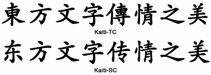
楷體為帶有書法形態、手寫筆觸之字體。
Kai is another of the major typefaces, and shows notable handwriting features.
主要使用於標題、引言、摘句、對話、內容出處等,與內文有所不同的段落上。但因為與宋體近似,故少用於強調。
Kai is mainly used in text that needs to be differentiated from the rest of the content, for example, headlines, references, quotations, and dialogs. It is rarely used for emphasis, because of its similarity with Song.
Note
由於楷體保留了書法筆觸,普遍用於公文書、教科書之內文字。
Since Kai retains some calligraphic features, it is widely used in office documents and textbooks.
2.2.4 黑體 Hei
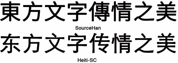
黑體主要應用於標題、圖說、對話之人名。內文中也會使用字重較粗的黑體作為特定文字的強調、著重。
Hei , is commonly used in headlines, signs, and personal names in dialogs. For certain types of text, characters in Kai style with thicker strokes typically indicate emphasis.
傳統印刷品少有使用黑體作為內文文字者,但受到萬維網、數位出版的影響,也有少數書籍開始使用黑體作為內文字體。
Traditional publications rarely apply the Hei style for content, but with the growing influence of the World Wide Web and the digital publishing industry, some publications are starting to experiment Hei in this context.
2.2.5 仿宋體 Fangsong (Imitation Song)
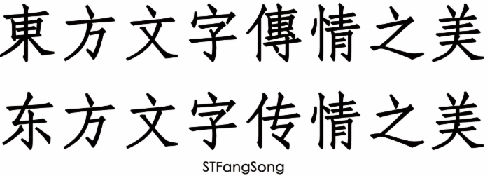
仿宋體的字體形態介於宋體與楷體之間。常用於引言、摘句等與內文區隔的段落上。
The Fangsong (Imitation Song) style lies between Song and Kai. It is commonly used in isolated paragraphs such as quotations or highlighted sentences.
2.3 版心 The Type Area (or Printing Area)
中文書籍排版依以下順序設計:
The type area , sometimes called the printing area, is designed in the following sequence. There is no actual definition of what the type area is. I suggest we change the foregoing to something like: The type area , sometimes called the printing area, is the rectangle in the middle of the page that contains the main body of the text. It is surrounded by space containing headers, footers, notes, etc.
-
首先,設計版心。
First, prepare a template of the page format, which determines the basic appearance of document pages.
-
其次以版心為基準,進行實際頁面的設計。
Then, specify the details of actual page elements based on the template.
書籍多數僅使用一種基礎排版體裁,雜誌則會使用上數種。
Books usually use one basic template for page format, whereas magazines often use several templates.
但儘管書籍僅使用一種體裁,在實際頁面的設計上,如:目錄、索引等頁面,會基於基本排版體裁重新設計。索引等頁面採用不同排版體裁設計的案例也相當多,直排書索引也會以橫排或者多欄排版方式設計。但在設計上,版面尺寸等依然不出基礎排版體裁。
Although in books, there tends to be one template for the page format, some further design effort based around the basic page format will be needed for pages such as the table of contents and indexes. Furthermore, there are many examples of indexes with a different page format than the basic page format, and vertically set books often have indexes in horizontal writing mode, and sometimes multiple columns. However, while doing actual design for the page, the size of the type area should not exceed the basic page template. (some doubts about the translation of 版面 here) .
雜誌則因為內容不同,排版體裁多變,文字大小、欄數依照內容不同會有所變化。
Magazines usually contain various kinds of content, which naturally leads to various designs of templates, different sizes of characters, and varying numbers of columns.
2.3.1 基礎排版體裁的主要元素 Basic Elements of Page Format
基礎排版體裁的主要元素如下:
The following are the basic elements of a page format.
-
完成尺寸與裝訂邊(中文書籍直排為右側裝訂、橫排為左側裝訂)
Trim size and binding side (vertically set Chinese documents are bound on the right-hand side, and horizontally set documents are bound on the left-hand side.)
-
文字書寫方向(直排或橫排)
Principal text direction (vertical writing mode or horizontal writing mode).
-
版心與完成尺寸的相對位置
Appearance of the type area and its position relative to the trim size.
-
頁眉與頁數位置
Appearance of running heads and page numbers, and their positions relative to the trim size and type area.
Note
決定版心除了在頁面中設定長方形的空間外,也有著供內文、標題、圖片配置做為基準的格子設定。其格子設定於中文排版原則下,內文必須依照格子進行配置。在文章僅由漢字構成的狀況下,行首、行尾對齊版心邊界是中文書排版重要的原則。但在與西文混排、或配置標點禁則處理時,為遵從本項原則,內文可不按照格子排列。
Establishing a type area may be seen as defining not only a rectangular area on a page, but also within that area an underlying, logical grid, to guide the placement of such things as characters, headings, and illustrations. Once the grid is established according to the principles of composition, the setting of the characters must align with the grid. If the content contains Chinese characters only, it is an important principle that the first and last characters on a line should align with the border of the type area. When both Chinese characters and Western text are mixed in the content, or forbidden locations of punctuation marks need to be taken into consideration, the setting of the content may not align with the grid.
2.3.2 版心的設計元素 Design of the Type Area
作為書籍基本設計而成的排版體裁稱為版心,版心的設計元素如下:
The type area defines the basic printing style of a book. The following are the basic elements of the type area.
-
所使用的文字尺寸以及字體種類
Character size and typeface name
-
文字書寫方向(直排或者橫排)
Text direction (vertical writing mode or horizontal writing mode)
-
分欄時,欄數以及欄距
Number of columns and column gap when using multi-column format
-
一行的長度(字數)
Length of a line
-
一頁之行數(分欄時為一欄之行數)
Number of lines per page (number of lines per column when using multi-column format)
-
行距
Line gap
-
字距
Letter-spacing
2.3.3 以版心作為實際頁面的排版體裁 Type Area and Real Page Format
本部分說明如何以版心作為基本排版體裁來設計各頁面。
This section explains how to create a real page format based on the type area.
-
配置標題的空間與位置標題所使用空間之文字方向與尺寸,以版心設定的行的位置為基準,採用數行的空間來設計。標題縮排時的處理,以版心所設定的文字尺寸為基準,決定要縮排的量。
Realm and position of headings: The direction and size of the characters of the heading should be based on a number of lines in the type area. The size of the indent is usually specified as a number of characters in the type area.
-
圖片之尺寸:橫排時圖片,寬度盡可能地以版心的尺寸一致;若為多欄排版時,則盡可能與版心所設定的一欄寬度一致。排列時多與版心的天或者地對齊配置。直排時亦同,依照版心的天地高度、或者多欄排版下所設計單欄或者多欄的天地尺寸為基準配置。排列時亦多與版心的天或者地對齊配置。
Size of illustrations: In horizontal writing mode, the width of illustrations should, if at all possible, be the width of the type area; in horizontal writing mode with multiple columns, the width of illustrations should, if at all possible, be the width of one type area column. The illustrations are usually set at the head or the foot of the page. Likewise, in vertical writing mode, the height of illustrations should, if at all possible, be either the height of one type area column or the height of the type area. The illustrations are usually set at the right side or left side of the type area.
-
目錄、索引、參考書目等頁面目錄、索引、參考書目等頁面以版心之尺寸作為基準設計。但有不少案例會於內文採單欄橫排時,目錄等頁採多欄設計;而目錄頁有時天地側會對文字進行縮排。
Page for Table of Contents, Indexes and References: The size of the type area for the table of contents, indexes and references of books is based on the size of the type area for the main body content. There are many examples of tables of contents in vertical writing mode where the left-to-right size is identical to that of the type area, but the top-to-bottom size is a little bit smaller.
2.3.4 設計版心的順序 Procedure for Defining the Type Area
-
決定版心尺寸
Specifying the dimensions of the type area
-
無分欄時,需決定文字尺寸、一行的字數(即為行長)、一頁的行數以及行距。
For a document with a single column per page, specify the character size, the line length (the number of characters per line), the number of lines per page, and the line gap.
-
當分欄時,需決定文字尺寸、一行的字數(即為行長)、一欄的行數、行距、欄數以及欄距。
For a document with multiple columns per page, specify the character size, the line length (the number of characters per line), the number of lines per column, the line-gap, the number of columns and the column gap.
-
-
決定相對於印刷版面,版心的配置位置。版心配置位置的設計順序有著以下方式。
Determining the position of the type area relative to the trim size. There are various alternative methods for specifying the position of the type area relative to the trim size:
-
將版心置於印刷版面的正中央,天地等高、左右等寬。
Set the type area at the horizontal and vertical center of the trim size.
-
橫排時指定天的留白量、直排時則指定地的留白量,左右等寬。
Position vertically by specifying the size of the space at the head (for horizontal writing mode) or the space at the foot (for vertical writing mode). Position horizontally by centering the type area.
-
天地等高,指定裝訂邊的留白量。
Position vertically by centering the type area. Position horizontally by specifying the size of the space for the gutter.
-
指定裝訂邊的留白量,橫排時指定天的留白量、直排時則指定地的留白量。
Position vertically by specifying the space at the head (for horizontal writing mode) or the space at the foot (for vertical writing mode). Position horizontally by specifying the size of the space for the gutter.
-
Note
一般而言,版心多置放於印刷版面的的正中央,然後依照版心尺寸不同,向上下、左右調整。這種設計方式主要承襲自活字印刷,但於桌上排版,則多以印刷版面計算與版心尺寸四方邊界之差為之。
In most cases the type area is set at the horizontal and vertical center of the trim size, and then it can be adjusted depending on its dimensions. This design method is mainly inherited from the letter press printing technology. For desktop publishing, the dimensions of the type area are usually calculated based on the space between the type area and the trim size.
2.3.5 設計版心的注意點 Considerations when Designing the Type Area
版心於設計時需考量以下事項:
The following are considerations that need to be taken into account when designing the type area:
-
決定版心尺寸時,得先考量到印刷版面尺寸與留白後進行。一般而言,版心與印刷版面會呈近於相似形的設計。
When deciding the dimensions of the type area, it is necessary to consider both the trim size and the margin. Generally speaking, the shape of the type area could be made similar to that of the trim size.
-
以成人為讀者製作書籍時,文字尺寸一般為10.5pt(≒3.7mm)與9pt(≒3.2mm)為多。除了特殊書籍外,最小也要有8pt(≒2.8mm)。
Character size. For the main target audience of publications, ie. the adult population, most commonly the character size is 10.5pt (≒3.7mm) or 9pt (≒3.2mm). The minimum acceptable size of type is 8pt (≒2.8mm), except for specialized publications.
Note中文活字尺寸以「號」為單位,又分新舊兩種寸法。可完整對應美制的「點」(point),分別如下:初號=42pt、一號=27.5pt、二號=21pt、三號=15.75pt、四號=13.75pt、五號=10.5pt、六號=7.875pt、七號=5.25pt。新五號四行=36pt、新一號=24pt、新二號=18pt、新三號字=16pt、新四號=12pt、新五號=9pt。
There are two traditional size systems for Chinese characters, and old one and a new one. The following shows the equivalence in the Western point system. In the Old size system, Size 0 = 42pt, Size 1 = 27.5pt, Size 2 = 21pt, Size 3 = 15.75pt, Size 4 = 13.75pt, Size 5 = 10.5pt, Size 6 = 7.875pt, and Size 7 = 5.25pt; in the new size system, New Size 0 = 36pt, New Size 1 = 24pt, New Size 2 = 18pt, New Size 3 = 16pt, New Size 4 = 12pt, New Size 5 is 9pt.
Note一般內文主要使用五號字(10.5pt≒3.7mm),而報紙、雜誌則使用新五號字(9pt≒3.2mm),兩種皆常為使用。而一般內文字最小使用到六號字(7.875pt≒2.8mm),若小於此尺寸,由於漢字結構複雜,則難以閱讀。
Size 5 is usually used for text content. Newspapers and magazines use both Size 5 and New Size 5. The acceptable minimal size for the text in content is Size 6 (7.875pt≒2.8mm). If a smaller size is used, it will be difficult to read due to the complex structure of the Chinese characters.
-
一行的行長應為文字尺寸的整數倍,各行的位置盡可能頭尾對齊。
Line length should be multiples of the character size and each line should be in alignment with each other.
Note中文在不與西文混排的狀況下,所使用的文字外框皆為正方形,除段落最後一行不對齊外,各行行首、行尾皆需對齊,這是重要的排版原則。
For Chinese composition without intermixed Western scripts, the characters all have a square-shaped frame, so all line lengths except that of the last line of the paragraph should, in principle, be the same.
-
行與行之間的空白(行距)除特別狀況外,皆需保持一致。
The line gaps between each line should be the same throughout the book, except for special cases. It would probably help, at this point, to define what the line gap is, since it initially sounds like the same thing as line height. What are the reference points for measuring the line gap?
Note在繁體中文排版,字間的注音符號可能會超入行距空間,而翻譯書籍亦可能使用類似日文排版的ruby文字,此時行距仍需保持一致。當文書需要配置這些元素時,於設計版心之階段就須考量到這些要素來決定行距。
In Traditional Chinese composition, there are cases where pronunciation marks, referred to as 'ruby' in the Japanese Layout Requirements , are inserted between lines. In such cases the line gap is not changed but is kept constant . If these elements are likely to occur in text, the line gap established during the type area design needs to be of an adequate size to accommodate them.
Note版心之行距多半介於文字尺寸之50%–100%之間,當行長較短、或文字尺寸較小時,行距設定也會相對較小。反之,行距一般不會超過文字尺寸,就算超過文字尺寸,也不會因而增加易讀性。
The line gap for the type area is commonly set to a value between 50% and 100% of the height of the character frame used for the type area. A shorter line gap can be chosen in cases where the line length is short or the character size of the type area is relatively small. On the other hand, the line gap usually does not exceed the character size. Increasing the line gap beyond the character size does not improve the reading experience.
Note指定版心的方法中,有著不以行距,而是依行高來設定的方法。行高就是彼此鄰接的兩行的基準點到基準點之間的距離。基準點依照處理方式而會有所不同,直排時行左右的中央線,橫排時為行上下的中央線。當配置的文字全部尺寸相同時,有著以下關係:
There is another method of specifying the type area that uses line height rather than line gaps. Line height is the distance between two adjacent lines measured from their reference points. The reference point differs from implementation to implementation, however, in vertical writing mode the horizontal center of the character frame is usually used, and with horizontal writing mode, the vertical center of the character frame is used. When the character size is the same for every character, the following calculation is used:
-
行高=文字尺寸÷2+行距+文字尺寸÷2=文字尺寸+行距
line height = character size / 2 + line gap + character size / 2 = character size + line gap
-
行距=行高-文字尺寸
line gap = line height - character size
-
2.4 文字書寫方向 Writing Mode
2.4.1 中文的文字書寫方向 Writing Modes in Chinese
中文的文字書寫方向,分為直排與橫排。其中,繁體中文出版品適用直排與橫排;簡體中文出版品則多為橫排,直排書籍的案例極少。
Chinese composition has two text directions, vertical writing mode and horizontal writing mode. Traditional Chinese can be composed both in vertical writing mode or horizontal writing mode, while Simplified Chinese is mostly composed in horizontal writing mode. There are rare cases where Simplified Chinese is composed in vertical writing mode.
Note
中文所使用的漢字與標點符號,原則上都是正方形的文字,自活字排版時代起,無論直、橫排,都能使用相同的活字排列。但部分標點符號需配合文字書寫方向調整字面分布及方向,見 3.1 標點符號與其排版 Line Composition Rules for Punctuation Marks 節之詳述。
Ever since the letter-press printing period, the characters and punctuation marks used for Chinese composition have basically been designed to have a square character frame. Thus the same collection of printing types can be used in either vertical writing mode or horizontal writing mode, simply by changing the direction of text. However, some adjustments will be needed for the punctuation marks so as to match the writing direction of the characters and their composition. This is described in more detail in 3.1 標點符號與其排版 Line Composition Rules for Punctuation Marks .
Note
傳統上,中文書籍以直排為主,繁體中文通行地區較大程度地保留了這項傳統。然而,近年隨著翻譯或中、西文混排等書籍的數量增加,加上文書處理軟體的預設文字書寫方向的影響,橫排也逐漸成為主流。在台灣,公文、自然科學類書籍等使用橫排居多;而文學作品,如詩、小說等,仍以直排為主。直排仍為繁體中文通行地區的重要文化表徵之一。
Traditionally, Chinese publications were composed mainly in vertical writing mode, and this tradition has been largely preserved in the regions using Traditional Chinese. However, with the increasing amount of translated publications and mixed-text publications, and the default mode of writing modes in the character processing software, horizontal writing mode is becoming more and more popular. In the Taiwan area, government departments, educational materials and books of natural science mainly use horizontal writing mode while literary works such as poetry and novels still use vertical writing mode. Vertical writing mode still stands as an important cultural characteristic of regions where Traditional Chinese is used.
Note
一份印刷品中,原則上會選用統一的文字書寫方向進行排版。但直排印刷品中,頁眉、圖說、表格等多會混用橫排。同時,部分頁面,如參考書目、註釋等亦可能使用橫排呈現。
There is usually only one direction for all text throughout a book, but there are cases where horizontal writing mode is used in certain parts of vertically composed books. Tables, captions for illustrations, running heads, and page numbers are usually composed horizontally in a page with a vertical writing mode.
2.4.2 橫排與直排的主要差異點 Major Differences Between Horizontal and Vertical Writing Modes
直排與橫排的主要差異點,列舉如下:
The following are major differences between vertical writing mode and horizontal writing mode:
-
文字、行、欄以及頁面配置、裝訂方向
Arrangement of characters, lines, columns and pages; direction of page progression.
-
直排時
Vertical composition.
-
文字由上而下,行由右而左排列。
Characters are arranged from top to bottom, lines are arranged from right to left.
-
欄水平切割,上下分欄。
Columns are arranged horizontally from top to bottom.
-
頁面由封面開始,由右向左進行配置(由左向右翻頁)。
A book starts with the left (recto) side and progresses from right to left.
-
-
橫排時
Horizontal composition.
-
文字由左而右,行由上而下排列。
Characters are arranged from left to right, and lines are arranged from top to bottom.
Note中文傳統上僅使用直排,當文字需要橫向排列時,採用每行一字、由右向左的規則,且不分欄,形成視覺上由右向左的橫排,此為直排的特例。過去常見於匾額、報紙、雜誌的標題,目前多為由左而右的橫排書寫方向取代。
Traditional Chinese mainly uses vertical writing mode. When characters need to be composed horizontally, each line will contain one character and lines will be arranged from right to left, and no columns will be applied. As a special case for vertical writing mode, this can be seen in stone inscriptions and headings in newspapers and magazines, but now it has been replaced by horizontal writing mode arranged from left to right.
-
欄垂直切割,左右分欄。
Columns are arranged vertically from left to right.
-
頁面由封面開始,由左而右進行配置(由右向左翻頁)。
A book starts with the right (recto) side and progresses from left to right.
-
-
-
文中包含西文、阿拉伯數字時,如下配置:
Orientation of Western Text and Latin alphanumeric characters in a line.
-
直排時,西文或阿拉伯數字有以下三種配置方式:
In vertical writing mode, there are 3 methods for arranging Western text and Latin alphanumeric characters:
-
與漢字採相同的書寫方向,依字母字字排列,主要用於單一西文字母或阿拉伯數字、首字母縮寫等。
One by one, with the same normal orientation as that of the other characters. This is usually applied to one-letter alphanumerics or capitalized abbreviations.
Note西文字母或阿拉伯數字,採用此配置時,需使用與漢字相同尺寸、字幅固定的等寬字體,而非比例字體。
Western text or alphanumeric characters used for this arrangement should have the same fixed size and width as the Chinese characters, rather than using the proportional width.
-
文字以順時鐘方向旋轉90度。主要用於西文的單字詞、語句等。
Rotated 90 degrees clockwise. This is usually applied to English words or sentences.
-
保持正常方向,橫排處理(如日文的縱中橫排)。主要應用於二至三位數字。
Set horizontally without changing orientation. This is usually applied to two-digit numbers or numbers with more than two digits.
Note數字於直排行內橫排,原則上不超過一個漢字的字幅。這是從活字印刷時代起,每行寬度固定所致。故直排時,西文字母與阿拉伯數字橫排不限於二位數,但原則上不能超過一個漢字。現代常見的用法還包括[3.0]、[A+]、[2B]等。
In principle, if numbers are arranged horizontally in a vertical writing mode, the width of the numbers should not exceed one character width. This rule originated in the letterpress printing era due to the fixed width of each line. Therefore, in vertical writing mode, Western text and alphanumeric characters are not limited to two digits, but the width should not exceed one character width. Some commonly seen examples include "3.0", "A+" and "2B".
-
-
橫排時,以正常方向配置。
In horizontal writing mode there is only one way of arranging alphanumerics, i.e. the normal orientation.
-
-
表格、圖片等標題列的位置
Arrangement of tables and/or illustrations.
-
直排時,表格橫列之標題列為上方,但直行之標題列位於右側。
In vertical writing mode, align the top of tables/illustrations to the right of the page but list the headers on the right side.
-
橫排時,表格橫列之標題列為上方,但直行之標題列位於左側。
In horizontal writing mode, align the top of tables/illustrations to the left of the page but list the headers on the left side.
-
-
換頁、換章時最末頁採多欄排列、行於頁面中結束時,依以下方式處理:
Arrangement of an incomplete number of lines on a multi-column format page due to new recto, page break, or other reason.
-
直排時,順其行文結束,各欄左右行數可以不一致。
In vertical writing mode, just finish the line where it ends. The number of lines in each column is not uniform.
-
橫排時,各欄的行數需平均。但因字數不足,行數無法與欄數配合時,不足的行數於最後一欄末尾留空。
In horizontal writing mode, re-arrange columns so that each column has the same number of lines. In case the number of lines is not divisible by the number of columns, add the smallest number to make it divisible and re-arrange columns using the quotient as the number of lines so that only the last column shall have the incomplete number of lines.
Note中文書籍無論直、橫排大多不分欄,這項處理多來自翻譯書籍或參考日文書籍之排版方式,故承襲日文排版需求。
For most publications in Chinese, no columns are arranged either in vertical writing mode or horizontal writing mode. This arrangement, referring to the Japanese composition method, is more for books with translated content.
-
正文到此结束
热门推荐


相关文章

近期评论
-
https://www.newcmy.com/register?aff=HBVX
建议您试试草莓云机场,可以流畅观看youtube和tiktok,上reddit/x也没有问题,还有各种ai优化节点。 -
出现OpenClaw "device signature expired"。the Gateway rejects if Math.abs(Date.now() - signedAt) > 10 * 60 * 1000 (10 minutes)
-
-
想购买您这个站,我的联系方式QQ741756694微信同步 能卖联系
-
-
-
-
-
https://www.liuhaihua.cn/archives/40657.html 这篇博客中的图片打不开了
-
不会英语啊。
Loading...
![[HBLOG]公众号](https://www.liuhaihua.cn/img/qrcode_gzh.jpg)