使用 Dojo Mobile 构建一个图形化的 KPI 仪表板
Dojo Mobile 是 Dojo Toolkit 的一个扩展模块,是一个类似 JQuery 的、得到广泛支持的 HTML5 和 JavaScript 框架。作为 Dojo Toolkit 的扩展,Dojo Mobile 使用 dojox JavaScript 库和包或命名约定 dojox/mobile 。
就像 Dojo 因其丰富的小部件模块而著称一样,Dojo Mobile 提供了方便的选项来模拟原生设备,包括窗体、按钮、图标、轻击式导航、选项卡、标题、徽章和列表。本教程将介绍 Dojo Mobile 对通过一个原生移动应用程序报告业务项目或部门的 KPI 的支持。您将学习如何使用 Dojo Mobile 的图表和测量库开发一个可视的仪表板,所有业务用户或经理都可以访问它来评估组织的项目和目标的实时状态。
KPI 是量化的度量方式,因每个组织的目标的不同而不同。此外,一个组织内的不同部门将使用自己的度量方式来测量目标的满足情况。组织的执行仪表板中可包含一种典型的 KPI,其中包含图表、仪表、提醒和下钻功能。按照本教程中的示例,您将开发一个精简的原生 Dojo Mobile 应用程序,它有一个图表和模拟的仪表来报告 KPI。
构建您的应用程序所需的准备工作
- Dojo Toolkit
- 已在您的 Eclipse 开发环境中设置 MobileFirst Platform Foundation Developer Edition 和WebSphere Liberty
KPI 仪表板
屏幕空间和带宽的高效使用对移动设备极其重要。您必须小心地计划如何通过移动设备提供 KPI,包括如何布局数据,如何执行调用来检索数据,以及如何消除所有不必要的开销,比如在适当时使用缓存。
要优化用户体验,应避免每个细节让用户眼花缭乱。使用 Dojo 的 dgauge 模块,可以轻松地通过仪表提供时间点指标,或者使用不断度量的曲线图或图表。
尽管仪表不是 KPI 显示空间的最佳方法,但许多业务用户仍然非常喜欢仪表,他们正在效仿汽车仪表盘上的模拟仪表盘仪表。与汽车仪表盘显示屏非常类似,仪表可提供业务部门各方面表现的实时或近实时指标。总之,我们的规则就是保持简单。
Dojo API
本教程中的示例基于 Dojo Toolkit 1.9 版,使用了 AMD 格式。AMD 是一种社区标准,这意味着其他兼容的加载器也可使用它。
如果尚未 下载 Dojo Toolkit ,那么请现在下载它,然后导入位于您的 Dojo 发行版中的 dojo.js JavaScript 文件来使用该加载器。清单 1 展示了如何导入 dojo.js 文件:
清单 1. 导入 dojo.js
........... <head> <meta http-equiv="Content-type" content="text/html; charset=utf-8"> <meta name="viewport" content="width=device-width,initial-scale=1,maximum-scale=1, minimum-scale=1,user-scalable=no"> <meta name="apple-mobile-web-app-capable" content="yes" > <title>Company XYZ<title> <script src="dojo-1.9/dojo/dojo.js" data-dojo-config="isDebug:1, async:1"></script> ........... ........... <head>
通过导入 dojo.js,可以访问您需要的移动和标准 Dojo 模块来开发 Dojo Mobile 应用程序。您在开发期间应将 isDebug 特性设置为 True ( 1 )。在使用 AMD 时,还需要将 async 特性设置为 True ( 1 )。
要加载和解析 HTML 页面,只需包含您将需要的 Dojo 类即可。在清单 2 中,一个基本的移动应用程序从 dojox/dgauges 库加载了各种 Dojo 仪表和指标。下面提供的模块对通过移动仪表板提供 KPI 很有用。请注意,这些模块被分组到 Dojo、Dijit 和 Dojox 中。
清单 2. 加载模块,AMD 风格
require(["dojox/mobile/parser", "dojo/ready","dojo/dom","dojo/_base/xhr", "dojox/dgauges/components/default/CircularLinearGauge", "dijit/registry","dojox/mobile/deviceTheme","dojox/mobile", "dojox/mobile/ScrollableView", "dojox/mobile/TabBar", "dojox/mobile/compat"], function(parser,ready,registry,deviceTheme) { parser.parse(); // Do other stuff here too. } ); 在 Dojo Mobile 中,您可以使用 dojox.dgauges 创建环形、半圆形或条形仪表。也可包含和自定义一些元素来构建自己的仪表,比如使用嵌入式文本来表示当前值、背景、指针和箭头。一定要使用 dojox.dgauges ,如清单 2 所示。该库的一个旧版本 dojox.gauges 将在 Dojo 2.0 版中弃用并中断支持。
使用 REST/JSON 或 WebSocket 执行数据访问
您可能非常熟悉 RESTful Web 服务和 JSON 。下面的 Dojo JavaScript 代码段展示了一个电子商务商店如何度量它从 RESTful 可用资源获取的每日返修产品指标。
清单 3. 抓取一个 KPI 的指标
require(['dojo/ready','dojo/_base/xhr'], function(ready,xhr){ ready(function () { var targetNode = dojo.byId("kpiGauge"); xhr.get({ url:"resources/kpi", handleAs:"json",timeout:10, load: function(data){ var parsedJSON = dojo.fromJson(dojo.toJson(data)); addGauge(parsedJSON.dailyReturnMetric); }, error: function (error) { targetNode.innerHTML = "An unexpected error occurred: " + error; } }); }); }); 使用一个 Ajax 请求和 dojo/_base/xhr ,您用户的浏览器将受到 同域策略 的限制。如果移动 Web 应用程序位于与用于请求数据的 URL 相同的服务器域中(通常属于这种情况),这可能没有问题。但是,如果您的移动 Web 应用程序需要访问来自不同于该应用程序所在域的服务器域的数据,那么您可以使用 JSONP 解决同域限制。Dojo 通过 dojo.io.script 模块提供了 JSONP 的功能。
获取数据的另一个选择是使用WebSocket 协议。这是提供需要频繁更新的 KPI 的移动 Web 应用程序的理想方法。幸运的是,Dojo 提供了客户端模块,支持使用基于 dojox 套接字的 Comet 风格实时通信来建立 WebSocket 连接。
清单 4 使用 dojox.socket 通过一个 Comet 资源来获取 KPI 指标,在 url 参数中可以看到。在本例中,返回的内容仍为 JSON 格式。该格式与清单 3中的示例相同时,您会看到替换用于抓取数据的协议有多简单。
清单 4. 一个 WebSocket 的代码
var socket = dojox.socket({ url:"/comet", headers: { "Accept": "application/json", "Content-Type": "application/json" }}); 第 1 步. 构建一个 KPI 移动应用程序
IBM MobileFirst Platform Foundation Developer Edition(用于示例应用程序)运行 IBM WebSphere Application Server V8.5 Liberty 配置文件。MobileFirst Platform 环境是一个包含 5 个组件的软件包:MobileFirst Studio、MobileFirst Server、MobileFirst Device Runtime Components、WebSphere Liberty 和 MobileFirst Console。
如果尚未安装 MobileFirst Platform Foundation Developer Edition 和WebSphere Liberty,那么请立即安装它们。
您现在已经为开始构建您的应用程序做好了准备。打开包含对 MobileFirst Platform 开发服务器的引用的 Eclipse IDE 来创建一个项目。在同一个项目中创建 Dojo Mobile Web 应用程序和 RESTful Web 服务会很有帮助。动态 Web 项目将包含提供一个 KPI 的示例数据的 Java EE Web 服务:
- 创建一个动态 Web 项目,并将运行时与 IBM MobileFirst Platform 开发服务器相关联。
- 将 Dojo 源文件(名为 dojo-1.9)复制到 WebContent 目录中。
- 创建这个单页移动应用程序,将它保存为 WebContent 目录中的一个 index.html 文件。
- 创建您自己的示例 Web 服务,它是一个使用您部署到 Java 应用服务器的 Java EE 的指南(可选操作)。
如果希望使用一个实际的 RESTful Web 服务来测试 Dojo Mobile 代码,那么可以创建 3 个 Java 源文件来快速实现此操作:ApplicationConfig.java(清单 5)、KPIMetricBean.java (清单 6) 和 KPIMobileResource.java (清单 7) ,将这些文件部署在 Java EE 应用服务器上。在示例应用程序中,这被用作 Daily Metric Resource 的一个 RESTful 资源,如后面的图 4中所示。
清单 5. ApplicationConfig.java
package kpi; import javax.ws.rs.core.Application; @javax.ws.rs.ApplicationPath("resources") public class ApplicationConfig extends Application { } 清单 6. KPIMetricBean.java
package kpi; import javax.ejb.Singleton; @Singleton public class KPIMetricBean { private final String dailyReturnMetric = "56"; /** * @return the singleValue */ public String getDailyReturnMetric() { return dailyReturnMetric; } /** * @param singleValue the singleValue to set */ public void setDailyReturnMetric(String dailyReturnMetric) { this.dailyReturnMetric = dailyReturnMetric; } } 清单 7. KPIMobileResource.java
package kpi; import javax.ejb.EJB; import javax.ejb.Stateless; import javax.ws.rs.Path; import javax.ws.rs.GET; import javax.json.JsonObject; import javax.ws.rs.Produces; import javax.json.Json; import javax.ws.rs.PathParam; import javax.ws.rs.core.MediaType; @Stateless @Path("/kpi") public class KPIMobileResource { @EJB private KPIMetricBean kpiMetric; @GET @Produces({MediaType.APPLICATION_JSON}) public KPIMetricBean getDailyReturns() { return kpiMetric; } } 步骤 1a. 添加菜单和标题
创建一个格式良好的基本的 HTML 页面 (index.html),使用清单 1和清单 2来启动您的 Dojo Mobile 应用程序。在 <body> 标签中,插入清单 8 中的代码来建立您的移动应用程序的标题。
清单 8. 标题和列表项
<!-- Start Main List --> <div id="main" data-dojo-type="dojox.mobile.View" data-dojo-props="selected: true"> <h1 data-dojo-type="dojox.mobile.Heading" data-dojo-props="fixed: 'top'"> <!-- the refresh button --> <div data-dojo-type="dojox.mobile.ToolBarButton" style="float:right;"> <!-- you can place a refresh icon here if you choose --> </div> Company XYZ </h1> <h2 data-dojo-type="dojox.mobile.RoundRectCategory">Commerce KPI</h2> <ul data-dojo-type="dojox.mobile.RoundRectList"> <li class="mblVariableHeight" data-dojo-type="dojox.mobile.ListItem" moveTo="inStore" transition="slide"> In Store </li> <li class="mblVariableHeight" data-dojo-type="dojox.mobile.ListItem" moveTo="web" transition="slide"> Web </li> <li class="mblVariableHeight" data-dojo-type="dojox.mobile.ListItem" moveTo="mobile" transition="slide"> Mobile </li> </ul> </div> <!-- End Main List -->
在用户导航各个列表视图时, dojox.mobile.RoundRectCategory 将 Company KPI 标题定向到顶部位置,而 dojox.mobile.RoundRectList 是列表项的容器。为每个列表项使用 dojox.mobile.RoundRectList 。定义的每一项为用户提供了基本的导航界面来选择感兴趣的 KPI。在本例中,基于销量,一个零售商的 KPI 有 3 个列表项:In Store、Web 和 Mobile。
transition="slide" 特性要求在用户手指滑动一个特定的列表项时,过渡到一个指定的 <div> 标签。 moveTo="toDivName" 指定用户实际滑到哪个 <div> 标签。
清单 9 中的语法与清单 8 中的语法基本相同。用户在以前的一个列表项上滑动他或她的手指,将会显示另一个简单的列表,以将选择缩小到一个特定的 KPI。在此示例中,KPI 每个父列表项的 Revenue 、 Customers 和 Returns 。
清单 9. 声明一个列表项
<!-- Start In Store KPI --> <div id="inStore" data-dojo-type="dojox.mobile.View"> <h1 data-dojo-type="dojox.mobile.Heading" back="Back" moveTo="#main">In Store KPI</h1> <br/> <ul data-dojo-type="dojox.mobile.RoundRectList"> <li class="mblVariableHeight" data-dojo-type="dojox.mobile.ListItem" moveTo="storeRevenueKPI" transition="slide"> Revenue </li> <li class="mblVariableHeight" data-dojo-type="dojox.mobile.ListItem" moveTo="storeCustomerKPI" transition="slide"> Customers </li> <li class="mblVariableHeight" data-dojo-type="dojox.mobile.ListItem" moveTo="storeReturnKPI" transition="slide"> Returns </li> </ul> </div> <div id="storeRevenueKPI" data-dojo-type="dojox.mobile.View"> <h1 data-dojo-type="dojox.mobile.Heading" back="Back" moveTo="#inStore">In Store Revenue KPI</h1> <br/> <div class="claro" id="simplechart" style="width: 450px; height: 550px; "></div> </div> <div id="storeCustomerKPI" data-dojo-type="dojox.mobile.View"> <h1 data-dojo-type="dojox.mobile.Heading" back="Back" moveTo="#inStore">In Store Customer KPI</h1> <br/> <div style="width:300px;height:300px;left:100px;top:100px" id="kpiGauge"> </div> </div> <div id="storeReturnKPI" data-dojo-type="dojox.mobile.View"> <h1 data-dojo-type="dojox.mobile.Heading" back="Back" moveTo="#inStore">In Store Returns KPI</h1> <br/> <div id="reportTotalsChartDiv" style='display:block; clear:none; z-index:999; width:100%; height:100%;'></div> <div id='reportTotalsLegendDiv'></div> </div> <!-- End In Store KPI --> <!-- Start Web KPI --> <div id="web" data-dojo-type="dojox.mobile.View"> <h1 data-dojo-type="dojox.mobile.Heading" back="Back" moveTo="#main">Web KPI</h1> <ul data-dojo-type="dojox.mobile.RoundRectList"> <li class="mblVariableHeight" data-dojo-type="dojox.mobile.ListItem" moveTo="webRevenueKPI" transition="slide"> Revenue </li> <li class="mblVariableHeight" data-dojo-type="dojox.mobile.ListItem" moveTo="webCustomerKPI" transition="slide"> Customers </li> <li class="mblVariableHeight" data-dojo-type="dojox.mobile.ListItem" moveTo="webReturnKPI" transition="slide"> Returns </li> </ul> </div> <div id="webRevenueKPI" data-dojo-type="dojox.mobile.View"> <h1 data-dojo-type="dojox.mobile.Heading" back="Back" moveTo="#web">Web Revenue KPI</h1> <br/> <div class="claro" id="simplechart" style="width: 450px; height: 550px; "></div> </div> <div id="webCustomerKPI" data-dojo-type="dojox.mobile.View"> <h1 data-dojo-type="dojox.mobile.Heading" back="Back" moveTo="#web">Web Customer KPI</h1> <br/> <div style="width:300px;height:300px;left:100px;top:100px" id="webkpiGauge"> </div> </div> <div id="webReturnKPI" data-dojo-type="dojox.mobile.View"> <h1 data-dojo-type="dojox.mobile.Heading" back="Back" moveTo="#web">Web Returns KPI</h1> <br/> <div id="reportTotalsChartDiv" style='display:block; clear:none; z-index:999; width:100%; height:100%;'></div> <div id='reportTotalsLegendDiv'></div> </div> <!-- End Web KPI --> <!-- Start Mobile KPI --> <div id="mobile" data-dojo-type="dojox.mobile.View"> <h1 data-dojo-type="dojox.mobile.Heading" back="Back" moveTo="#main">Mobile KPI</h1> <ul data-dojo-type="dojox.mobile.RoundRectList"> <li class="mblVariableHeight" data-dojo-type="dojox.mobile.ListItem" moveTo="mobileRevenueKPI" transition="slide"> Revenue </li> <li class="mblVariableHeight" data-dojo-type="dojox.mobile.ListItem" moveTo="mobileCustomerKPI" transition="slide"> Customers </li> <li class="mblVariableHeight" data-dojo-type="dojox.mobile.ListItem" moveTo="mobileReturnKPI" transition="slide"> Returns </li> </ul> </div> <div id="mobileRevenueKPI" data-dojo-type="dojox.mobile.View"> <h1 data-dojo-type="dojox.mobile.Heading" back="Back" moveTo="#mobile">Mobile Revenue KPI</h1> <br/> <div class="claro" id="simplechart" style="width: 450px; height: 550px; "></div> </div> <div id="mobileCustomerKPI" data-dojo-type="dojox.mobile.View"> <h1 data-dojo-type="dojox.mobile.Heading" back="Back" moveTo="#mobile">Mobile Customer KPI</h1> <br/> <div style="width:300px;height:300px;left:100px;top:100px" id="mobilekpiGauge"> </div> </div> <div id="mobileReturnKPI" data-dojo-type="dojox.mobile.View"> <h1 data-dojo-type="dojox.mobile.Heading" back="Back" moveTo="#mobile">Mobile Returns KPI</h1> <br/> <div id="reportTotalsChartDiv" style='display:block; clear:none; z-index:999; width:100%; height:100%;'></div> <div id='reportTotalsLegendDiv'></div> </div> <!-- End Mobile KPI -->
清单 9 中的重要特性包括 moveTo 和 transition 。 moveTo 指定要呈现哪个 <div> ID,而 transition=slide 允许视图使用移动设备上常见的滑动模式。呈现 moveTo 中指定的 <div> ID 的视图时,您将得到一个新的页面视图。
在此示例中,您可以看到 KPI Revenue 、 Customers 和 Returns 的另一个列表视图。使用与主视图中相同的模式,滑动视图呈现 KPI 的可视报告。采用 “保持简单” 方法,您现在已为呈现该报告做好了准备。为此,您可简单地利用包含图表、模拟仪表和 Ajax/JSON 的庞大的 Dojo 模块库来收集数据。
最后,完成视图和过渡页面,在屏幕底部包含一个选项卡菜单。添加一个过渡到列表视图项的 main 选项卡,以及一个可用于过渡到用户的首选项的 settings 选项卡:
清单 10. Main 和 Settings 选项卡
<!-- Start Settings for KPI --> <div id="settings" data-dojo-type="dojox.mobile.ScrollableView"> <h1 data-dojo-type="dojox.mobile.Heading" data-dojo-props="fixed: 'top'">Settings</h1> <h2 data-dojo-type="dojox.mobile.RoundRectCategory">Settings code here</h2> </div> <!-- End Settings for KPI --> <!-- Keep this at bottom for navigating main screen and settings 'TabBar' --> <ul data-dojo-type="dojox.mobile.TabBar" data-dojo-props=" fixed: 'bottom'"> <!-- top left width height --> <li data-dojo-type="dojox.mobile.TabBarButton" data-dojo-props=" selected: true, moveTo: 'main'">Main</li> <li data-dojo-type="dojox.mobile.TabBarButton" data-dojo-props=" moveTo:'settings'">Settings</li> </ul>
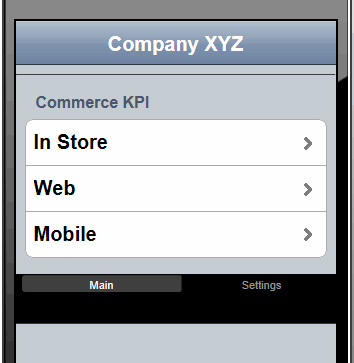
应用程序的登录页显示了导航标题、选项卡菜单和列表视图的结果:
图 1. KPI 移动应用程序的登录页
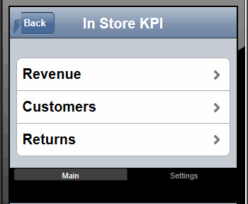
单击一个列表项时,页面会过渡到下一组列表视图。在图 2 中,选择了 In Store 选项,为用户提供了为 Revenue 、 Customers 或 Returns 选择 KPI 图表或刻度盘的选项:
图 2. 选择 KPI 的格式
步骤 1b. 验证数据访问
编写执行 RESTful 调用的 JavaScript 代码之前,验证数据是否可用是一个不错的想法。这有助于排除故障。RESTful Web 服务的好处是,对于 GET 调用,通常可以使用 Web 浏览器来验证 URL 是否正确,以及是否传递了所需的参数。
步骤 1c. 构建 KPI 指标
KPI 报告将特定于每个组织或业务单元。创建 KPI 指标的关键是使用针对仪表和图表的 Dojo 模块。以编程方式而不是以声明方式为此应用程序创建指标,这种方式让您能够利用设计选项的灵活性。
借助 Graph Dojo 图表,可以绘制出更具吸引力的曲线图和图表,让用户能够查看一段时间的 KPI,进而提供一个更加分布式的图像。请记住移动设备的屏幕大小和带宽限制。尝试提供一个有用的视图,同时将花哨的修饰保持到最少。
出于演示目的,您可以将清单 11 中的 JavaScript 放在 index.html 页面中。也可以创建您自己的 JavaScript 文件,将它们导入到主要 HTML 页面中。
清单 11. 自定义一个图表 KPI
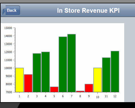
require(["dojox/charting/Chart","dojox/charting/themes/Julie", "dojox/charting/plot2d/Columns","dojox/charting/plot2d/Markers", "dojox/charting/axis2d/Default","dojo/domReady!", "dojox/charting/widget/Legend"], function(Chart, theme) { //Each item represents the monthly total revenue for the sales channel var sampleRevenueData = [10000,9200,11811,12000,7662,13887, 14200,7142,8002,10009,11288,12099]; var chart = new dojox.charting.Chart("kpiChart", { title: "Monthly Revenue Volume - 2013", titlePos: "bottom", titleGap: 25, titleFont: "normal normal normal 15pt Arial", titleFontColor: "black" }); chart.setTheme(theme); chart.addPlot("default", { type: "Columns", label: true, gap: 1, styleFunc: function(item){ if(item < 10000){ return { fill : "red" }; }else if(item > 9999 && item < 11000){ return { fill: "yellow" }; } else if(item >= 11000){ return { fill: "green" }; } return {}; } }); chart.addAxis("x"); chart.addAxis("y", { vertical: true, fixLower: "major", fixUpper: "major" }); chart.addSeries("Monthly Volume - 2013 ",sampleRevenueData); chart.render(); var chartLegend = new dojox.charting.widget.Legend( {chart: chart, horizontal: true}, "chartLegend"); }); 这段 JavaScript 代码呈现一个标绘图 (plotted chart),如图 3 所示。该 JavaScript 使用数据值上的逻辑来填充列的颜色(绿色、黄色或红色)。左侧的 ( y ) 轴表示收入,底部的 ( x ) 轴表示 1 到 12 月份。
图 3. 包含彩色编码的列的 KPI 图
模拟仪表(表示一个仪表刻度盘)最受 KPI 用户喜欢。尽管它可能在移动环境中会占据大量屏幕可用空间,但它为用户提供了一定的熟悉性,而且各个警告阈值具有彩色编码。
清单 12 中的代码演示了加载屏幕时的 Dojo Circular Linear Gauge。
清单 12. 声明仪表
require(["dojox/dgauges/components/classic/CircularLinearGauge"], function (CircularLinearGauge) { var kpiGauge = new CircularLinearGauge({ minimum: 0, maximum: 100, majorTickInterval: 25, minorTickInterval: 5 }, dojo.byId("kpiGauge")); kpiGauge.startup(); }); 接下来,我们要创建 JavaScript,在加载页面时加载和调用 RESTful 服务。如果创建了清单 5、清单 6和清单 7中描述的 Java 源文件所提供的 Java EE RESTful 服务,那么您会在清单 13 中看到抓取的数据。成功获取该数据后,会调用 addGauge 函数,在设定的数字位置呈现阈值颜色,并使用指针指向获取的数据值。
清单 13. 使用 Ajax/JSON 获取数据
require(['dojo/ready','dojo/_base/xhr'], function(ready,xhr){ ready(function () { var targetNode = dojo.byId("kpiGauge"); xhr.get({ url:"resources/kpi", handleAs:"json",timeout:10, load: function(data){ var parsedJSON = dojo.fromJson(dojo.toJson(data)); addGauge(parsedJSON.dailyReturnMetric); }, error: function (error) { targetNode.innerHTML = "An unexpected error occurred: " + error; } }); }); }); addGauge 函数自定义仪表的呈现方式:
清单 14. 自定义 Gauge KPI
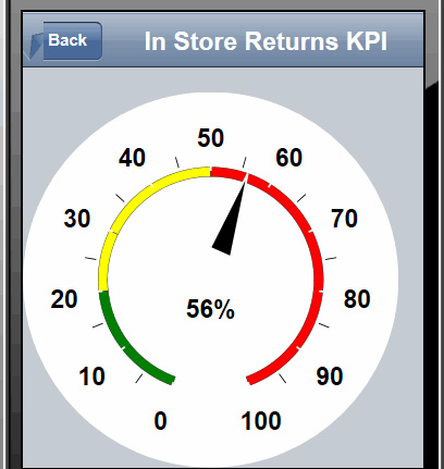
function addGauge(value) { require(["dojo/ready","dojo/dom","dojo/_base/xhr", "dijit", "dojox/dgauges/TextIndicator", "dojox/dgauges/LinearScaler","dojox/dgauges/CircularScale", "dojox/dgauges/CircularRangeIndicator","dojox/dgauges/CircularValueIndicator"], function (ready,dom, xhr,dijit, TextIndicator, LinearScaler, CircularScale, CircularRangeIndicator,CircularValueIndicator) { ready(function () { var kpiGauge = dijit.registry.byId("kpiGauge"); kpiGauge.addElement("background", function(g){ g.createEllipse({ cx: 100, cy: 100, rx: 100, ry: 100 }).setFill("#FFFFFF"); // The background fill of our gauge. This overrides the default fill }); // Set our range values and tick increments var range = new LinearScaler({ minimum: 0, // scale starting value ( i.e. 0 ) maximum: 100, // scale ending value (i.e.100 ) majorTickInterval: 10, // Big ticks every 10th value, 10,20,30,40, etc. minorTickInterval: 5 // minor tick lines every 5th value }); var scale = new CircularScale({ scaler: range, originX: 100, originY: 100, startAngle: 110, endAngle: 70, radius: 70, labelPosition: "outside", tickShapeFunc: function(group, scale, tick){ return group.createLine({ x1: tick.isMinor ? 2 : 0, y1: 0, x2: tick.isMinor ? 8 : 12, y2: 0 }).setStroke({ color: tick.isMinor ? "black" : "white", width: tick.isMinor ? 0.5 : 1 }); } }); kpiGauge.addElement("scale", scale); // This is our needle var indicator = new CircularValueIndicator({ interactionArea: "none", indicatorShapeFunc: function(group){ return group.createPolyline([15, -6, 60, 0, 15, 6, 16, -6]) .setFill("black").setStroke("white"); }, value : value }); scale.addIndicator("indicator", indicator); // Our Green threshold is set var rangeIndicatorGreen = new CircularRangeIndicator({ start: 0, value: 20, // End our Green max on the gauge radius: 60, startThickness:5, endThickness: 5, fill: "green", interactionMode: "none" }); scale.addIndicator("rangeIndicatorGreen", rangeIndicatorGreen, true); // Our Yellow threshold is set var rangeIndicatorYellow = new CircularRangeIndicator({ start: 20, value: 50, // End our Yellow max on the gauge radius: 60, startThickness:5, endThickness: 5, fill: "yellow", interactionMode: "none" }); scale.addIndicator("rangeIndicatorYellow", rangeIndicatorYellow, true) // Our Red threshold is et var rangeIndicatorRed = new CircularRangeIndicator({ start: 50, value: 100, // End our red max on the gauge radius: 60, startThickness:5, endThickness: 5, fill: "red", interactionMode: "none" }); scale.addIndicator("rangeIndicatorRed", rangeIndicatorRed, true); // The sets the text of the current value var indicatorText = new TextIndicator(); indicatorText.set("value", value + "%"); indicatorText.set("x", 100); indicatorText.set("y", 120); kpiGauge.addElement("indicatorText", indicatorText); }); }); } 该仪表使用彩色编码来表示各种阈值,其中红色是 “问题” 指示器,在这里可以看到。在这个 KPI 中,返回值为 56%,表示存在问题。业务用户可能会分析这个问题来揭示问题根源。
图 4. KPI 模拟仪表
步骤 2. 测试应用程序
使用针对各种设备的移动浏览器模拟器,测试您的 Dojo Mobile KPI 应用程序是件很轻松的事。
步骤 2a. 使用模拟器
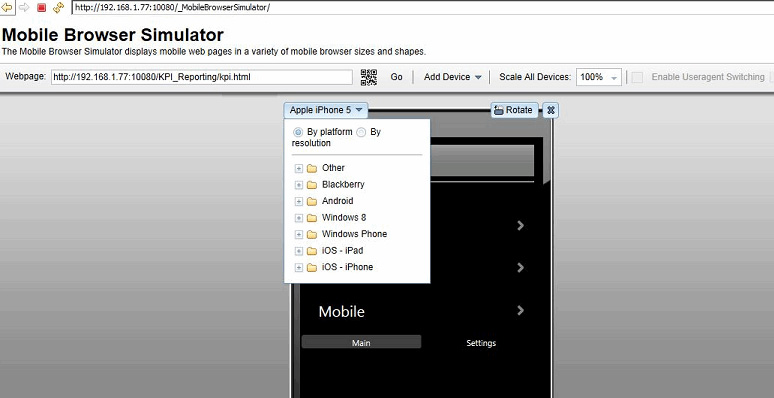
移动浏览器模拟器是一个测试 Dojo Mobile KPI 应用程序的出色的应用程序,可以将它直接用于 MobileFirst Platform 应用程序,模拟广泛的移动设备。在本地运行时,导航到 http://localhost:10080/_MobileBrowserSimulator/ ,然后输入移动应用程序的 URL,在各种模拟设备上查看它。选项包括 Android、BlackBerry 和 iOS 设备的许多变体。为减轻在设备浏览器中输入主机名的痛苦,该模拟器甚至随带了一个 QR 代码,在您准备好在实际的移动设备上测试时,可以利用该代码来输入您想要测试的 URL。
图 5. MobileFirst Platform 开发服务器移动模拟器
点击查看大图
关闭 [x]
图 5. MobileFirst Platform 开发服务器移动模拟器
步骤 2b. 在设备上测试
应用程序在模拟器中通过后,使用可用的移动设备执行最终测试。确保没有防火墙或网络问题存在,使用移动设备的浏览器导航到应用程序 URL 或从模拟器采集 QR 代码。
结束语
您现在已拥有一个实用的操作说明,您可以依照该说明,使用 Dojo Mobile 的图表、曲线图和仪表来构建可从移动设备访问的快捷、高效的 KPI 仪表板。开发移动 KPI 仪表板与为桌面环境开发 KPI 仪表板没有太大区别。对于熟悉 Dojo Toolkit 的开发人员,应用程序示例中使用的图表、曲线图和仪表模块很容易使用 Dojo Mobile 移植到移动领域。
正文到此结束
- 本文标签: 电子商务 服务器 解析 软件 数据 Apple IBM json 缩小 标题 API web Android 组织 js Developer UI 时间 tab Select dependencies cat RESTful java HTML list ip Ajax jquery 代码 测试 DOM 参数 产品 移动设备 目录 App value eclipse final 配置 HTML5 协议 parse REST tar IDE 空间 node key 开发 安装
- 版权声明: 本文为互联网转载文章,出处已在文章中说明(部分除外)。如果侵权,请联系本站长删除,谢谢。
- 本文海报: 生成海报一 生成海报二
热门推荐


相关文章

近期评论
-
谢谢
-
https://www.newcmy.com/register?aff=HBVX建议您试试草莓云机场,可以流畅观看youtube和tiktok,上reddit/x也没有问题,还有各种ai优化节点。
-
-
-
想购买您这个站,我的联系方式QQ741756694微信同步 能卖联系
-
-
-
-
-
https://www.liuhaihua.cn/archives/40657.html 这篇博客中的图片打不开了
Loading...
![[HBLOG]公众号](https://www.liuhaihua.cn/img/qrcode_gzh.jpg)