使用 CSS3 绘制 Hello Kitty
偶然间看到了 SegmentFault 上的 一篇文章 ,感觉这个 Hello Kitty 画的还不错,心血来潮也用 CSS3 画了个 Hello Kitty,现在在这里记录一下详细的绘制过程。想要源码、素材、在线演示的同学可以直接拉到最下面。
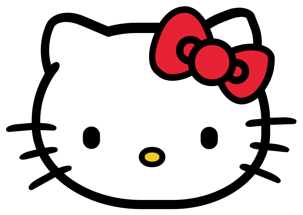
我们先看下原图:
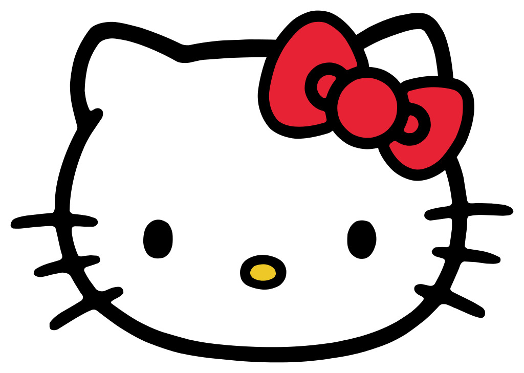
结构分解
从上图可以看出,Hello Kitty 由脸蛋、耳朵、红色蝴蝶结、眼睛、鼻子和六根胡须构成,所以 DOM 结构也相对简单:
<divclass="hello-kitty-div">
<!-- 脸蛋 -->
<divclass="face"></div>

<!-- 左耳 -->
<divclass="left-ear"></div>
<divclass="left-ear-clean"></div>
<divclass="left-ear-beautify"></div>
<!-- 右耳 -->
<divclass="right-ear"></div>
<divclass="right-ear-clean"></div>

<!-- 蝴蝶结 -->
<divclass="bowknot-outside-left-top-container">
<divclass="bowknot-outside-left-top"></div>
</div>
<divclass="bowknot-outside-left-bottom-container">
<divclass="bowknot-outside-left-bottom"></div>
</div>
<divclass="bowknot-outside-right-top-container">
<divclass="bowknot-outside-right-top"></div>
</div>
<divclass="bowknot-outside-right-bottom-container">
<divclass="bowknot-outside-right-bottom"></div>
</div>
<divclass="bowknot-inside-left"></div>
<divclass="bowknot-inside-right"></div>
<divclass="bowknot-inside-center"></div>

<!-- 左眼 -->
<divclass="left-eye"></div>
<!-- 右眼 -->
<divclass="right-eye"></div>

<!-- 鼻子 -->
<divclass="nose"></div>

<!-- 左胡须 -->
<divclass="left-moustache-1"></div>
<divclass="left-moustache-2"></div>
<divclass="left-moustache-3"></div>
<!-- 右胡须 -->
<divclass="right-moustache-1"></div>
<divclass="right-moustache-2"></div>
<divclass="right-moustache-3"></div>
</div>
开始绘制
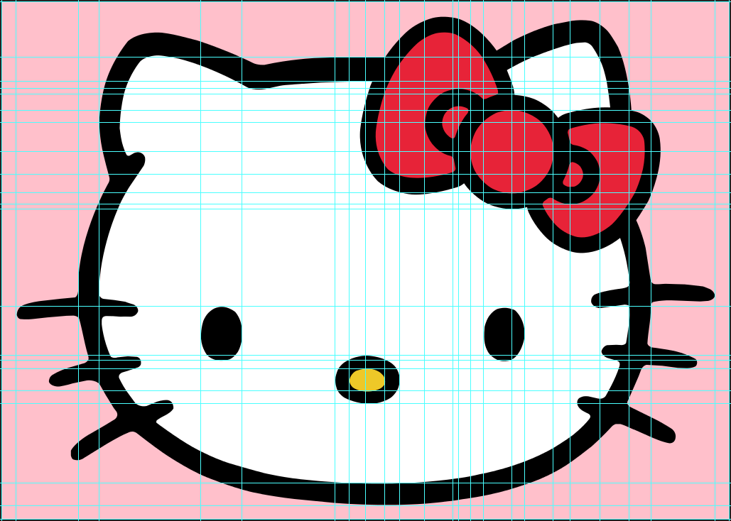
可以利用 Photoshop 的参考线精确的计算出元素的 left、top、width、height、border-width 以及四个角的水平 radius 值和垂直 radius 值,有偏差的地方再微调一下基本就可以了。
脸蛋
.hello-kitty-div.face{
left:107px;
top:77px;
width:747px;
height:566px;
border-top:35pxsolid black;
border-bottom:31pxsolid black;
border-left:29pxsolid black;
border-right:30pxsolid black;
border-top-left-radius:355px333px;
border-top-right-radius:355px333px;
border-bottom-left-radius:370px285px;
border-bottom-right-radius:330px255px;
background-color: white;
z-index:100;
}
左耳
.hello-kitty-div.left-ear{
left:112px;
top:61px;
width:250px;
height:250px;
border-top:33pxsolid black;
border-bottom:30pxsolid black;
border-left:28pxsolid black;
border-right:30pxsolid black;
border-top-left-radius:138px100px;
border-bottom-left-radius:334px310px;
background-color: white;
transform:rotate(23deg);
z-index:99;
}

让耳朵和脸蛋连为一体:
.hello-kitty-div.left-ear-clean{
left:146px;
top:96px;
width:250px;
height:250px;
border-top-left-radius:138px100px;
border-bottom-left-radius:360px310px;
background-color: white;
transform:rotate(23deg);
z-index:101;
}
再稍加点缀,美化一下:
.hello-kitty-div.left-ear-beautify{
left:149px;
top:221px;
width:60px;
height:30px;
border-top-left-radius:20px15px;
border-top-right-radius:25px15px;
border-bottom-left-radius:20px15px;
border-bottom-right-radius:25px15px;
background-color: black;
transform:rotate(-52deg);
z-index:102;
}
右耳
.hello-kitty-div.right-ear{
left:600px;
top:50px;
width:250px;
height:250px;
border-top:33pxsolid black;
border-bottom:28pxsolid black;
border-left:30pxsolid black;
border-right:29pxsolid black;
border-top-left-radius:220px170px;
border-top-right-radius:90px57px;
border-bottom-right-radius:334px245px;
background-color: white;
transform:rotate(-21deg);
z-index:99;
}

.hello-kitty-div.right-ear-clean{
left:700px;
top:105px;
width:120px;
height:120px;
background-color: white;
z-index:101;
}
右耳画的比较粗糙,因为马上就要画蝴蝶结了。
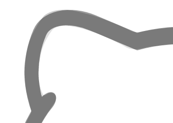
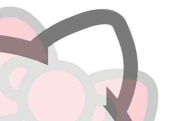
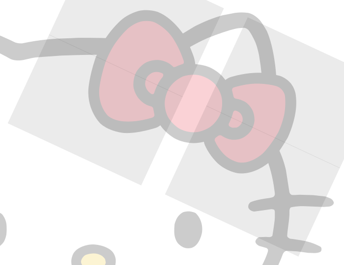
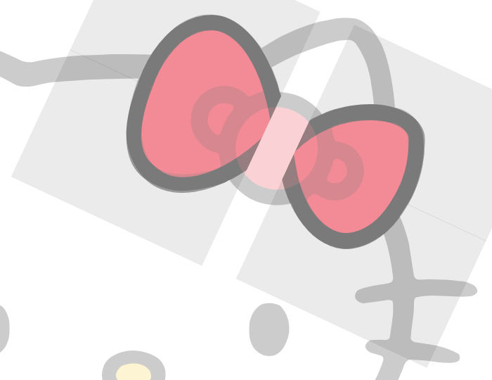
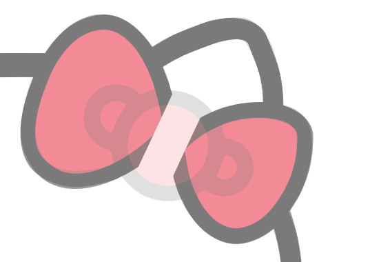
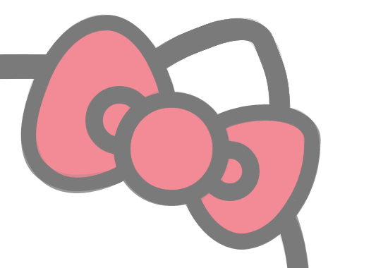
蝴蝶结
蝴蝶结分为两个外边,三个圆。外边是整个绘画过程中最难画的地方,用矩形调整 radius 参数很难做到没有偏差,因为它不像是更圆润的矩形,而像是更圆润的三角形。在这里,我们把它分成四块,各个外边各两块,在块内绘制好对应的区域,再利用 overflow: hidden; 来隐藏多余的部分。然后是三个圆,相对简单。
代码量实在太多,就不贴出来了,大概思路就这样子。
眼睛,鼻子
眼睛和鼻子相对简单,就不贴代码了。

胡须
因为胡须是弯弯的,所以每根胡须需要两个元素来实现,我们就用 :before 和 :after 吧。
某一根胡须的代码:
.hello-kitty-div.left-moustache-1:before{
content:'/20';
display: block;
position: absolute;
left:20px;
top:420px;
width:100px;
height:24px;
border-top-left-radius:80px30px;
border-bottom-left-radius:20px;
background-color: black;
transform:rotate(-5deg);
z-index:101;
}

.hello-kitty-div.left-moustache-1:after{
content:'/20';
display: block;
position: absolute;
left:131px;
top:418px;
width:60px;
height:24px;
border-top-right-radius:100px30px;
border-bottom-right-radius:20px;
background-color: black;
transform:rotate(2deg);
z-index:101;
}
现在,整个 Hello Kitty 就画完了,有没有觉得很可爱? ~~(ฅ>ω<*ฅ)~~ 。
最后
完整源码及素材: https://github.com/chnhyg/css3-hello-kitty
在线演示: http://chnhyg.coding.me/css3-hello-kitty
正文到此结束
热门推荐


相关文章


Loading...
![[HBLOG]公众号](https://www.liuhaihua.cn/img/qrcode_gzh.jpg)

