CSS3 动画
概览
通过 CSS3,我们能够创建动画,这可以在许多网页中取代动画图片、Flash 动画以及 JavaScript。
由于是CSS3 嘛,所以部分旧版本浏览器当然无法完美呈现,节哀。
小试牛刀
学习任何东西都需要有一定的成就感才会有继续学习的动力,先别管那么多,先让我们的动画动起来。
<!DOCTYPE html> <html> <head> <style> @keyframes myfirst { from {background:red;} to {background:yellow;} } /* Firefox */ @-moz-keyframes myfirst { from {background:red;} to {background:yellow;} } /* Safari and Chrome */ @-webkit-keyframes myfirst { from {background:red;} to {background:yellow;} } /* Opera */ @-o-keyframes myfirst { from {background:red;} to {background:yellow;} } div { width:100px; height:100px; margin: 50px auto; background:red; animation:myfirst 5s; -moz-animation:myfirst 5s; /* Firefox */ -webkit-animation:myfirst 5s; /* Safari and Chrome */ -o-animation:myfirst 5s; /* Opera */ } </style> </head> <body> <div></div> </body> </html> 
是不是很简单,很炫酷呀?
实现CSS3 动画需要至少以下几个条件:
-
使用
@keyframes创建动画并命名 -
使用
animation简写属性 或 其他具体属性 调用动画并设置动画时长 -
将
animation绑定到某个选择器上
下面具体介绍各相关属性吧。
创建动画 @keyframes
通过 @keyframes 规则,您能够创建动画。
创建动画的原理是将一套 CSS 样式逐渐变化为另一套样式。
在动画过程中,您能够多次改变这套 CSS 样式。
以百分比来规定改变发生的时间,或者通过关键词 from 和 to 来规定改变发生的时间。
0% 是动画的开始时间,100% 动画的结束时间。
为了获得最佳的浏览器支持,您应该始终定义 0% 和 100% 选择器。
@keyframes myfirst { 0% {background: red; left:0px; top:0px;} 25% {background: yellow; left:200px; top:0px;} 50% {background: blue; left:200px; top:200px;} 75% {background: green; left:0px; top:200px;} 100% {background: red; left:0px; top:0px;} } /* Firefox */ @-moz-keyframes myfirst { 0% {background: red; left:0px; top:0px;} 25% {background: yellow; left:200px; top:0px;} 50% {background: blue; left:200px; top:200px;} 75% {background: green; left:0px; top:200px;} 100% {background: red; left:0px; top:0px;} } /* Safari 和 Chrome */ @-webkit-keyframes myfirst { 0% {background: red; left:0px; top:0px;} 25% {background: yellow; left:200px; top:0px;} 50% {background: blue; left:200px; top:200px;} 75% {background: green; left:0px; top:200px;} 100% {background: red; left:0px; top:0px;} } /* Opera */ @-o-keyframes myfirst { 0% {background: red; left:0px; top:0px;} 25% {background: yellow; left:200px; top:0px;} 50% {background: blue; left:200px; top:200px;} 75% {background: green; left:0px; top:200px;} 100% {background: red; left:0px; top:0px;} } 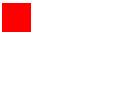
调用动画 animation
上面我们使用 @keyframes 创建了动画,接下来我们来调用动画。
上面也说了,调用动画最基本的是动画名称和动画花费的时间,下面将具体介绍动画调用的相关属性。
animation-name
指定要调用的动画。
animation-name: keyframename | none; none 规定无动画效果(可用于覆盖来自级联的动画)。
keyframename 命名遵循如下规则:
名字可以是字母,数字, _ 或 - ,区分大小写,只能以字母或单 - 开头,不能使用 none , unset , initial , inherit 关键字。
animation-duration
animation-duration 属性定义动画完成一个周期所需要的时间,以秒或毫秒计。
animation-duration: 2s; /*等价于 2000ms*/ animation-timing-function
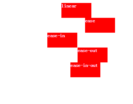
animation-timing-function 规定动画的速度曲线。
animation-timing-function: value; 此属性值使用名为三次贝塞尔(Cubic Bezier)函数的数学函数来生成速度曲线。
有如下值可选:
| 值 | 描述 |
|---|---|
linear | 动画从头到尾的速度是相同的。 |
ease | 默认。动画以低速开始,然后加快,在结束前变慢。 |
ease-in | 动画以低速开始。 |
ease-out | 动画以低速结束。 |
ease-in-out | 动画以低速开始和结束。 |
cubic-bezier(n, n, n, n) | 在 cubic-bezier 函数中自己的值。可能的值是从 0 到 1 的数值。 |
5 个预定义关键字对应的贝塞尔函数为:
linear: cubic-bezier(0.0, 0.0, 1.0, 1.0) ease: cubic-bezier(0.25, 0.1, 0.25, 1.0) ease-in: cubic-bezier(0.42, 0, 1.0, 1.0) ease-out: cubic-bezier(0, 0, 0.58, 1.0) ease-in-out: cubic-bezier(0.42, 0, 0.58, 1.0)简单体会一下 5 种速度曲线的效果:
想亲自去体验各种值对速度的影响,请移步这里: 贝塞尔速度曲线
animation-delay
animation-delay 属性定义动画何时开始。
animation-delay: time; 值以秒或毫秒计。允许负值,-2s 使动画马上开始,但跳过 2 秒进入动画。
animation-iteration-count
animation-iteration-count 属性定义动画的播放次数。
animation-iteration-count: n | infinite; n 表示具体的次数,默认为1, infinite 规定无限次播放。
animation-direction
animation-direction 属性定义是否应该轮流反向播放动画。
animation-direction: normal | reverse | alternate | alternate-reverse; 两个关键字可选, normal 表示动画正常播放,默认值,从 0% -> 100% 再从 0% -> 100% . reverse 与 normal 相反,从 100% -> 0% 再从 100% -> 0% . alternate 表示轮流反向播放,从 0% -> 100% 再从 100% -> 0% 再从 0% -> 100% . alternate-reverse 与 alternate 相反。
animation-play-state
animation-play-state 属性规定动画正在运行还是暂停。
animation-play-state: paused | running; paused 表示动画正在暂停,动画不会动。 running 表示动画正在动,默认。
animation
此属性为上述七个具体属性的简写属性。
animation: name duration timing-function delay iteration-count direction play-state; 小结
对CSS3 动画先简单了解这么多,后续可能有新内容再补充。
参考资料
正文到此结束
热门推荐


相关文章

近期评论
-
谢谢
-
https://www.newcmy.com/register?aff=HBVX建议您试试草莓云机场,可以流畅观看youtube和tiktok,上reddit/x也没有问题,还有各种ai优化节点。
-
-
-
想购买您这个站,我的联系方式QQ741756694微信同步 能卖联系
-
-
-
-
-
https://www.liuhaihua.cn/archives/40657.html 这篇博客中的图片打不开了
Loading...
![[HBLOG]公众号](https://www.liuhaihua.cn/img/qrcode_gzh.jpg)

