用 Seaborn 画出好看的分布图(Python)
%matplotlib inline
Populating the interactive namespace from numpy and matplotlib import seaborn as sns import numpy as np from numpy.random import randn import matplotlib as mpl import matplotlib.pyplot as plt from scipy import stats # style set 这里只是一些简单的style设置 sns.set_palette('deep', desat=.6) sns.set_context(rc={'figure.figsize': (8, 5) } ) np.random.seed(1425) # figsize是常用的参数.最简单的hist (直方图)
最简单的hist是使用一列数据(series)作为输入, 也不用考虑其它的参数.
data = randn(75) plt.hist(data) (array([ 2., 5., 4., 10., 12., 16., 7., 7., 6., 6.]), array([-2.04713616, -1.64185099, -1.23656582, -0.83128065, -0.42599548, -0.02071031, 0.38457486, 0.78986003, 1.1951452 , 1.60043037, 2.00571554]), <a list of 10 Patch objects>) 
# 增加一些参数, 就能画出别样的风采 data = randn(100) plt.hist(data, bins=12, color=sns.desaturate("indianred", .8), alpha=.4) (array([ 2., 3., 3., 11., 10., 15., 10., 17., 10., 8., 7., 4.]), array([-2.56765228, -2.1665249 , -1.76539753, -1.36427015, -0.96314278, -0.5620154 , -0.16088803, 0.24023935, 0.64136672, 1.0424941 , 1.44362147, 1.84474885, 2.24587623]), <a list of 12 Patch objects>) 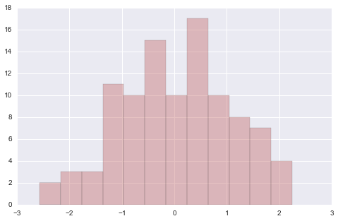
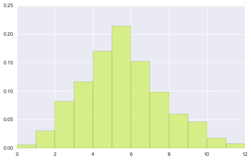
# 以上数据是单总体, 双总体的hist data1 = stats.poisson(2).rvs(100) data2 = stats.poisson(5).rvs(500) max_data = np.r_[data1, data2].max() bins = np.linspace(0, max_data, max_data+1) #plt.hist(data1) # # 首先将2个图形分别画到figure中 plt.hist(data1, bins, normed=True, color="#FF0000", alpha=.9) plt.figure() plt.hist(data2, bins, normed=True, color="#C1F320", alpha=.5) (array([ 0.006, 0.03 , 0.082, 0.116, 0.17 , 0.214, 0.152, 0.098, 0.06 , 0.046, 0.018, 0.008]), array([ 0., 1., 2., 3., 4., 5., 6., 7., 8., 9., 10., 11., 12.]), <a list of 12 Patch objects>) 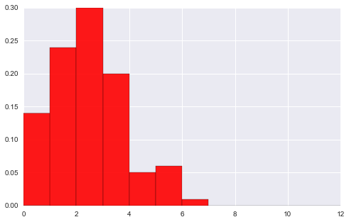
# 观察下面图形 可以看出nomed参数的作用 -- # 首先还是各自绘出自己的分布hist, 然后将二者重合部分用第三颜色加以区别. plt.hist(data1, bins, normed=True, color="#FF0000", alpha=.9) plt.hist(data2, bins, normed=True, color="#C1F320", alpha=.5) (array([ 0.006, 0.03 , 0.082, 0.116, 0.17 , 0.214, 0.152, 0.098, 0.06 , 0.046, 0.018, 0.008]), array([ 0., 1., 2., 3., 4., 5., 6., 7., 8., 9., 10., 11., 12.]), <a list of 12 Patch objects>) 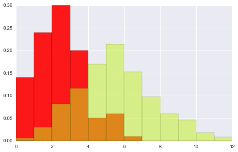
# hist 其它参数 x = stats.gamma(3).rvs(5000); #plt.hist(x, bins=80) # 每个bins都有分界线 # 若想让图形更连续化 (去除中间bins线) 用histtype参数 plt.hist(x, bins=80, histtype="stepfilled", alpha=.8) (array([ 19., 27., 53., 97., 103., 131., 167., 176., 196., 215., 214., 202., 197., 153., 202., 214., 181., 160., 175., 179., 148., 148., 117., 130., 125., 122., 100., 102., 80., 85., 66., 67., 58., 51., 56., 42., 52., 36., 37., 26., 29., 19., 26., 21., 26., 19., 16., 12., 12., 17., 12., 9., 10., 4., 4., 6., 4., 7., 3., 6., 1., 3., 3., 1., 1., 2., 0., 0., 1., 2., 3., 1., 2., 3., 1., 2., 1., 0., 0., 2.]), array([ 0.13431232, 0.28186933, 0.42942633, 0.57698333, 0.72454033, 0.87209734, 1.01965434, 1.16721134, 1.31476834, 1.46232535, 1.60988235, 1.75743935, 1.90499636, 2.05255336, 2.20011036, 2.34766736, 2.49522437, 2.64278137, 2.79033837, 2.93789538, 3.08545238, 3.23300938, 3.38056638, 3.52812339, 3.67568039, 3.82323739, 3.9707944 , 4.1183514 , 4.2659084 , 4.4134654 , 4.56102241, 4.70857941, 4.85613641, 5.00369341, 5.15125042, 5.29880742, 5.44636442, 5.59392143, 5.74147843, 5.88903543, 6.03659243, 6.18414944, 6.33170644, 6.47926344, 6.62682045, 6.77437745, 6.92193445, 7.06949145, 7.21704846, 7.36460546, 7.51216246, 7.65971947, 7.80727647, 7.95483347, 8.10239047, 8.24994748, 8.39750448, 8.54506148, 8.69261849, 8.84017549, 8.98773249, 9.13528949, 9.2828465 , 9.4304035 , 9.5779605 , 9.7255175 , 9.87307451, 10.02063151, 10.16818851, 10.31574552, 10.46330252, 10.61085952, 10.75841652, 10.90597353, 11.05353053, 11.20108753, 11.34864454, 11.49620154, 11.64375854, 11.79131554, 11.93887255]), <a list of 1 Patch objects>) 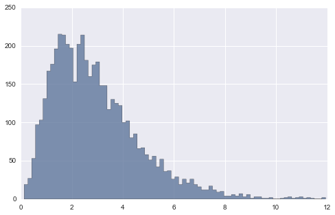
# 上面的多总体hist 还是独立作图, 并没有将二者结合, # 使用jointplot就能作出联合分布图形, 即, x总体和y总体的笛卡尔积分布 # 不过jointplot要限于两个等量总体. # jointplot还是非常实用的, 对于两个连续型变量的分布情况, 集中趋势能非常简单的给出. # 比如下面这个例子 x = stats.gamma(2).rvs(5000) y = stats.gamma(50).rvs(5000) with sns.axes_style("dark"): sns.jointplot(x, y, kind="hex") 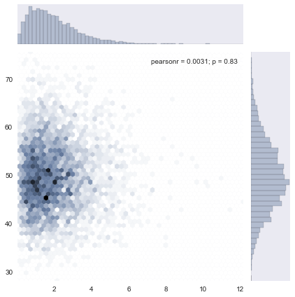
# 下面用使用真实一点的数据作个dmeo import pandas as pd from pandas import read_csv df = read_csv("test.csv", index_col='index') df[:2]| department | typecity | product | credit | ddate | month_repay | apply_amont | month_repay_real | amor | tst_amount | salary_net | LTI | DTI | pass | deny | |
|---|---|---|---|---|---|---|---|---|---|---|---|---|---|---|---|
| index | |||||||||||||||
| 13652622 | gedai | ordi | elite | CR8 | 2015/5/29 12:27 | 2000 | 40000 | 1400.90 | 36 | 30000 | 1365.30 | 21.973193 | 0.610366 | 1 | 0 |
| 13680088 | gedai | ordi | xinxin | CR16 | 2015/6/3 18:38 | 8000 | 100000 | 3589.01 | 36 | 70000 | 3598.66 | 19.451685 | 0.540325 | 1 | 0 |
clean_df = df[df['salary_net'] < 10000] sub_df = pd.DataFrame(data=clean_df, columns=['salary_net', 'month_repay'] ) with sns.axes_style("dark"): sns.jointplot('salary_net', 'month_repay', data=sub_df, kind="hex") plt.ylim([0, 10000]) plt.xlim([0, 10000]) 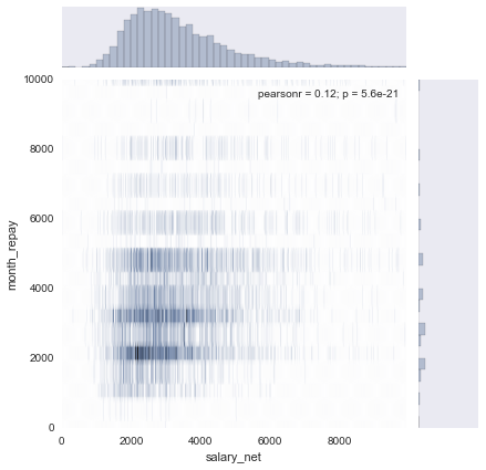
注: jointplot除了作图, 还会给出x, y的相关系数(pearson_r) 和r = 0 的假设检验p值.
下面学习新的图形: kdeplot, rugplot
# rugplot # rugplot 是比Histogram更加直观的 "Histogram" data = randn(80) plt.hist(data, alpha=0.3, color='#ffffff') sns.rugplot(data) <matplotlib.axes._subplots.AxesSubplot at 0x226826a0> 
# example # 下面的图看上去复杂, 不过也很好理解, 从一个样本点生成一个bell-curve # 这样看bell集中的地方就是数据最密集的地方. sns.rugplot(data, color='indianred') xx = np.linspace(-4, 4, 100) # 计算bandwidth bandwidth = ( ( 4*data.std() ** 5)/(3 *len(data))) ** .2 bandwidth = len(data) ** (-1. /5) #0.416276603701 print bandwidth kernels = [] for d in data: # basis function as a gaussian PDF kernel = stats.norm(d, bandwidth).pdf(xx) kernels.append(kernel) # Scale for plotting kernel /= kernel.max() kernel *= .4 plt.plot(xx, kernel, "#888888", alpha=.18) plt.ylim(0, 1) 0.416276603701 (0, 1) 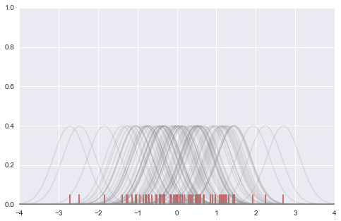
# example 2 # set-Up f, (ax1, ax2) = plt.subplots(2, 1, sharex=True) # color_palette 就是要画图用的 "调色盘" c1, c2 = sns.color_palette("husl", 3)[:2] # summed kde summed_kde = np.sum(kernels, axis=0) ax1.plot(xx, summed_kde, c=c1) sns.rugplot(data, c=c1, ax=ax1) ax1.set_title("summed basis function") # density estimate scipy_kde = stats.gaussian_kde(data)(xx) ax2.plot(xx, scipy_kde, c=c2) sns.rugplot(data, c=c2, ax=ax2) ax2.set_yticks([]) # no ticks of y ax2.set_title("scipy gaussian_kde") f.tight_layout() 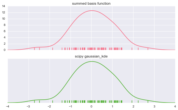
有了上面的知识, 就能理解kdeplot的作用了.
sns.kdeplot(data, shade=True) <matplotlib.axes._subplots.AxesSubplot at 0x2356ba20> 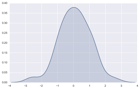
# 比较bw(bandwidth) 作用 pal = sns.blend_palette([sns.desaturate("royalblue", 0), "royalblue"], 5) bws = [.1, .25, .5, 1, 2] for bw, c in zip(bws, pal): sns.kdeplot(data, bw=bw, color=c, lw=1.8, label=bw) plt.legend(title="kernel bandwidth value") sns.rugplot(data, color="#CF3512") <matplotlib.axes._subplots.AxesSubplot at 0x225db9b0> 
# 比较不同的kernels kernels = ["biw", "cos", "epa", "gau", "tri", "triw"] for k, c in zip(kernels, pal): sns.kdeplot(data, kernel=k, color=c, label=k) plt.legend() <matplotlib.legend.Legend at 0x225db278> 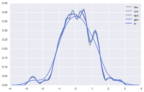
# cut, clip 参数用于对outside data ( data min左, max右) 的预测 填充 with sns.color_palette('Set2'): f, (ax1, ax2) = plt.subplots(2, 1, figsize=(8, 8), sharex=True) for cut in[4, 3, 2]: sns.kdeplot(data, cut=cut, label=cut, lw=cut*1.5, ax=ax1) for clip in[1, 2, 3]: sns.kdeplot(data, clip=(-clip, clip), label=clip, ax=ax2) 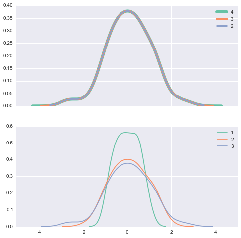
# 利用kdeplot来确定两个sample data 是否来自于同一总体 f, (ax1, ax2) = plt.subplots(2, 1, sharex=True, figsize=(8, 6)) c1, c2, c3 = sns.color_palette('Set1', 3) dist1, dist2, dist3 = stats.norm(0, 1).rvs((3, 100)) dist3 = pd.Series(dist3 + 2, name='dist3') # dist1, dist2是两个近似正态数据, 拥有相同的中心和摆动程度 sns.kdeplot(dist1, shade=True, color=c1, ax=ax1) sns.kdeplot(dist2, shade=True, color=c2, label='dist2', ax=ax1) # dist3 分布3 是另一个近正态数据, 不过中心为2. sns.kdeplot(dist1, shade=True, color=c2, ax=ax2) sns.kdeplot(dist3, shade=True, color=c3, ax=ax2) <matplotlib.axes._subplots.AxesSubplot at 0x2461a240> 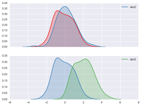
# kdeplot是密度图. # 对概率密度统计熟悉的人还会想到的是累积密度图 # kdeplot 参数 cumulative with sns.color_palette("Set1"): for d, label in zip(data, list("ABC")): sns.kdeplot(d, cumulative=True, label=label) 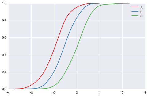
# vertical 参数 把刚才的图形旋转90度 plt.figure(figsize=(4, 8)) data = stats.norm(0, 1).rvs((3, 100)) + np.arange(3)[:, None] with sns.color_palette("Set2"): for d, label in zip(data, list("ABC")): sns.kdeplot(d, vertical=True, shade=True, label=label) # plt.hist(data, vertical=True) # error vertical不是每个函数都具有的 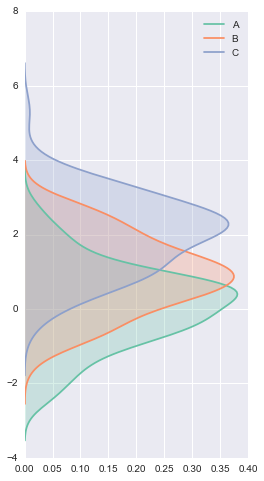
多维数据的kdeplot
data = np.random.multivariate_normal([0, 0], [[1, 2], [2, 20]], size=1000) data = pd.DataFrame(data, columns=["X", "Y"]) mpl.rc("figure", figsize=(6, 6)) sns.kdeplot(data) <matplotlib.axes._subplots.AxesSubplot at 0x23104320> 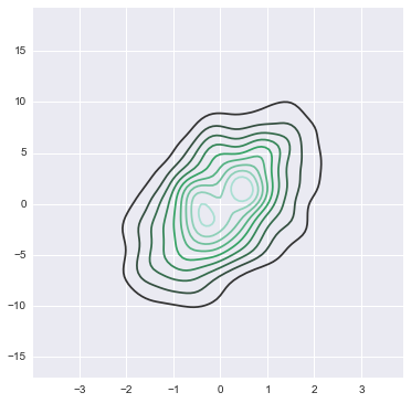
# 更多的还是用来画二维数据的density plot sns.kdeplot(data.X, data.Y, shade=True, bw="silverman", gridsize=50, clip=(-11, 11)) # gridsize参数用来指定grid尺寸 # cut clip 参数类似之前提到过的 # cmap则是用来color map映射, 相当于一个color小帽子(mask) <matplotlib.axes._subplots.AxesSubplot at 0x2768f240> 
sns.kdeplot(data.X, data.Y, shade=True, bw="silverman", gridsize=50, clip=(-11, 11), cmap="BuGn_d") sns.kdeplot(data.X, data.Y, shade=True, bw="silverman", gridsize=50, clip=(-11, 11), cmap="Purples") <matplotlib.axes._subplots.AxesSubplot at 0x26c6fa20> 
好了. 那再让我来回来想想jointplot
之前jointplot用了 kind=hex, 那么当见过了kde核函数分布图后, 可以把这二者结合到一起.
with sns.axes_style('white'): sns.jointplot('X', 'Y', data, kind='kde') 
hist增强版 - distplot
# distplot 简版就是hist 加上一根density curve sns.set_palette("hls") mpl.rc("figure", figsize=(9, 5)) data = randn(200) sns.distplot(data) <matplotlib.axes._subplots.AxesSubplot at 0x25eb34e0> 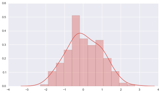
# 当然慢慢地就发现distplot的功能, 远比hist强大. sns.distplot(data, kde=True, rug=True, hist=True) # 更细致的, 来用各kwargs来指定 (参数的参数dict) sns.distplot(data, kde_kws={"color": "seagreen", "lw":3, "label" : "KDE" }, hist_kws={"histtype": "stepfilled", "color": "slategray" }) <matplotlib.axes._subplots.AxesSubplot at 0x261ffe80> 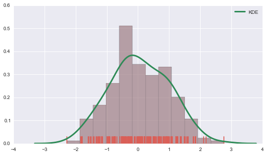
好了. 下面的图很熟悉, boxplot 与 violinplot
boxplot, 连续数据的另一种分布式描述. 以five - figures作为大概的集中趋势, 离散趋势的统计量.violinplot是与之类似, 它是在boxplot基础上增加了density curve (也就是"小提琴"的两侧曲线)
A violin plot is a method of plotting numeric data. It is a box plot with a rotated kernel density plot on each side.[1]
more info at wiki
# first 先来看boxplot sns.set(rc={"figure.figsize": (6, 6)}) data = [randn(100), randn(120) + 1.5] plt.boxplot(data) # 这是一个简单版"dataframe", 由两列不等长的series(array)组成, 没有index columns所以在图中默认用1,2,3代替 {'boxes': [<matplotlib.lines.Line2D at 0x25747908>, <matplotlib.lines.Line2D at 0x26995048>], 'caps': [<matplotlib.lines.Line2D at 0x2574c6d8>, <matplotlib.lines.Line2D at 0x2574cc50>, <matplotlib.lines.Line2D at 0x26995d68>, <matplotlib.lines.Line2D at 0x2699f320>], 'fliers': [<matplotlib.lines.Line2D at 0x2576e780>, <matplotlib.lines.Line2D at 0x2699fe10>], 'means': [], 'medians': [<matplotlib.lines.Line2D at 0x2576e208>, <matplotlib.lines.Line2D at 0x2699f898>], 'whiskers': [<matplotlib.lines.Line2D at 0x25747b38>, <matplotlib.lines.Line2D at 0x2574c160>, <matplotlib.lines.Line2D at 0x26995278>, <matplotlib.lines.Line2D at 0x269957f0>]} 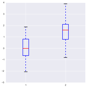
# 上面的图形是mpl module画出来的, 比较"ugly" # 来看看seaborn画出来的样貌 sns.boxplot(data) # ... 可能只是两种不同的风格吧! <matplotlib.axes._subplots.AxesSubplot at 0x26926160> 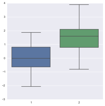
# 当然, 如果可以, 最好我们能指定两组分布更多的信息 sns.boxplot(data, names=['left', 'right'], whis=np.inf, color='indianred') <matplotlib.axes._subplots.AxesSubplot at 0x24513160> 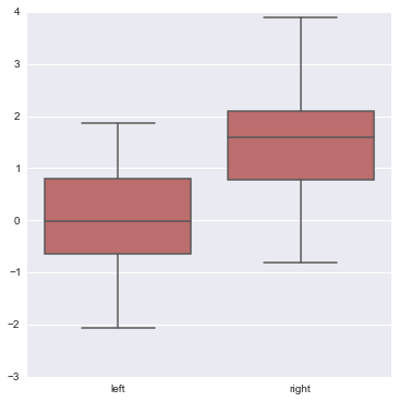
# 其它参数demo sns.boxplot(data, names=['down', 'up'],linewidth=2, widths =.5, vert=False, color='slategray') <matplotlib.axes._subplots.AxesSubplot at 0x2673edd8> 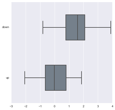
# join_rm 参数 rm 是指 repeated-measures data 重复观测 # 为了彰显重复观测的效应, 可使用join_rm参数==True pre = randn(25) post = pre+ np.random.rand(25) sns.boxplot([pre, post], names=["left", "right"], color="coral", join_rm =True) <matplotlib.axes._subplots.AxesSubplot at 0x2598d1d0> 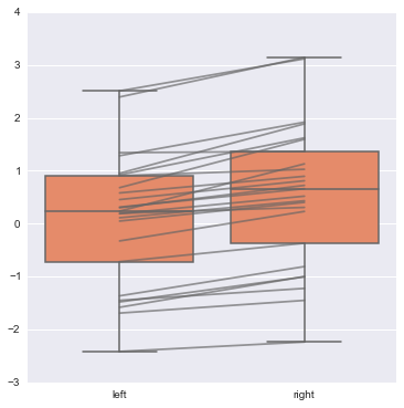
# 下面介绍violinplot, 而且是从boxplot开始讲起. # 这也是非常喜欢这个module(作者)的原因, 很合我的味口 d1 = stats.norm(0, 5).rvs(100) d2 = np.concatenate([stats.gamma(4).rvs(50), -1 * stats.gamma(4).rvs(50) ]) data = pd.DataFrame(dict(d1=d1, d2=d2)) sns.boxplot(data, color="pastel", widths=.5) <matplotlib.axes._subplots.AxesSubplot at 0x28c3c080> 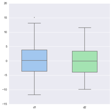
# 看上面两个boxplot 分布是很接近的, 但有多像? 无法定量 # 简单的boxplot是定性的描述, 用来比较时更不能定量比较相似程度 sns.violinplot(data, color="pastel") <matplotlib.axes._subplots.AxesSubplot at 0x29058240> 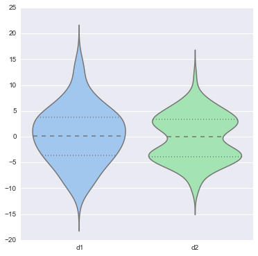
# 这个时候 2个sample分布就不像了... # boxplot violinplot 常常用来 比较 一个分组(离散) X 一个连续变量的各组差异 # 因此若有DataFrame结构, 要尽量学着使用groupby操作. y = np.random.randn(200) g = np.random.choice(list('abcdef'), 200) for i, l in enumerate('abcdef'): y[g == l] += i // 2 df = pd.DataFrame(dict(score=y, group=g)) sns.boxplot(df.score, df.group) <matplotlib.axes._subplots.AxesSubplot at 0x2908fe80> 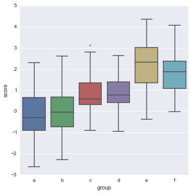
# 到最后, 我看到了作者用到了我特别喜欢的一个词 tune # violinplot 就相当于是对boxplot一个tuning的过程, 哦, 想到了老罗. sns.violinplot(df.score, df.group, color="Paired", bw=1) <matplotlib.axes._subplots.AxesSubplot at 0x28feec88> 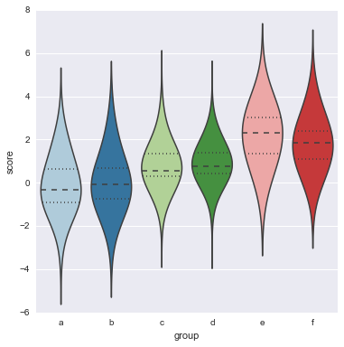
# 关于names(组名称list), 默认的画图顺序是 array顺序, 也能额外用order参数指定 order = list('cbafed') sns.boxplot(df.score, df.group, order=order, color='PuBuGn_d') <matplotlib.axes._subplots.AxesSubplot at 0x24ce4d68> 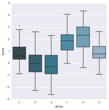
在复杂的violinplot基础上再tune一点
# 使用参数 inner # inner : {‘box’ | ‘stick’ | ‘points’} # Plot quartiles or individual sample values inside violin. y = np.random.randn(200) g = np.random.choice(list("abcdef"), 200) for i, l in enumerate("abcdef"): y[g == l] += i // 2 df = pd.DataFrame(dict(score=y, group=g)) sns.boxplot(df.score, df.group); 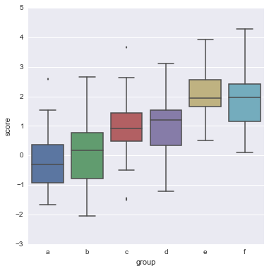
正文到此结束
热门推荐


相关文章


Loading...
![[HBLOG]公众号](http://www.liuhaihua.cn/img/qrcode_gzh.jpg)