怎么使用Toolbar之集成与属性配置
自 Toolbar 面世也有些年头了,但线上项目中一直没有机会使用。想着再不用就太对不起这么好的控件了,所以最近抽空研究了下Toolbar。写下这篇文章,做个总结。
Toolbar 的问世是为了替换以前的ActionBar,它比 ActionBar 的使用更加灵活方便,它可以放在布局中的任何位置。不过一般都是把Toolbar放在布局的顶部来使用的。下面我就一步步学习下怎么使用Toolbar吧。
集成
Toolba这个控件是谷歌在 14年10月份 加入到v7 appcompat兼容包中的。因此,要在项目中使用Toolb的话就必须要引入v7 appcompat包咯。现在用Android Studio创建项目会默认引入该包,如果是使用原来的老项目的话,可以手动引入。只需要在module的build.gradle的依赖里加入下面这行代码即可。
compile 'com.android.support:appcompat-v7:23.1.0'
然后就可以在xml或者java中像普通控件那样使用Toolbar了。可以先看下下面这个xml的运行效果。
<?xml version="1.0" encoding="utf-8"?>
<android.support.design.widget.CoordinatorLayout
    xmlns:android="http://schemas.android.com/apk/res/android"
    xmlns:app="http://schemas.android.com/apk/res-auto"
    xmlns:tools="http://schemas.android.com/tools"
    android:layout_width="match_parent"
    android:layout_height="match_parent"
    android:fitsSystemWindows="true"
    tools:context="com.demo.activity.MainActivity">

    <android.support.design.widget.AppBarLayout
        android:layout_width="match_parent"
        android:layout_height="wrap_content"
        android:theme="@style/AppTheme.AppBarOverlay">

        <android.support.v7.widget.Toolbar
            android:id="@+id/toolbar"
            android:layout_width="match_parent"
            android:layout_height="?attr/actionBarSize"
            android:background="?attr/colorPrimary"
            app:popupTheme="@style/AppTheme.PopupOverlay"/>

    </android.support.design.widget.AppBarLayout>

    <android.support.v7.widget.RecyclerView
        android:id="@+id/recycler_view"
        android:layout_width="match_parent"
        android:layout_height="wrap_content" />

</android.support.design.widget.CoordinatorLayout>
注这里使用到了 CoordinatorLayout 这个控件,暂时就把他想象成RelativeLayout就行了,后面会介绍到它。
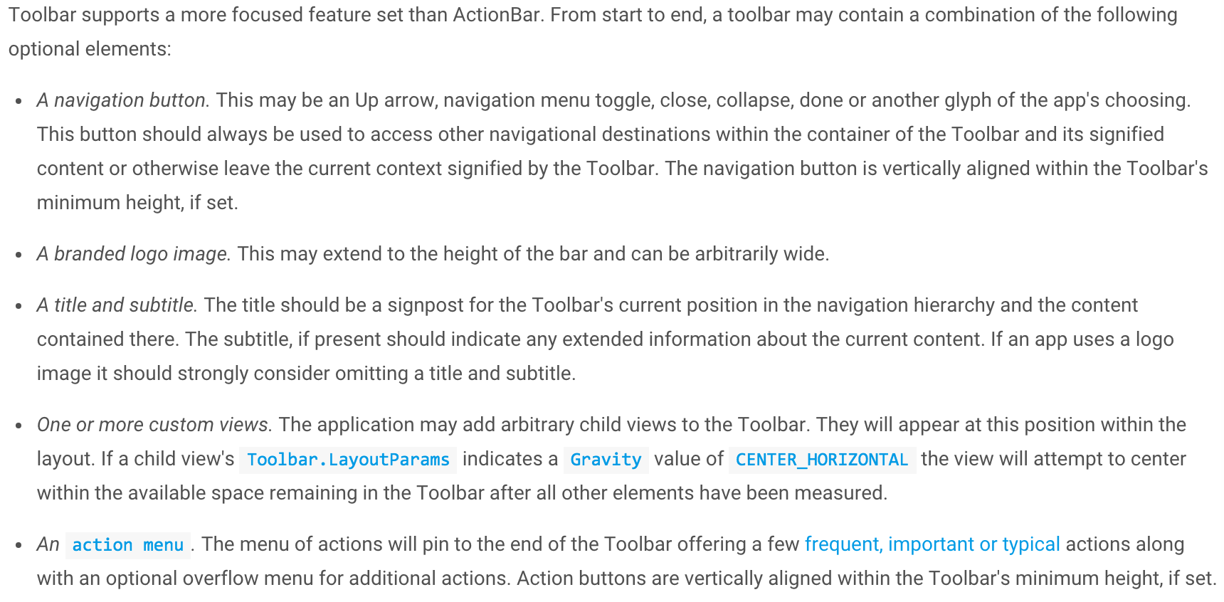
效果长这样

看到效果有人会说了,这跟ActionBar也没啥区别呀。我只能说客官你别着急,继续往下看嘛,这才刚开始。
配置Toolbar
上面说了,Toolbar最常用的场景就是放在页面顶端当做ActionBar来使用。要把Toolbar当做ActionBar来使用,你只需两行代码就搞定了。
Toolbar toolbar = (Toolbar) findViewById(R.id.toolbar);
setSupportActionBar(toolbar); //如果不往下兼容的话,调用setActionBar(toolbar)即可;
通过上面的设置,我们就可以通过 getSupportActionBar() 来获取到一个ActionBar的实例,然后就可以调用ActionBar的方法来进行设置了。比如 setDisplayHomeAsUpEnabled(true) 就可以在Toolbar上显示一个导航按钮,可以是个箭头,也可以是个汉堡菜单。
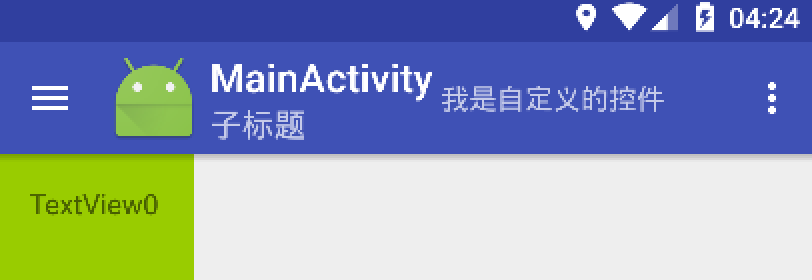
Toolbar提供了比ActionBar更多的特性,包括可以在Toolba上放置一个导航按钮、品牌logo、标题和子标题、自定义的View以及ActionMenu.
我们可以通过java代码来设置这些参数,也可以通过在xml中的属性值来设置。但要记得使用自定义命名空间哟。
Toolbar toolbar = (Toolbar) findViewById(R.id.toolbar);
//设置Toolbar为ActionBar
setSupportActionBar(toolbar);
ActionBar ab = getSupportActionBar();

ab.setDisplayHomeAsUpEnabled(true);
//设置导航按钮,这里设置了一个汉堡按钮
toolbar.setNavigationIcon(R.drawable.ic_menu);

//给导航按钮设置点击监听
toolbar.setNavigationOnClickListener(new View.OnClickListener() {
    @Override
    public void onClick(View v) {
        Toast.makeText(MainActivity.this, "导航按钮", Toast.LENGTH_SHORT).show();
    }
});

//设置品牌logo
toolbar.setLogo(R.mipmap.ic_launcher);

//设置子标题
toolbar.setSubtitle("子标题");
<android.support.v7.widget.Toolbar
        android:id="@+id/toolbar"
        android:layout_width="match_parent"
        android:layout_height="?attr/actionBarSize"
        android:background="?attr/colorPrimary"
        app:layout_scrollFlags="scroll|enterAlways"
        app:popupTheme="@style/AppTheme.PopupOverlay">

        <TextView
            android:layout_width="wrap_content"
            android:layout_height="wrap_content"
            android:text="我是自定义的控件" />
    </android.support.v7.widget.Toolbar>
通过上面这些设置之后,我们的Toolbar就长这样子了。现在看起来是不是像样多了。
 怎么样,经过上面的介绍。Toolbar的基本用法应该都了解的差不多了吧。后面我会继续总结Toolbar跟其他控件的配合使用,包括 NavigationView 、 RecyclerView 、 CoordinatorLayout 等。敬请期待……
正文到此结束
热门推荐


相关文章


Loading...
![[HBLOG]公众号](http://www.liuhaihua.cn/img/qrcode_gzh.jpg)

