Android Material Design系列之Navigation Drawer
从今天开始,我们讲一个关于Material Design风格控件系列的文章。个人认为Material Design风格还是非常漂亮和好看的。关于Material Design的控件,从今天这篇开始一个一个的讲,希望能够对大家有所帮助。
Material Design系列控件,我们今天就先从侧滑菜单栏开始,侧滑菜单栏通过名字我们就知道包含两部分,一部分是侧滑(DrawerLayout),一部分是导航菜单栏(NavigationView)。DrawerLayout包含NavigationView,一设置侧滑菜单栏就形成了。因为建立一个侧滑菜单很简单,在用Android Studio新建项目时,最后选择Navigation Drawer Activity或者在新建Activity时选择Navigation Drawer Activity,就出来了。今天我们讲一下它们的自定义配置。
DrawerLayout布局
<?xml version="1.0" encoding="utf-8"?>

<android.support.v4.widget.DrawerLayout xmlns:android="http://schemas.android.com/apk/res/android"

    xmlns:app="http://schemas.android.com/apk/res-auto"

    xmlns:tools="http://schemas.android.com/tools"

    android:id="@+id/drawer_layout"

    android:layout_width="match_parent"

    android:layout_height="match_parent"

    android:fitsSystemWindows="true"

    tools:openDrawer="start">

    <include

        layout="@layout/app_bar_main"

        android:layout_width="match_parent"

        android:layout_height="match_parent" />


    <android.support.design.widget.NavigationView

        android:id="@+id/nav_view"

        android:layout_width="wrap_content"

        android:layout_height="match_parent"

        android:layout_gravity="start"

        android:fitsSystemWindows="true"

        app:headerLayout="@layout/nav_header_main"

        app:menu="@menu/activity_main_drawer" />

</android.support.v4.widget.DrawerLayout>
从上面的布局代码中我们就看出来了,DrawerLayout包含NavigationView,中间的include先不管,那是toolbar,咱改天详细讲。新建完项目,自带的布局效果是这样的,如下:
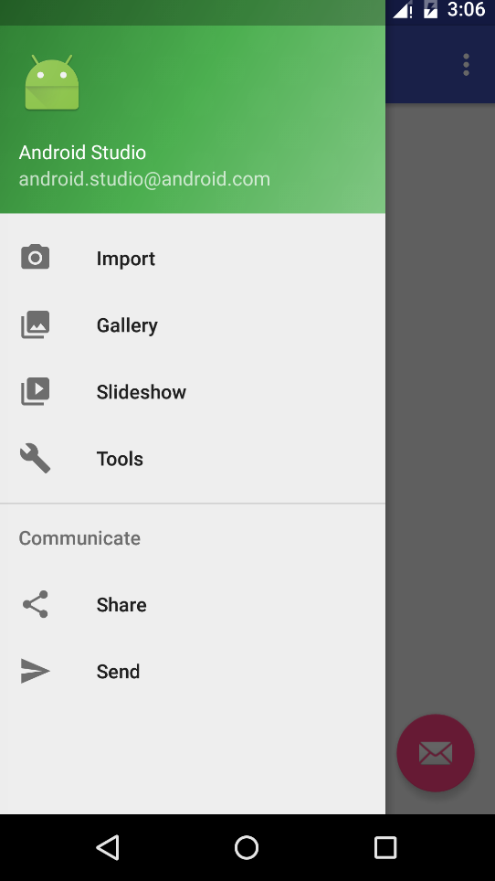
从图中,我们可以看到菜单列表,这个菜单列表是我们刚开始建项目时自动生成的,系统默认的,我们需要定制这个菜单变成我们自己的。其实就是要用到了NavigationView。
NavigationView
NavigationView分为两部分,一部分是headerLayout,一部分是menu。headerLayout就是对应菜单的顶部部分,一般用来显示用户信息什么的,menu则对应实际的菜单选项。我们从上面的布局代码中可以看出分别对应的就是 app:headerLayout和app:menu。
headerLayout
布局代码如下:
<?xml version="1.0" encoding="utf-8"?>

<LinearLayout xmlns:android="http://schemas.android.com/apk/res/android"

    android:layout_width="match_parent"

    android:layout_height="wrap_content"

    android:padding="16dp"

    android:theme="@style/ThemeOverlay.AppCompat.Dark"

    android:background="?attr/colorPrimaryDark"

    android:gravity="center"

    android:orientation="vertical">


    <ImageView

        android:id="@+id/head_iv"

        android:layout_width="60dp"

        android:layout_height="60dp"

        android:layout_marginTop="30dp"

        android:background="@drawable/head" />


    <TextView

        android:text="非著名程序员"

        android:layout_marginTop="10dp"

        android:textColor="#ffffff"

        android:layout_width="wrap_content"

        android:layout_height="wrap_content" />

</LinearLayout>
menu
<?xml version="1.0" encoding="utf-8"?>

<menu xmlns:android="http://schemas.android.com/apk/res/android">

    <group android:checkableBehavior="single">

        <item

            android:id="@+id/nav_home"

            android:icon="@drawable/nav_icon_home"

            android:title="Home" />

        <item

            android:id="@+id/nav_favorite"

            android:icon="@drawable/nav_icon_favorite"

            android:title="收藏" />

        <item

            android:id="@+id/nav_followers"

            android:icon="@drawable/nav_icon_followers"

            android:title="群组" />

        <item

            android:id="@+id/nav_settings"

            android:icon="@drawable/nav_icon_settings"

            android:title="设置" />

    </group>

    <item android:title="分享和反馈">

        <menu>

            <item

                android:id="@+id/nav_share"

                android:icon="@drawable/nav_icon_my_shares"

                android:title="分享" />

            <item

                android:id="@+id/nav_feedback"

                android:icon="@drawable/nav_icon_feedback"

                android:title="意见反馈" />

        </menu>

    </item>

</menu>
代码实现
初始化相关控件
里面的Toolbar和FloatingActionButton稍后我们在这个系列讲,对DrawerLayout和NavigationView进行了声明和初始化。
//toolbar的设置,稍后讲这个控件

Toolbar toolbar = (Toolbar) findViewById(R.id.toolbar);

setSupportActionBar(toolbar);

//悬浮按钮控件,稍后讲这个控件

FloatingActionButton fab = (FloatingActionButton) findViewById(R.id.fab);

fab.setOnClickListener(new View.OnClickListener() {

    @Override

    public void onClick(View view) {

        Snackbar.make(view, "Replace with your own action", Snackbar.LENGTH_LONG)

                .setAction("Action", null).show();

    }

});

//设置DrawerLayout

DrawerLayout drawer = (DrawerLayout) findViewById(R.id.drawer_layout);

ActionBarDrawerToggle toggle = new ActionBarDrawerToggle(

        this, drawer, toolbar, R.string.navigation_drawer_open, R.string.navigation_drawer_close);

drawer.setDrawerListener(toggle);

toggle.syncState();

//设置NavigationView

NavigationView navigationView = (NavigationView) findViewById(R.id.nav_view);

navigationView.setNavigationItemSelectedListener(this);
侧滑菜单中选项按钮的点击事件
MainActivity实现了NavigationView.OnNavigationItemSelectedListener这个监听事件,然后在实现的监听方法里判断点击事件。
方法如下:
@Override

   public boolean onNavigationItemSelected(MenuItem item) {

       int id = item.getItemId();

       if (id == R.id.nav_home) {

           Toast.makeText(this, "home", Toast.LENGTH_SHORT).show();

       } else if (id == R.id.nav_favorite) {

           Toast.makeText(this, "收藏", Toast.LENGTH_SHORT).show();

       } else if (id == R.id.nav_followers) {

           Toast.makeText(this, "群组", Toast.LENGTH_SHORT).show();

       } else if (id == R.id.nav_settings) {

           Toast.makeText(this, "设置", Toast.LENGTH_SHORT).show();

       } else if (id == R.id.nav_share) {

           Toast.makeText(this, "分享", Toast.LENGTH_SHORT).show();

       } else if (id == R.id.nav_feedback) {

           Toast.makeText(this, "意见反馈", Toast.LENGTH_SHORT).show();

       }


       DrawerLayout drawer = (DrawerLayout) findViewById(R.id.drawer_layout);

       drawer.closeDrawer(GravityCompat.START);

       return true;

   }
记得实现了监听,别忘了设置监听:navigationView.setNavigationItemSelectedListener(this);
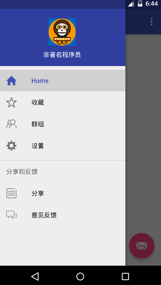
到这里就讲完了。做完之后的效果图如下:
噢,忘了,你们肯定会问,如果点击侧滑上面的头像,怎么实现呢?
headerLayout上的控件实现
如果要实现headerLayout上的控件的点击,那就得这样做了,如下:
View navHeaderView = navigationView.inflateHeaderView(R.layout.header_layout);


ImageView headIv = (ImageView) navHeaderView.findViewById(R.id.head_iv);

headIv.setOnClickListener(new View.OnClickListener() {

        @Override

        public void onClick(View view) {

            Toast.makeText(MainActivity.this, "点击我的头像", Toast.LENGTH_SHORT).show();

        }

});
但是这样做了之后,就相当于在navigationView上又添加了一个headerlayou布局,所以这时,我们需要在布局文件中把
app:headerLayout="@layout/header_layout"
这行代码去掉,否则会重复的。
主题和配色
上面用到的主题和颜色,我们可以在资源文件中配置。
比如color中:
<?xml version="1.0" encoding="utf-8"?>

<resources>

    <color name="colorPrimary">#3F51B5</color>

    <color name="colorPrimaryDark">#303F9F</color>

    <color name="colorAccent">#FF4081</color>

</resources>
比如style中:
<resources>

    <!-- Base application theme. -->

    <style name="AppTheme" parent="Theme.AppCompat.Light.DarkActionBar">

        <!-- Customize your theme here. -->

        <item name="colorPrimary">@color/colorPrimary</item>

        <item name="colorPrimaryDark">@color/colorPrimaryDark</item>

        <item name="colorAccent">@color/colorAccent</item>

    </style>

    <style name="AppTheme.NoActionBar">

        <item name="windowActionBar">false</item>

        <item name="windowNoTitle">true</item>

    </style>

    <style name="AppTheme.AppBarOverlay" parent="ThemeOverlay.AppCompat.Dark.ActionBar" />

    <style name="AppTheme.PopupOverlay" parent="ThemeOverlay.AppCompat.Light" />

</resources>
在这里配置成自己想要实现的主题和颜色即可。这回是真讲完了。是不是很简单,赶紧试一试去吧。
正文到此结束
热门推荐


相关文章


Loading...
![[HBLOG]公众号](http://www.liuhaihua.cn/img/qrcode_gzh.jpg)

