Android中Toolbar的使用
为什么引入Toolbar
Toolbar是Android5.0新增的一个控件,在开发中为了兼容低版本一般使用support v7中的Toolbar。Toolbar可以理解为就是一个工具栏,在Android5.0以前的版本中都是由ActionBar来实现的工具栏。如果有人使用过Android官方的ActionBar就会知道它到底是有多么让人头大了,以至于许多开发者都转向了第三方开源库ActionBarSherlock,ActionBarSherlock在使用上给开发者带来了很大便利,因为它可以很方便的定义自己的style。可以这么说吧,ActionBarSherlock在一个方面解决了Android官方提供的ActionBar所带来的问题,这是引入Tooolbar被引入的原因之一,但是它却没有解决ActionBar本身就存在的缺陷。
ActionBar一般是作为Activity框架层不可见窗体的一部分来使用的,开发者很难在View视图层级自由的控制它,但是Toolbar却可以完全看成一个ViewGroup,它是Android View层级树的一部分,可以放在View层级树的任意位置,可以应用动画,可以跟着scrollView滚动,可以与布局中的其他view交互,这就是Toolbar引入的第二个原因。
可以说Android官方推出Toolbar在某些程度上已经看到了ActionBar已经限制了Android App开发与设计的弹性。在Material Design中已经有了一个更好的名称定义:AppBar,后续文章中再介绍Material Design中的AppBar,接下来重点介绍Toolbar在开发中如何使用。
Toolbar的简单使用
本文使用的support包是com.android.support:appcompat-v7:23.4.0,在可以自由定制Toolbar的style之前,先熟悉一下Android Material Design相关背景色的定义。
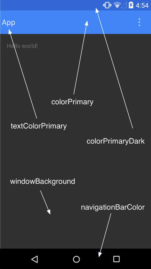
通过设置主题中android:colorPrimary and android: colorPrimaryDark等属性(如果使用appCompat,不用再去设置“android”前缀了),AppCompat将会自动的为那些text,checkbox和一些在L之前的组件着色。在这里注意一点textColorPrimary、windowBackground在Android以前的版本中就存在了,所以前面必须加上”android”前缀,navigationBarColor仅能在 API v21 也就是 Android 5 以后的版本中使用, 因此要将之设定在 res/values-v21/styles.xml 里面。
Toolbar主题定义
<stylename="AppTheme.Base" parent="Theme.AppCompat.Light.NoActionBar"> <itemname="colorPrimary">@color/colorPrimary</item> <itemname="colorPrimaryDark">@color/colorPrimaryDark</item> <itemname="colorAccent">@color/colorAccent</item> </style>
这里一定要注意在value.xml文件中定义的应用主题必须是NoActionBar主题,接下来再来看一下Toolbar的相关style的定义。
<android.support.v7.widget.Toolbar android:id="@+id/toolbar" android:layout_width="match_parent" app:titleTextColor="#fff" app:theme="@style/Theme.AppCompat.NoActionBar" app:popupTheme="@style/CustomPopupTheme" android:layout_height="wrap_content" android:background="@color/colorPrimary" android:minHeight="?actionBarSize"/>
先介绍一下高度的定义,先定义一个最小高度为ActionBar的高度,然后将layout_height定义为wrap_content。在应用全局主题时我们定义的是Theme.AppCompat.Light.NoActionBar,而在Toolbar上应用的主题是Theme.AppCompat.NoActionBar,Toolbar上又使用了系统默认的黑色主题,这里解释一下原因,如果使用浅色主题在Toolbar上的默认的一些系统图标就会显示为黑色,然而在本文中我们将Toolbar定义为了深色背景,所以想在Toolbar上面使用白色图标。
下面是Toolbar可以使用的style属性:
接下来我们看一下在Activity中如何使用Toolbar。
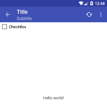
toolbar = (Toolbar) findViewById(R.id.toolbar); toolbar.setTitle("Title"); toolbar.setSubtitle("Subtitle"); setSupportActionBar(toolbar); actionBar = getSupportActionBar(); actionBar.setDisplayHomeAsUpEnabled(true); 在Activity继承的类上面使用的是AppCompatActivity,是的,在使用Toolbar时仍然使用了ActionBar,使用setSupportActionBar将toolbar传入。下面是程序的运行截图。
Toolbar菜单按钮的显示
与在ActionBar中使用Menu一样,代码如下:
public boolean onCreateOptionsMenu(Menumenu) { getMenuInflater().inflate(R.menu.action_menu, menu); return true; } 上面在定义Toolbar的style有这样一个属性 app:popupTheme="@style/CustomPopupTheme" ,CustomPopupTheme定义如下:
<stylename="CustomPopupTheme" parent="@style/Theme.AppCompat.Light.NoActionBar"> <itemname="android:textColorPrimary">@color/textColorPrimary</item> </style>
溢出菜单的使用还是比较复杂的,一般情况下在使用的时候可以自定义一个style进行单独赋值。溢出菜单已经定义好了,也可以显示出来了,但是问题又来了,溢出菜单中的图标显示不出来,在以前使用的时候我们可以通过反射来显示图标,代码如下:
public boolean onMenuOpened(int featureId, Menumenu) { if (featureId == Window.FEATURE_ACTION_BAR && menu != null) { if (menu.getClass().getSimpleName().equals("MenuBuilder")) { try { Method m = menu.getClass().getDeclaredMethod( "setOptionalIconsVisible", Boolean.TYPE); m.setAccessible(true); m.invoke(menu, true); } catch (Exception e) { } } } return super.onMenuOpened(featureId, menu); } 在网上查了很多资料之后,发现只要Activity是继承AppCompatActivity,使用onMenuOpened方法都不可以显示溢出菜单图标,针对继承AppCompatActivity类,可以采用下面方法来显示图标:
protected boolean onPrepareOptionsPanel(Viewview, Menumenu) { if (menu != null) { if (menu.getClass().getSimpleName().equals("MenuBuilder")) { try{ Method m = menu.getClass().getDeclaredMethod("setOptionalIconsVisible", Boolean.TYPE); m.setAccessible(true); m.invoke(menu, true); } catch (Exception e) { Log.e(getClass().getSimpleName(), "onMenuOpened...unable to set icons for overflow menu", e); } } } return super.onPrepareOptionsPanel(view, menu); } 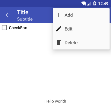
Toolbar设置返回上一层级
在Toolbar结合AppCompatActivity中提供了专门的方法返回上一层级,代码如下:
//设置返回上一级按钮可用 actionBar.setDisplayHomeAsUpEnabled(true); @Override public boolean onSupportNavigateUp() { finish(); return true; } 上面代码看上去非常简单,但是如果我们重写了onOptionsItemSelected方法,则上面方法将会无效,因为在AppCompatActivity中该方法的实现源码如下:
public final boolean onMenuItemSelected(int featureId, android.view.MenuItemitem) { if (super.onMenuItemSelected(featureId, item)) { return true; } final ActionBarab = getSupportActionBar(); if (item.getItemId() == android.R.id.home && ab != null && (ab.getDisplayOptions() & ActionBar.DISPLAY_HOME_AS_UP) != 0) { return onSupportNavigateUp(); } return false; } 因此一旦重写了onOptionsItemSelected就要手动处理返回了。
public boolean onOptionsItemSelected(MenuItemitem) { switch (item.getItemId()){ ... case android.R.id.home: finish(); break; } return true; } Toolbar显示在底部
Toolbar显示在底部,前面我们已经说过了,它是View视图层级的一部分,想让它显示在底部,只需要更改布局文件就可以了,在布局的时候我们将它看做一个ViewGroup就可以了。
<LinearLayoutxmlns:android="http://schemas.android.com/apk/res/android" xmlns:app="http://schemas.android.com/apk/res-auto" android:layout_width="match_parent" android:layout_height="match_parent" android:background="#fff" android:orientation="vertical"> <CheckBox android:layout_width="wrap_content" android:layout_height="wrap_content" android:text="CheckBox"/> <TextView android:layout_width="match_parent" android:layout_height="0dp" android:layout_weight="1" android:background="#fff" android:gravity="center" android:text="Hello world!" android:textColor="#444"/> <android.support.v7.widget.Toolbar android:id="@+id/toolbar" android:layout_width="match_parent" app:titleTextColor="#fff" app:theme="@style/Theme.AppCompat.NoActionBar" app:popupTheme="@style/CustomPopupTheme" android:layout_height="wrap_content" android:background="@color/colorPrimary" android:minHeight="?actionBarSize"/> </LinearLayout>
自定义Toolbar布局文件
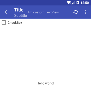
在上面自定义Toolbar的style时,我们将它的layout_height设置成了wrap_content,从这里就可以知道,Toolbar的高度不再受系统限制了,不但高度不再受系统限制,还可定义任意我们想要的布局。在ActionBar中使用Menu,在菜单上长按会弹出Toast,这种交互是很多UI设计师不愿意看到的,这时候我们就可以自己定义一个按钮放上去,而不是使用自定义系统菜单。下面是一个简单的例子,在Toolbar中放置了TextView,如果布局比较复杂我们也可以include进来。
<android.support.v7.widget.Toolbar android:id="@+id/toolbar" android:layout_width="match_parent" android:layout_height="wrap_content" android:background="@color/colorPrimary" android:minHeight="?actionBarSize" app:popupTheme="@style/CustomPopupTheme" app:theme="@style/Theme.AppCompat.NoActionBar" app:titleTextColor="#fff"> <TextView android:text="I'm custom TextView" android:layout_width="wrap_content" android:layout_height="match_parent"/> </android.support.v7.widget.Toolbar>
Toolbar与DrawerLayout组合使用
在NavigationView这篇博客中已经有了简单介绍,可以组合成两种不同的交互,详情请参考这篇博客 Android Material Design之NavigationView 。为了使用Toolbar与DrawerLayout,Android系统提供了专门的方法来结合它们,代码如下:
private Toolbartoolbar; private DrawerLayoutmDrawerLayout; private ActionBaractionBar; private ActionBarDrawerTogglemDrawerToggle; ... private void initView() { toolbar = (Toolbar) findViewById(R.id.toolbar); toolbar.setTitle("ToolbarDrawer"); mDrawerLayout = (DrawerLayout) findViewById(R.id.drawerLayout); setSupportActionBar(toolbar); actionBar = getSupportActionBar(); mDrawerToggle = new ActionBarDrawerToggle(this, mDrawerLayout, toolbar, R.string.drawer_open, R.string.drawer_close); mDrawerToggle.syncState(); mDrawerLayout.addDrawerListener(mDrawerToggle); } 
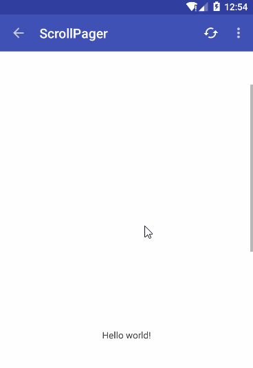
Toolbar放在Scroll页面
直接看布局文件,可以实现两种方式的滚动,一种是Toolbar跟随滚动,另外一种是Toolbar如同fix效果一样,都可以通过布局文件实现,代码如下:
<!--方式一--> <ScrollViewxmlns:android="http://schemas.android.com/apk/res/android" xmlns:app="http://schemas.android.com/apk/res-auto" android:layout_width="match_parent" android:layout_height="match_parent" android:background="#fff" android:clipToPadding="true" android:orientation="vertical"> <LinearLayout android:layout_width="match_parent" android:layout_height="wrap_content" android:background="#fff" android:orientation="vertical"> <android.support.v7.widget.Toolbar android:id="@+id/toolbar" android:layout_width="match_parent" app:titleTextColor="#fff" app:theme="@style/Theme.AppCompat.NoActionBar" app:popupTheme="@style/CustomPopupTheme" android:layout_height="wrap_content" android:background="@color/colorPrimary" android:minHeight="?actionBarSize"/> ... </LinearLayout> </ScrollView> <!--方式二--> <LinearLayoutxmlns:android="http://schemas.android.com/apk/res/android" xmlns:app="http://schemas.android.com/apk/res-auto" android:layout_width="match_parent" android:layout_height="match_parent" android:background="#fff" android:orientation="vertical"> <android.support.v7.widget.Toolbar android:id="@+id/toolbar" android:layout_width="match_parent" android:layout_height="wrap_content" android:background="@color/colorPrimary" android:minHeight="?actionBarSize" app:popupTheme="@style/CustomPopupTheme" app:theme="@style/Theme.AppCompat.NoActionBar" app:titleTextColor="#fff"/> <ScrollView android:layout_width="match_parent" android:layout_height="0dp" android:layout_weight="1"> <LinearLayout android:layout_width="match_parent" android:layout_height="wrap_content" android:orientation="vertical"> ... </LinearLayout> </ScrollView> </LinearLayout>
小结
本本只涉及到Toolbar的简单使用,另外有关Toolbar可以完全看作是一个View,可以使用属性动画实现一些更友好的交互。与Android Material Design结合还有许多更高级的特效在以后的文章中再做介绍,如与CoordinatorLayout和RecyclerView结合实现的视差动画。
正文到此结束
热门推荐


相关文章


Loading...
![[HBLOG]公众号](http://www.liuhaihua.cn/img/qrcode_gzh.jpg)

